Mount Tabor leans heavily Republican by roughly 36 points: about 32% of voters vote Democratic and 68% Republican.
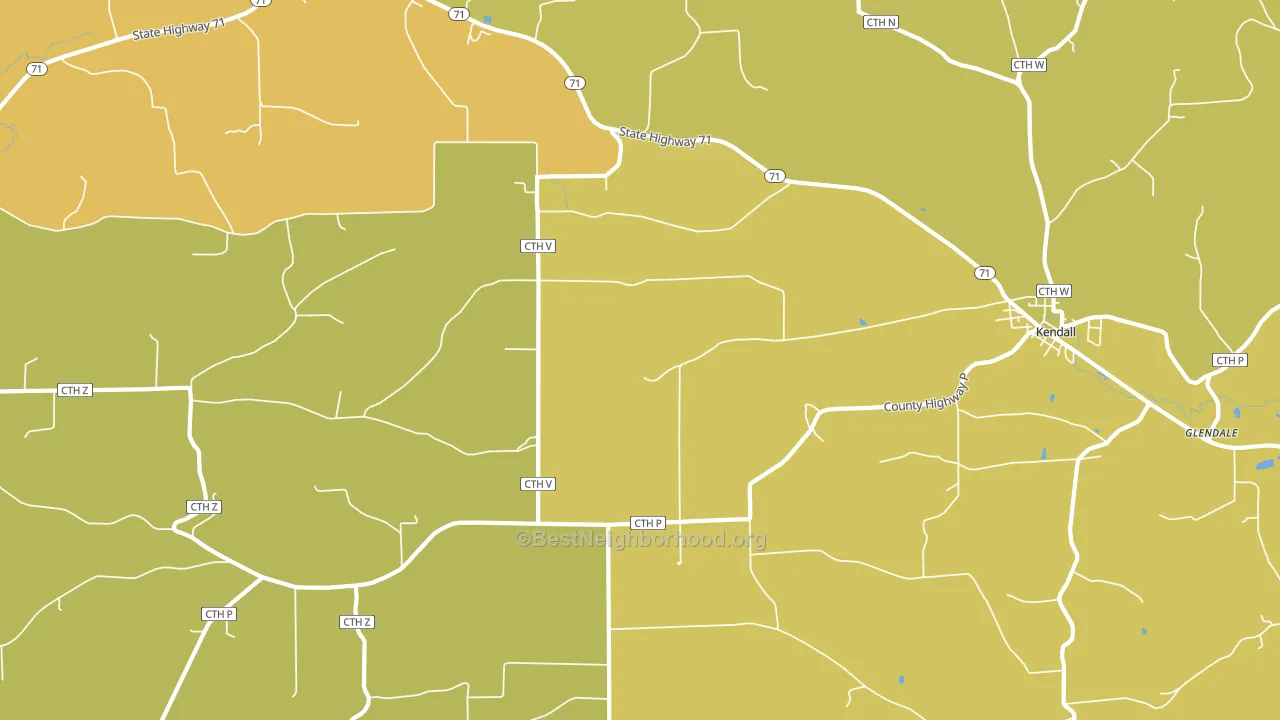
About 61% of adults in Mount Tabor typically vote, near the U.S. average of about 62%. Among adults in Mount Tabor, ~20% vote Democratic, ~41% Republican, and ~39% don't vote. The map below shows estimated turnout by block group.
How Mount Tabor compares
Among cities within 25 miles, Mount Tabor leans more Republican than 29 of 45 neighbors.
Mount Tabor runs about 36 points more Republican than Wisconsin as a whole.
Why Mount Tabor leans the way it does
Density, race composition, education, and family structure all sit close to their national averages in Mount Tabor. The lean here lands roughly where demographic data alone would predict.
Population density, never-married share, and Republican lean
Places that combine low population density and a never-married-heavy adult population tend to lean Republican, as Mount Tabor, WI does.
Why turnout in Mount Tabor looks the way it does
Crowded housing lines up with lower turnout. About 7% of homes in Mount Tabor have more than one occupant per room, above 94% of cities. Low high-school completion lines up with lower turnout, and about 83% of adults in Mount Tabor have completed high school, below 86% of cities. Learn more about the findings and methodology on the political spectrum map.
Nearby Cities
- Kendall, WI R+37
- Wilton, WI R+39
- Clifton, WI R+38
- Elroy, WI R+35
- Ontario, WI R+26
- Norwalk, WI R+38
- Hustler, WI R+32
- Hillsboro, WI R+30
- Valley, WI R+30
- Oakdale, WI R+40
Cities with Similar Populations
- Indian Town, VA R+38
- Sheppton, PA R+48
- Georgeville, MN R+56
- Quinerly, NC R+23
- Loma Mar, CA D+52
- Quitsna, NC D+54
- Guilford, VT D+22
- Grassflat, PA R+60
- Koontz Lake, IN R+54
- Claytown, MS R+50
Sources and methodology
Precinct-level voting records used to fit the model come from Wisconsin Elections Commission, distributed by the Voting and Election Science Team. Demographic inputs come from the U.S. Census Bureau (ACS 5-year estimates and the 2020 Decennial Census). Health and environmental inputs come from the CDC (PLACES and the Environmental Justice Index). Land cover comes from the USGS and EPA. Election-day and lead-up weather come from PRISM 4km daily grids and the NOAA Global Historical Climatology Network. Mail-voting and election-administration patterns come from the MIT Election Lab's Survey of the Performance of American Elections. Block-group crime detail comes from CrimeGrade. Internet data and modeling support provided by ISPreports.org.
Modeling and analysis by the BestNeighborhood data science team. Full methodology and findings: political spectrum map.
Methodology reviewed by the BestNeighborhood data team. Last updated May 2026.