Muskegon County is a true toss-up. About 51% of voters here vote Democratic and 49% Republican.
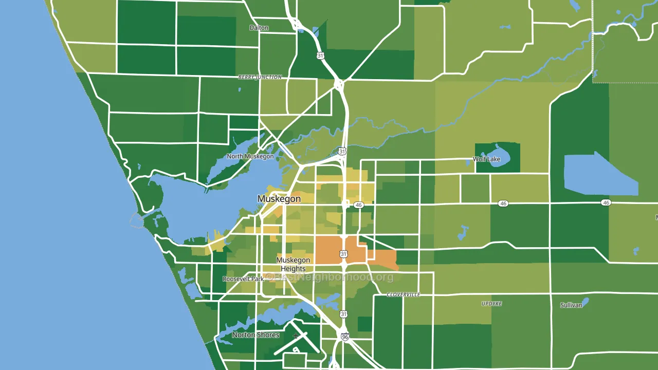
About 81% of adults in Muskegon County typically vote, above the U.S. average of about 62%. Among adults in Muskegon County, ~41% vote Democratic, ~40% Republican, and ~19% don't vote. The map below shows estimated turnout by block group.
How Muskegon County compares
Among counties within 50 miles, Muskegon County sits roughly in the middle of the political spectrum, with 4 neighbors leaning further in the place's direction and 1 leaning the other way.
Politically, Muskegon County sits close to the rest of Michigan.
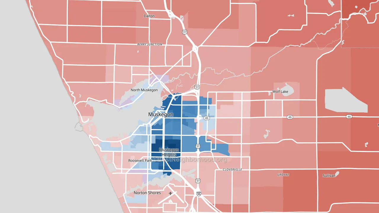
Politics vary noticeably by city within Muskegon County. The south side runs the most Democratic (D+32) and the northeast side runs the most Republican (R+27), a spread of about 60 points.
Why Muskegon County leans the way it does
Density, race composition, education, and family structure all sit close to their national averages in Muskegon County. The lean here lands roughly where demographic data alone would predict.
Population density and Democratic lean
Places with high population density tend to lean Democratic; Muskegon County, MI sits in the top quarter nationally on this measure.
Why turnout in Muskegon County looks the way it does
Turnout in Muskegon County sits close to the national pattern. Routine healthcare access, homeownership, education, and food security all land near their national averages here. Learn more about the findings and methodology on the political spectrum map.
Nearby Counties
- Ottawa County, MI R+16
- Newaygo County, MI R+40
- Oceana County, MI R+28
- Kent County, MI D+10
- Allegan County, MI R+28
- Mecosta County, MI R+26
- Mason County, MI R+20
- Montcalm County, MI R+41
- Lake County, MI R+30
- Ionia County, MI R+30
Counties with Similar Populations
- Bay County, FL R+35
- Hendricks County, IN R+20
- Scott County, IA D+5
- Lee County, AL R+13
- Porter County, IN R+11
- Licking County, OH R+29
- Carroll County, MD R+24
- Shawnee County, KS D+4
- Guadalupe County, TX R+23
- Imperial County, CA Even
Sources and methodology
Precinct-level voting records used to fit the model come from Michigan Department of State, Elections, distributed by the Voting and Election Science Team. Demographic inputs come from the U.S. Census Bureau (ACS 5-year estimates and the 2020 Decennial Census). Health and environmental inputs come from the CDC (PLACES and the Environmental Justice Index). Land cover comes from the USGS and EPA. Election-day and lead-up weather come from PRISM 4km daily grids and the NOAA Global Historical Climatology Network. Mail-voting and election-administration patterns come from the MIT Election Lab's Survey of the Performance of American Elections. Block-group crime detail comes from CrimeGrade. Internet data and modeling support provided by ISPreports.org.
Modeling and analysis by the BestNeighborhood data science team. Full methodology and findings: political spectrum map.
Methodology reviewed by the BestNeighborhood data team. Last updated May 2026.