Neponset leans heavily Democratic by roughly 36 points: about 68% of voters vote Democratic and 32% Republican.
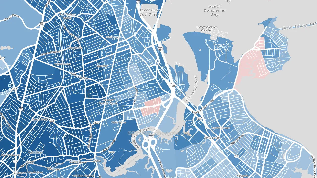
About 66% of adults in Neponset typically vote, near the U.S. average of about 62%. Among adults in Neponset, ~45% vote Democratic, ~21% Republican, and ~34% don't vote. The map below shows estimated turnout by block group.
How Neponset compares
Among neighborhoods within 5 miles, Neponset leans more Democratic than 1 of 18 neighbors.
Neponset runs about 12 points more Democratic than Massachusetts as a whole.
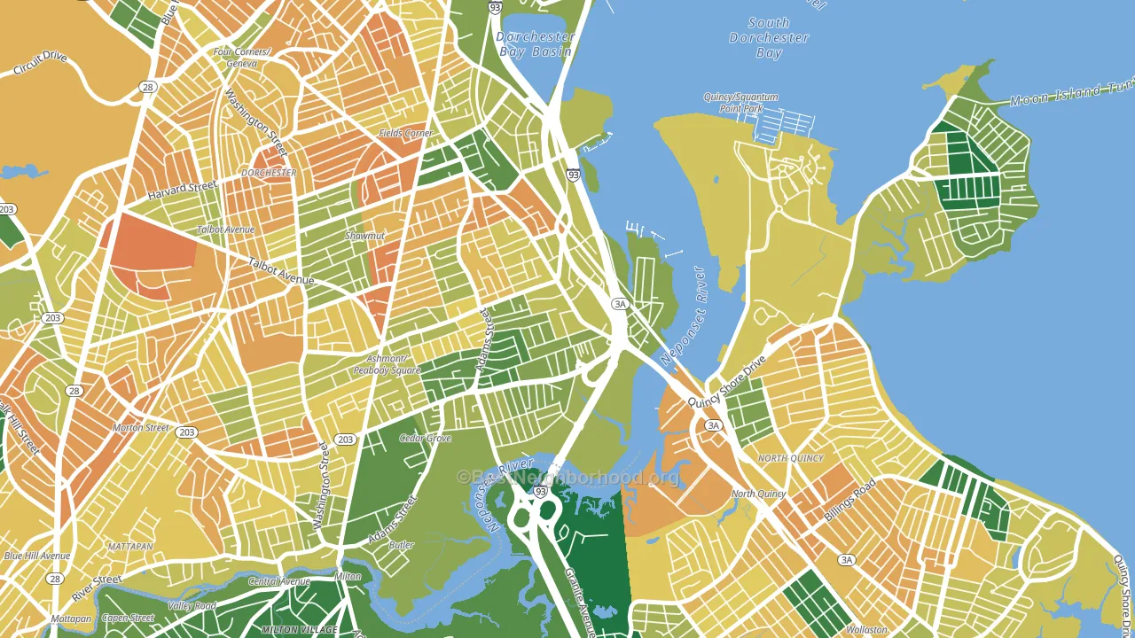
Politics vary noticeably by block within Neponset. The northwest side is the most Democratic-leaning (D+45) and the southwest side is the least Democratic-leaning (D+29), a spread of about 16 points.
Why Neponset leans the way it does
This analysis examined 14,881 data points per neighborhood to find what predicts political lean and turnout. The items below are a few correlations that stood out for Neponset, not a ranked or complete list of what matters most.
Areas with many never-married adults vote Democratic. About 46% of adults in Neponset have never been married, modestly above similar-sized neighborhoods (around 40%).
Walkability and Democratic lean
Places with a highly walkable street grid tend to lean Democratic; Neponset, Boston, MA sits in the top tenth nationally on this measure. A walkable street grid does not change how people vote; it mostly reflects how urban a place is.
Why turnout in Neponset looks the way it does
Turnout in Neponset sits close to the national pattern. Routine healthcare access, homeownership, education, and food security all land near their national averages here. Learn more about the findings and methodology on the political spectrum map.
Nearby Neighborhoods
- Fields Corner, Boston, MA D+49
- South Dorchester, Boston, MA D+57
- Dorchester Center, Boston, MA D+71
- East Milton, Milton, MA D+31
- Mount Bowdoin, Boston, MA D+65
- North Dorchester, Boston, MA D+59
- Milton Upper Mills, Milton, MA D+67
- Roxbury, Boston, MA D+65
- Dorchester Heights, Boston, MA D+51
- Nubian Square, Boston, MA D+65
Neighborhoods with Similar Populations
- Garden District, Sandusky, OH D+14
- Granville Historic District, Granville, OH Even
- Elizabeth Park Valley, Akron, OH D+46
- Toluca Lake, North Hollywood, CA D+37
- Lowlanders, Sunnyvale, CA D+42
- South Forest Park, Everett, WA D+19
- Tiger Hole-Secret Woods, Jacksonville, FL R+17
- Fremont Park, Glendale, CA D+12
- Clarkdale, Culver City, CA D+38
- Colonial Village, Teaneck, NJ D+29
Sources and methodology
Precinct-level voting records used to fit the model come from Massachusetts Secretary of the Commonwealth, Elections, distributed by the Voting and Election Science Team. Demographic inputs come from the U.S. Census Bureau (ACS 5-year estimates and the 2020 Decennial Census). Health and environmental inputs come from the CDC (PLACES and the Environmental Justice Index). Land cover comes from the USGS and EPA. Election-day and lead-up weather come from PRISM 4km daily grids and the NOAA Global Historical Climatology Network. Mail-voting and election-administration patterns come from the MIT Election Lab's Survey of the Performance of American Elections. Block-group crime detail comes from CrimeGrade. Internet data and modeling support provided by ISPreports.org.
Modeling and analysis by the BestNeighborhood data science team. Full methodology and findings: political spectrum map.
Methodology reviewed by the BestNeighborhood data team. Last updated May 2026.