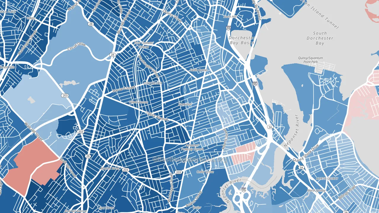
South Dorchester is a Democratic stronghold. About 79% of voters here vote Democratic and 21% Republican.
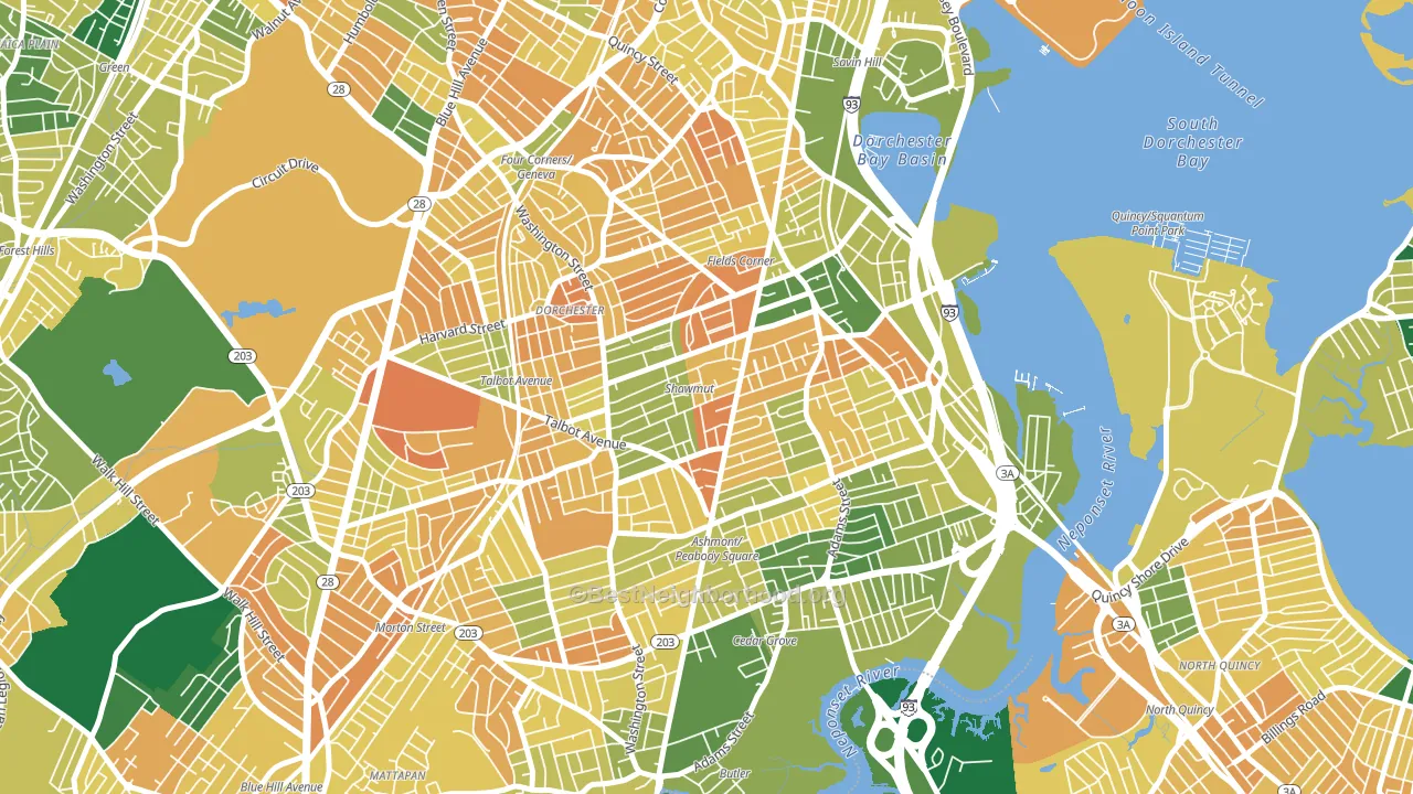
About 49% of adults in South Dorchester typically vote, below the U.S. average of about 62%. Among adults in South Dorchester, ~39% vote Democratic, ~10% Republican, and ~51% don't vote. The map below shows estimated turnout by block group.
How South Dorchester compares
Among neighborhoods within 5 miles, South Dorchester leans more Democratic than 6 of 23 neighbors.
South Dorchester runs about 32 points more Democratic than Massachusetts as a whole.
Politics vary noticeably by block within South Dorchester. The southwest side is the most Democratic-leaning (D+72) and the northeast side is the least Democratic-leaning (D+35), a spread of about 37 points.
Why South Dorchester leans the way it does
This analysis examined 14,881 data points per neighborhood to find what predicts political lean and turnout. The items below are a few correlations that stood out for South Dorchester, not a ranked or complete list of what matters most.
Areas with many never-married adults vote Democratic. About 48% of adults in South Dorchester have never been married, about 18 points above the U.S. average of 29%.
Paved land cover and Democratic lean
Places with extensive paved surfaces tend to lean Democratic; South Dorchester, Boston, MA sits in the top quarter nationally on this measure. Paved ground does not change how people vote; it mostly reflects how urban and built-up a place is.
Why turnout in South Dorchester looks the way it does
High-crime urban areas turn out at lower rates, mostly because the housing stress common in those areas makes voting harder. South Dorchester sits in the top 15% nationally on a violent-crime measure. See CrimeGrade for more details. Learn more about the findings and methodology on the political spectrum map.
Nearby Neighborhoods
- Fields Corner, Boston, MA D+49
- Dorchester Center, Boston, MA D+71
- Neponset, Boston, MA D+37
- Mount Bowdoin, Boston, MA D+65
- North Dorchester, Boston, MA D+59
- Roxbury, Boston, MA D+65
- East Milton, Milton, MA D+31
- Forest Hills, Jamaica Plain, MA D+68
- Nubian Square, Boston, MA D+65
- Milton Upper Mills, Milton, MA D+67
Neighborhoods with Similar Populations
- Woodhaven, Queens, NY D+9
- Fenway-Kenmore, Boston, MA D+67
- Dyker Heights, Brooklyn, NY R+20
- Mission, San Francisco, CA D+72
- Greater Memorial, Houston, TX R+14
- Auburndale, Queens, NY R+2
- New Brighton, Staten Island, NY D+36
- Capitol Hill, Washington, DC D+77
- Richmond, Philadelphia, PA D+24
- Carmel Valley, San Diego, CA D+29
Sources and methodology
Precinct-level voting records used to fit the model come from Massachusetts Secretary of the Commonwealth, Elections, distributed by the Voting and Election Science Team. Demographic inputs come from the U.S. Census Bureau (ACS 5-year estimates and the 2020 Decennial Census). Health and environmental inputs come from the CDC (PLACES and the Environmental Justice Index). Land cover comes from the USGS and EPA. Election-day and lead-up weather come from PRISM 4km daily grids and the NOAA Global Historical Climatology Network. Mail-voting and election-administration patterns come from the MIT Election Lab's Survey of the Performance of American Elections. Block-group crime detail comes from CrimeGrade. Internet data and modeling support provided by ISPreports.org.
Modeling and analysis by the BestNeighborhood data science team. Full methodology and findings: political spectrum map.
Methodology reviewed by the BestNeighborhood data team. Last updated May 2026.