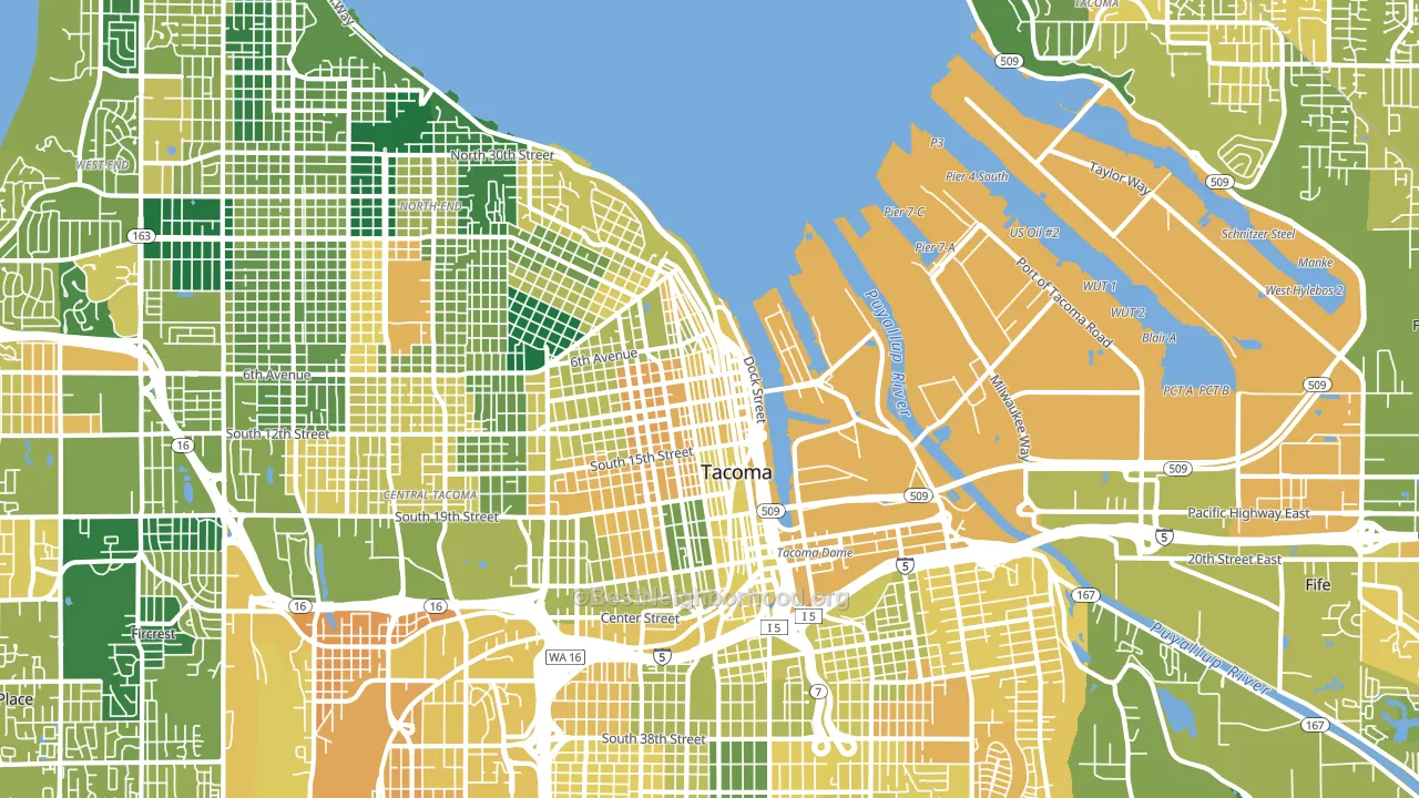
New Tacoma leans heavily Democratic by roughly 50 points: about 75% of voters vote Democratic and 25% Republican.
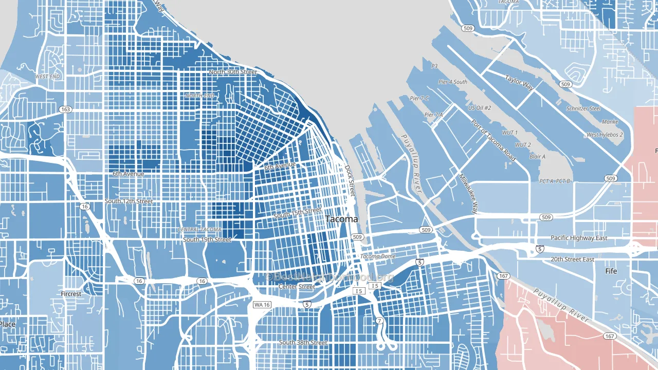
About 47% of adults in New Tacoma typically vote, below the U.S. average of about 62%. Among adults in New Tacoma, ~35% vote Democratic, ~12% Republican, and ~53% don't vote. The map below shows estimated turnout by block group.
How New Tacoma compares
Among neighborhoods within 5 miles, New Tacoma leans more Democratic than 6 of 8 neighbors.
New Tacoma runs about 31 points more Democratic than Washington as a whole.
Politics vary noticeably by block within New Tacoma. The northwest side runs the most Democratic (D+63) and the northeast side runs the most Republican (Even), a spread of about 64 points.
Why New Tacoma leans the way it does
This analysis examined 14,881 data points per neighborhood to find what predicts political lean and turnout. The items below are a few correlations that stood out for New Tacoma, not a ranked or complete list of what matters most.
Areas with many never-married adults vote Democratic. About 53% of adults in New Tacoma have never been married, modestly above similar-sized neighborhoods (around 41%).
Walkability and Democratic lean
Places with a highly walkable street grid tend to lean Democratic; New Tacoma, Tacoma, WA sits in the top tenth nationally on this measure. A walkable street grid does not change how people vote; it mostly reflects how urban a place is.
Why turnout in New Tacoma looks the way it does
Renters vote less often than owners. About 83% of households in New Tacoma rent, about 58 points above the U.S. average of 25%. High-crime urban areas turn out at lower rates, and New Tacoma sits in the top 15% on a violent-crime measure. Learn more about the findings and methodology on the political spectrum map.
Nearby Neighborhoods
- Central, Tacoma, WA D+52
- North End, Tacoma, WA D+58
- Eastside Enact, Tacoma, WA D+32
- Northeast Tacoma, Tacoma, WA D+23
- South Tacoma, Tacoma, WA D+33
- West End, Tacoma, WA D+33
- South End, Tacoma, WA D+31
- Twin Lakes, Federal Way, WA D+28
- Waller, Tacoma, WA R+4
- Summit, Puyallup, WA R+3
Neighborhoods with Similar Populations
- Nestor, San Diego, CA D+19
- Greater Inwood, Houston, TX D+38
- West of Twin Peaks, San Francisco, CA D+62
- Encanto, San Diego, CA D+29
- Northwest Yonkers, Yonkers, NY D+33
- Liberty Heights, Springfield, MA D+34
- Grogan's Mill, The Woodlands, TX R+8
- Original Town, Carrollton, TX D+13
- Asia on Argyle, Chicago, IL D+73
- Sunset Hill, Seattle, WA D+70
Sources and methodology
Precinct-level voting records used to fit the model come from Washington Secretary of State, Elections, distributed by the Voting and Election Science Team. Demographic inputs come from the U.S. Census Bureau (ACS 5-year estimates and the 2020 Decennial Census). Health and environmental inputs come from the CDC (PLACES and the Environmental Justice Index). Land cover comes from the USGS and EPA. Election-day and lead-up weather come from PRISM 4km daily grids and the NOAA Global Historical Climatology Network. Mail-voting and election-administration patterns come from the MIT Election Lab's Survey of the Performance of American Elections. Block-group crime detail comes from CrimeGrade. Internet data and modeling support provided by ISPreports.org.
Modeling and analysis by the BestNeighborhood data science team. Full methodology and findings: political spectrum map.
Methodology reviewed by the BestNeighborhood data team. Last updated May 2026.