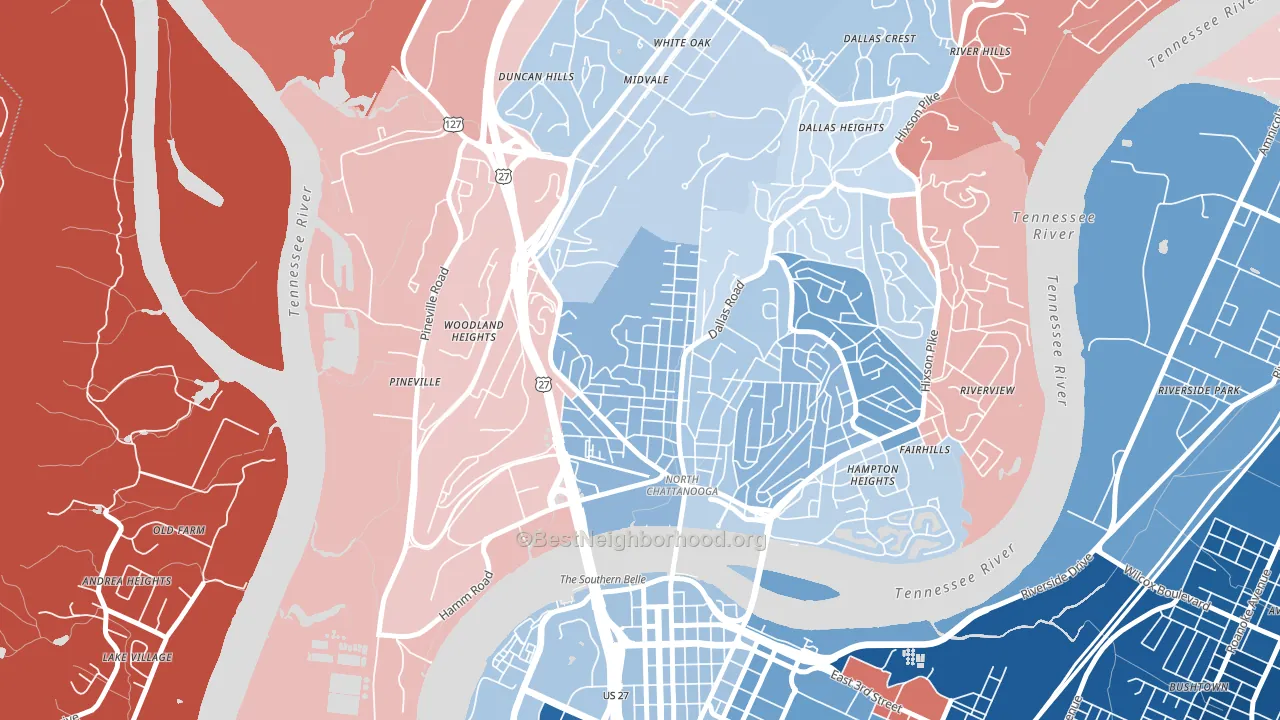
Northside Community leans Democratic by roughly 16 points: about 58% of voters vote Democratic and 42% Republican.
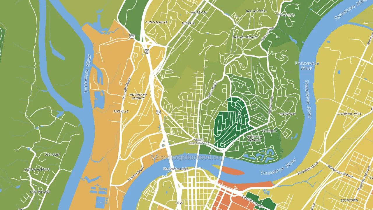
About 63% of adults in Northside Community typically vote, near the U.S. average of about 62%. Among adults in Northside Community, ~37% vote Democratic, ~26% Republican, and ~37% don't vote. The map below shows estimated turnout by block group.
How Northside Community compares
Among neighborhoods within 5 miles, Northside Community leans more Democratic than 1 of 4 neighbors.
Northside Community runs about 46 points more Democratic than Tennessee as a whole. Tennessee leans Republican overall, while Northside Community is one of the few Democratic-leaning pockets.
Politics vary noticeably by block within Northside Community. The south side runs the most Democratic (D+32) and the northwest side runs the most Republican (R+6), a spread of about 39 points.
Why Northside Community leans the way it does
This analysis examined 14,881 data points per neighborhood to find what predicts political lean and turnout. The items below are a few correlations that stood out for Northside Community, not a ranked or complete list of what matters most.
Northside Community votes against the grain of Tennessee. Tennessee leans Republican overall, while Northside Community runs about 46 points more Democratic.
Developed land, local retail density, and voter turnout
Places that combine a rural land-use pattern and dense local retail within a mile tend to turn out at a higher rate, as Northside Community, Chattanooga, TN does.
Why turnout in Northside Community looks the way it does
Turnout in Northside Community sits close to the national pattern. Routine healthcare access, homeownership, education, and food security all land near their national averages here. Learn more about the findings and methodology on the political spectrum map.
Nearby Neighborhoods
- Downtown Chattanooga, Chattanooga, TN D+40
- Martin Luther King, Chattanooga, TN D+36
- Highland Park, Chattanooga, TN D+42
- Lookout Valley, Chattanooga, TN R+38
- Cannon Heights, Dalton, GA D+4
- Hampton Cove, Owens Cross Roads, AL R+37
- Downtown Huntsville, Huntsville, AL D+8
- Brookwood, Acworth, GA Even
- Crabapple, Milton, GA R+6
- Trowbridge Square, Sandy Springs, GA D+62
Neighborhoods with Similar Populations
- Coral Ridge Isles, Fort Lauderdale, FL Even
- Aetna, Gary, IN D+76
- Wyandotte, Louisville, KY D+23
- Eastside, Tucson, AZ D+3
- Rosemont, Portland, ME D+69
- Alger Heights, Grand Rapids, MI D+46
- Tierra Oeste, Albuquerque, NM D+15
- North Park, Billings, MT D+17
- Adams, Huntington Beach, CA Even
- Harris, Lehigh Acres, FL R+8
Sources and methodology
Precinct-level voting records used to fit the model come from Tennessee Secretary of State, Division of Elections, distributed by the Voting and Election Science Team. Demographic inputs come from the U.S. Census Bureau (ACS 5-year estimates and the 2020 Decennial Census). Health and environmental inputs come from the CDC (PLACES and the Environmental Justice Index). Land cover comes from the USGS and EPA. Election-day and lead-up weather come from PRISM 4km daily grids and the NOAA Global Historical Climatology Network. Mail-voting and election-administration patterns come from the MIT Election Lab's Survey of the Performance of American Elections. Block-group crime detail comes from CrimeGrade. Internet data and modeling support provided by ISPreports.org.
Modeling and analysis by the BestNeighborhood data science team. Full methodology and findings: political spectrum map.
Methodology reviewed by the BestNeighborhood data team. Last updated May 2026.