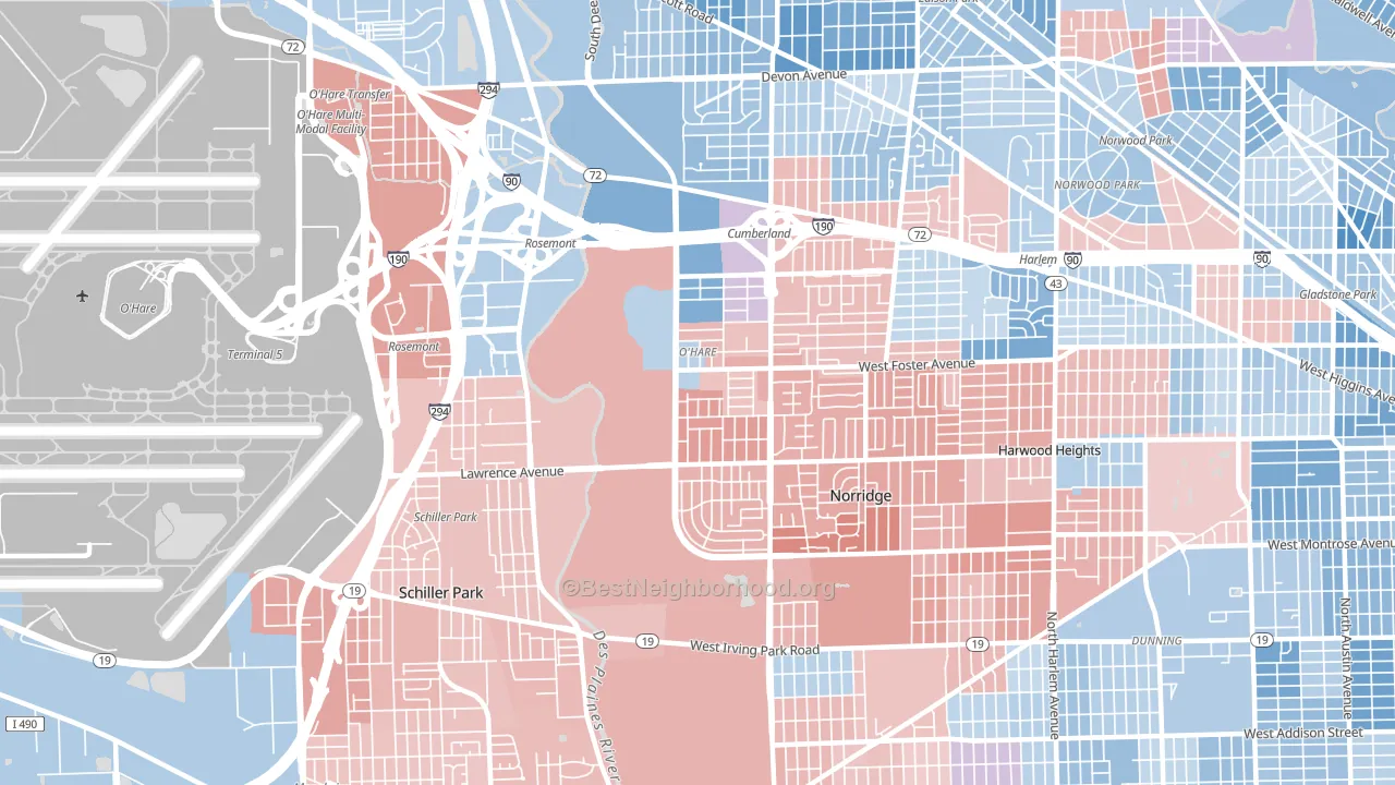
O'Hare leans slightly Republican by roughly 8 points: about 46% of voters vote Democratic and 54% Republican.
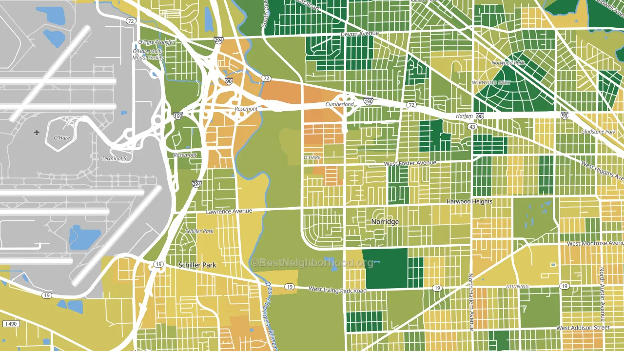
About 48% of adults in O'Hare typically vote, below the U.S. average of about 62%. Among adults in O'Hare, ~22% vote Democratic, ~26% Republican, and ~52% don't vote. The map below shows estimated turnout by block group.
How O'Hare compares
Among neighborhoods within 5 miles, O'Hare is the most Republican-leaning.
O'Hare runs about 19 points more Republican than Illinois as a whole. Illinois leans Democratic overall, while O'Hare is one of the few Republican-leaning pockets.
Politics vary noticeably by block within O'Hare. The northwest side runs the most Democratic (D+7) and the southeast side runs the most Republican (R+16), a spread of about 23 points.
Why O'Hare leans the way it does
This analysis examined 14,881 data points per neighborhood to find what predicts political lean and turnout. The items below are a few correlations that stood out for O'Hare, not a ranked or complete list of what matters most.
O'Hare votes against the grain of Illinois. Illinois leans Democratic overall, while O'Hare runs about 19 points more Republican.
Cancer-screening access and voter turnout
Places with low colon-cancer-screening access tend to turn out at a lower rate; O'Hare, Chicago, IL sits in the bottom quarter nationally on this measure. Cancer screening does not drive turnout; it reflects income, insurance, and healthcare access.
Why turnout in O'Hare looks the way it does
Turnout in O'Hare sits close to the national pattern. Routine healthcare access, homeownership, education, and food security all land near their national averages here. Learn more about the findings and methodology on the political spectrum map.
Nearby Neighborhoods
- Norwood Park, Chicago, IL Even
- Dunning, Chicago, IL Even
- Edison Park, Chicago, IL D+5
- Colonial Gardens, Chicago, IL D+20
- Schorsch, Chicago, IL D+12
- Ellsworth, Elmwood Park, IL D+7
- Montclare, Elmwood Park, IL D+21
- Gladstone, Chicago, IL D+23
- Jefferson Park, Chicago, IL D+22
- Martin Luther, Chicago, IL D+26
Neighborhoods with Similar Populations
- Harrowgate, Philadelphia, PA D+53
- West Akron, Akron, OH D+76
- Lakeview Terrace, Sylmar, CA D+18
- St Marys Park, San Francisco, CA D+53
- Highland Creek, Charlotte, NC D+38
- Lincoln Heights, Spokane, WA D+21
- Fairmount, Philadelphia, PA D+75
- North Aurora, Aurora, CO D+39
- Victory Hills, Kansas City, KS D+38
- Dutchtown, St. Louis, MO D+64
Sources and methodology
Precinct-level voting records used to fit the model come from Illinois State Board of Elections, distributed by the Voting and Election Science Team. Demographic inputs come from the U.S. Census Bureau (ACS 5-year estimates and the 2020 Decennial Census). Health and environmental inputs come from the CDC (PLACES and the Environmental Justice Index). Land cover comes from the USGS and EPA. Election-day and lead-up weather come from PRISM 4km daily grids and the NOAA Global Historical Climatology Network. Mail-voting and election-administration patterns come from the MIT Election Lab's Survey of the Performance of American Elections. Block-group crime detail comes from CrimeGrade. Internet data and modeling support provided by ISPreports.org.
Modeling and analysis by the BestNeighborhood data science team. Full methodology and findings: political spectrum map.
Methodology reviewed by the BestNeighborhood data team. Last updated May 2026.