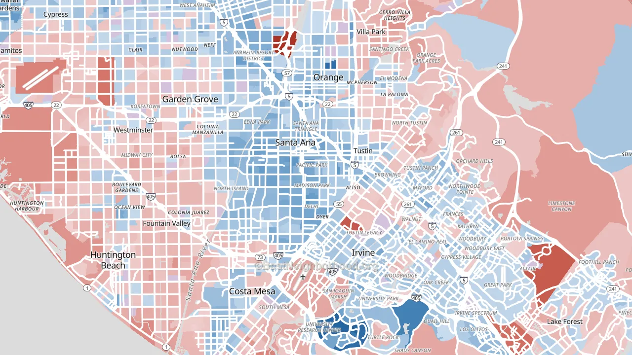
Orange County leans slightly Democratic by roughly 6 points: about 53% of voters vote Democratic and 47% Republican.
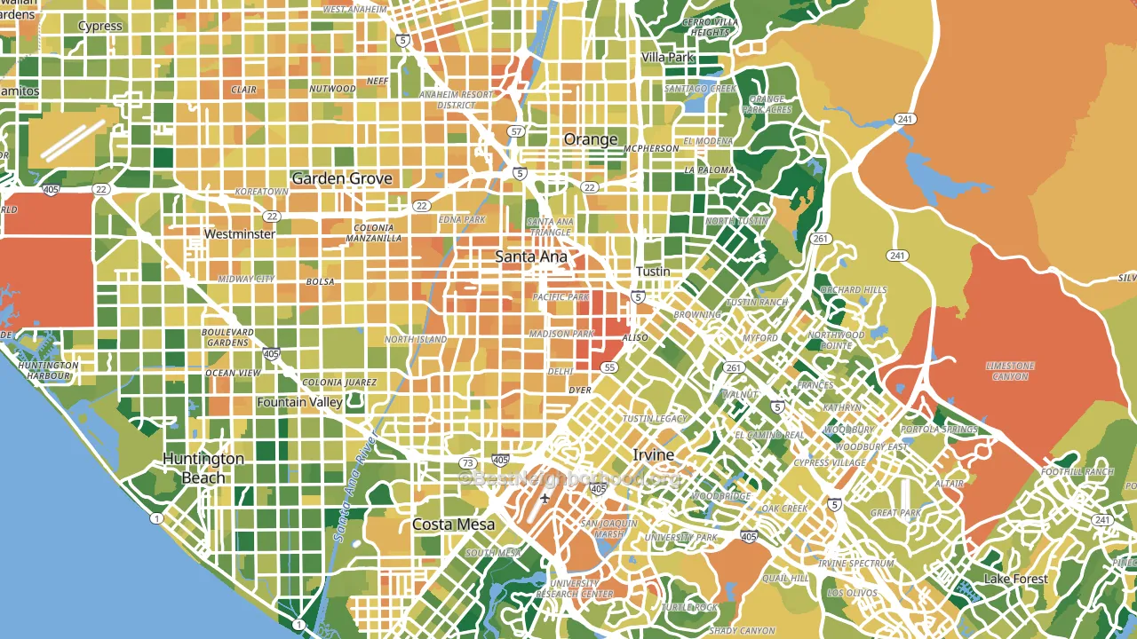
About 59% of adults in Orange County typically vote, near the U.S. average of about 62%. Among adults in Orange County, ~31% vote Democratic, ~28% Republican, and ~41% don't vote. The map below shows estimated turnout by block group.
How Orange County compares
Among counties within 50 miles, Orange County leans more Democratic than 2 of 3 neighbors.
Orange County runs about 14 points more Republican than California as a whole.
Politics vary noticeably by city within Orange County. The south side runs the most Democratic (D+10) and the northeast side runs the most Republican (R+11), a spread of about 21 points.
Why Orange County leans the way it does
This analysis examined 14,881 data points per county to find what predicts political lean and turnout. The items below are a few correlations that stood out for Orange County, not a ranked or complete list of what matters most.
Dense areas vote Democratic. About 96% of residents in Orange County live in densely developed areas, about 59 points above the U.S. average of 36%. High college attainment predicts Democratic voting, and Orange County sits in the top quarter (about 44%, above 94% of counties). A high never-married share predicts Democratic voting, and about 35% of adults in Orange County have never been married, above 85% of counties.
Walkability and Democratic lean
Places with a highly walkable street grid tend to lean Democratic; Orange County, CA sits in the top tenth nationally on this measure. A walkable street grid does not change how people vote; it mostly reflects how urban a place is.
Why turnout in Orange County looks the way it does
Renters vote less often than owners. About 43% of households in Orange County rent, about 18 points above the U.S. average of 25%. Crowded housing lines up with lower turnout, and about 10% of homes in Orange County have more than one occupant per room, in the top fraction of counties. Learn more about the findings and methodology on the political spectrum map.
Nearby Counties
- Los Angeles County, CA D+32
- San Bernardino County, CA Even
- Riverside County, CA Even
- San Diego County, CA D+17
- Ventura County, CA D+16
- Kern County, CA R+12
- Santa Barbara County, CA D+26
- Imperial County, CA Even
- Tulare County, CA R+12
- San Luis Obispo County, CA D+8
Counties with Similar Populations
- San Diego County, CA D+17
- Kings County, NY D+34
- Miami-Dade County, FL R+8
- Dallas County, TX D+27
- Riverside County, CA Even
- Queens County, NY D+23
- King County, WA D+45
- Clark County, NV D+12
- San Bernardino County, CA Even
- Tarrant County, TX D+3
Sources and methodology
Precinct-level voting records used to fit the model come from California Secretary of State, Elections, distributed by the Voting and Election Science Team. Demographic inputs come from the U.S. Census Bureau (ACS 5-year estimates and the 2020 Decennial Census). Health and environmental inputs come from the CDC (PLACES and the Environmental Justice Index). Land cover comes from the USGS and EPA. Election-day and lead-up weather come from PRISM 4km daily grids and the NOAA Global Historical Climatology Network. Mail-voting and election-administration patterns come from the MIT Election Lab's Survey of the Performance of American Elections. Block-group crime detail comes from CrimeGrade. Internet data and modeling support provided by ISPreports.org.
Modeling and analysis by the BestNeighborhood data science team. Full methodology and findings: political spectrum map.
Methodology reviewed by the BestNeighborhood data team. Last updated May 2026.