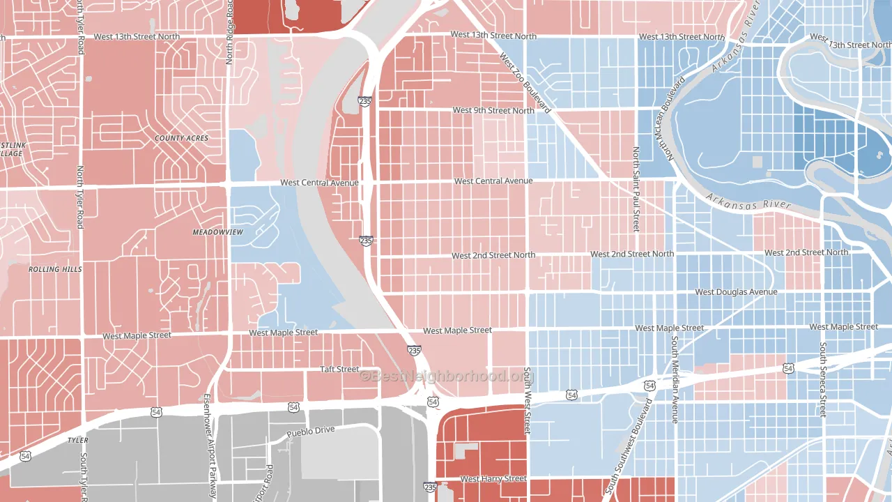
Orchard Breeze leans slightly Republican by roughly 6 points: about 47% of voters vote Democratic and 53% Republican.
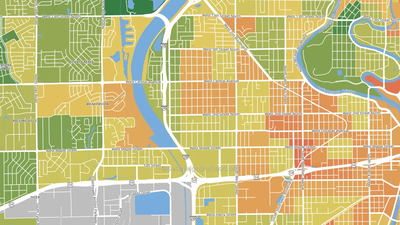
About 50% of adults in Orchard Breeze typically vote, below the U.S. average of about 62%. Among adults in Orchard Breeze, ~24% vote Democratic, ~26% Republican, and ~50% don't vote. The map below shows estimated turnout by block group.
How Orchard Breeze compares
Among neighborhoods within 5 miles, Orchard Breeze leans more Republican than 10 of 13 neighbors.
Orchard Breeze runs about 10 points more Democratic than Kansas as a whole.
Why Orchard Breeze leans the way it does
This analysis examined 14,881 data points per neighborhood to find what predicts political lean and turnout. The items below are a few correlations that stood out for Orchard Breeze, not a ranked or complete list of what matters most.
Car-dependent areas vote Republican. About 84% of residents in Orchard Breeze drive to work alone, about 10 points above the U.S. average of 74%. Low college attainment predicts Republican voting, and Orchard Breeze sits in the bottom quarter (about 16%, below 83% of neighborhoods).
Cholesterol-screening access and voter turnout
Places with low cholesterol-screening access tend to turn out at a lower rate; Orchard Breeze, Wichita, KS sits in the bottom tenth nationally on this measure. Cholesterol screening does not drive turnout; it reflects income, insurance, and healthcare access.
Why turnout in Orchard Breeze looks the way it does
High-crime urban areas turn out at lower rates, mostly because the housing stress common in those areas makes voting harder. Orchard Breeze sits in the top 15% nationally on a violent-crime measure. See CrimeGrade for more details. Learn more about the findings and methodology on the political spectrum map.
Nearby Neighborhoods
- Orchard Park, Wichita, KS R+9
- Sunflower, Wichita, KS D+7
- Delano, Wichita, KS Even
- Stanley-Aley, Wichita, KS R+5
- Indian Hills Riverbend, Wichita, KS D+7
- North Riverside, Wichita, KS D+10
- Benjamin Hills, Wichita, KS Even
- Southwest Village, Wichita, KS R+15
- Historic Midtown, Wichita, KS D+32
- Southwest, Wichita, KS Even
Neighborhoods with Similar Populations
- Mariners Village, Orlando, FL D+5
- Rankin Historic District, Ironton, OH R+24
- SW Jones, Wausau, WI Even
- Downtown Chandler, Chandler, AZ D+22
- Bayou Shore, Galveston, TX D+19
- Lake Forest, Jacksonville, FL D+66
- Hawk's Landing, Verona, WI D+50
- Kinsmith, Cleveland, OH D+82
- Valverde, Denver, CO D+50
- College Hill, Greensboro, NC D+76
Sources and methodology
Precinct-level voting records used to fit the model come from Kansas Secretary of State, Elections, distributed by the Voting and Election Science Team. Demographic inputs come from the U.S. Census Bureau (ACS 5-year estimates and the 2020 Decennial Census). Health and environmental inputs come from the CDC (PLACES and the Environmental Justice Index). Land cover comes from the USGS and EPA. Election-day and lead-up weather come from PRISM 4km daily grids and the NOAA Global Historical Climatology Network. Mail-voting and election-administration patterns come from the MIT Election Lab's Survey of the Performance of American Elections. Block-group crime detail comes from CrimeGrade. Internet data and modeling support provided by ISPreports.org.
Modeling and analysis by the BestNeighborhood data science team. Full methodology and findings: political spectrum map.
Methodology reviewed by the BestNeighborhood data team. Last updated May 2026.