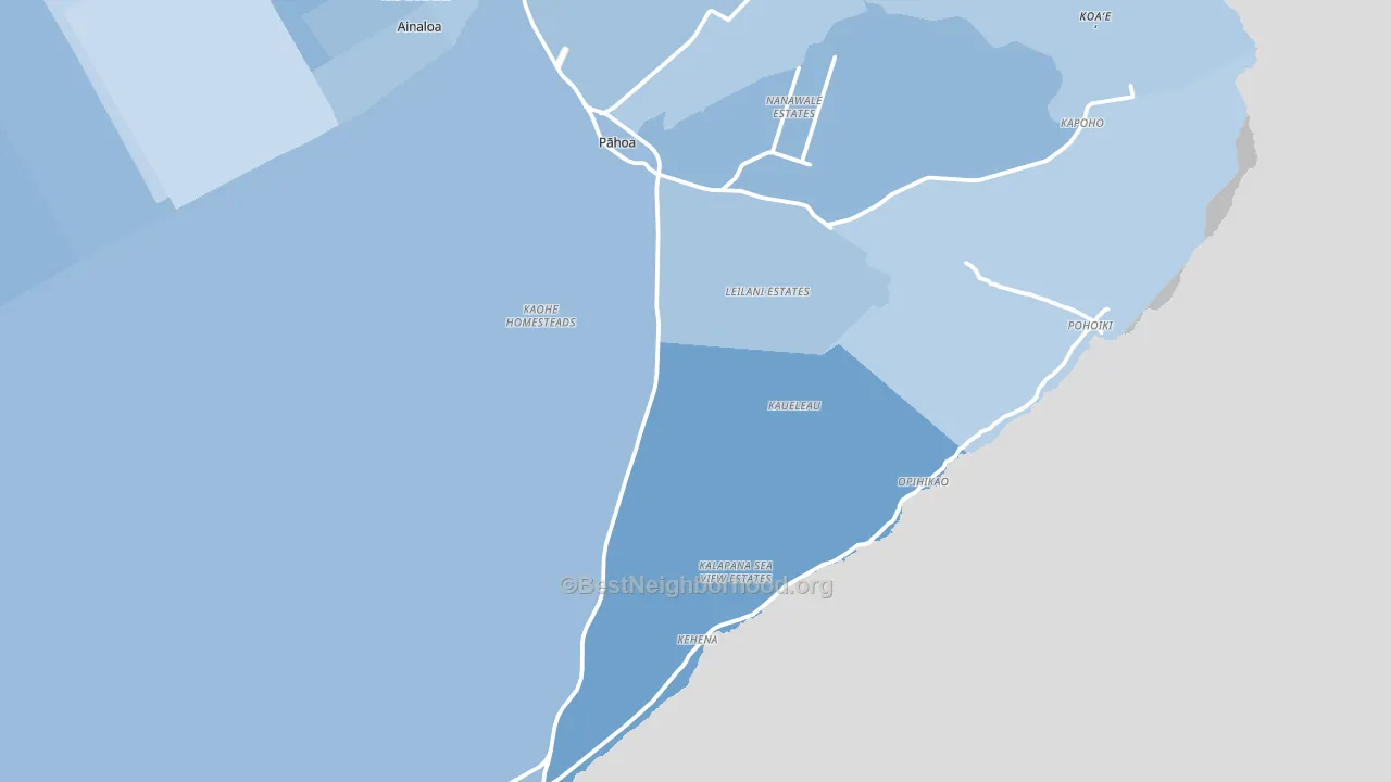
Pahoa leans Democratic by roughly 28 points: about 64% of voters vote Democratic and 36% Republican.
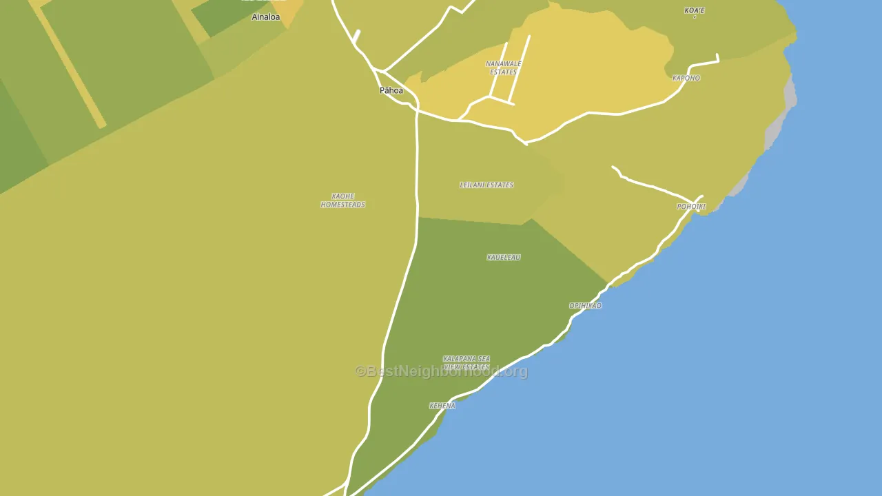
About 57% of adults in Pahoa typically vote, near the U.S. average of about 62%. Among adults in Pahoa, ~36% vote Democratic, ~21% Republican, and ~43% don't vote. The map below shows estimated turnout by block group.
How Pahoa compares
Among cities within 25 miles, Pahoa leans more Democratic than 13 of 16 neighbors.
Pahoa runs about 4 points more Democratic than Hawaii as a whole.
Politics vary noticeably by neighborhood within Pahoa. The south side is the most Democratic-leaning (D+33) and the northwest side is the least Democratic-leaning (D+20), a spread of about 13 points.
Why Pahoa leans the way it does
This analysis examined 14,881 data points per city to find what predicts political lean and turnout. The items below are a few correlations that stood out for Pahoa, not a ranked or complete list of what matters most.
Areas with many never-married adults vote Democratic. About 32% of adults in Pahoa have never been married, above 80% of cities.
Food insecurity and voter turnout
Places with high food insecurity tend to turn out at a lower rate; Pahoa, HI sits in the top tenth nationally on this measure. Food insecurity does not directly drive turnout; it reflects economic hardship, which lines up with lower voting.
Why turnout in Pahoa looks the way it does
Areas with high food insecurity turn out at lower rates. About 27% of adults in Pahoa report food insecurity, about 11 points above the U.S. average of 16%. High-crime urban areas turn out at lower rates, and Pahoa sits in the top 15% on a violent-crime measure. Learn more about the findings and methodology on the political spectrum map.
Nearby Cities
- Nanawale Estates, HI D+22
- Opihikao, HI D+21
- Ainaloa, HI D+4
- Hawaiian Beaches, HI D+18
- Kalapana, HI D+20
- Hawaiian Paradise Park, HI D+13
- Keaau, HI D+12
- Mountain View, HI D+20
- Kurtistown, HI D+18
- Fern Forest, HI D+28
Cities with Similar Populations
- Cool, CA R+16
- Greene, NY R+32
- Carter Lake, IA R+15
- Mapleton, IL R+35
- Sauquoit, NY R+34
- Itta Bena, MS D+66
- Banks, OR R+13
- Chattaroy, WA R+40
- Hudson, CO R+52
- Thorp, WI R+40
Sources and methodology
Precinct-level voting records used to fit the model come from Hawaii Office of Elections, distributed by the Voting and Election Science Team. Demographic inputs come from the U.S. Census Bureau (ACS 5-year estimates and the 2020 Decennial Census). Health and environmental inputs come from the CDC (PLACES and the Environmental Justice Index). Land cover comes from the USGS and EPA. Election-day and lead-up weather come from PRISM 4km daily grids and the NOAA Global Historical Climatology Network. Mail-voting and election-administration patterns come from the MIT Election Lab's Survey of the Performance of American Elections. Block-group crime detail comes from CrimeGrade. Internet data and modeling support provided by ISPreports.org.
Modeling and analysis by the BestNeighborhood data science team. Some land-use inputs for Hawaii, including walkability and the environmental-justice index, are estimated rather than measured, so the figures here carry added uncertainty. Full methodology and findings: political spectrum map.
Methodology reviewed by the BestNeighborhood data team. Last updated May 2026.