Piney Grove leans Republican by roughly 18 points: about 41% of voters vote Democratic and 59% Republican.
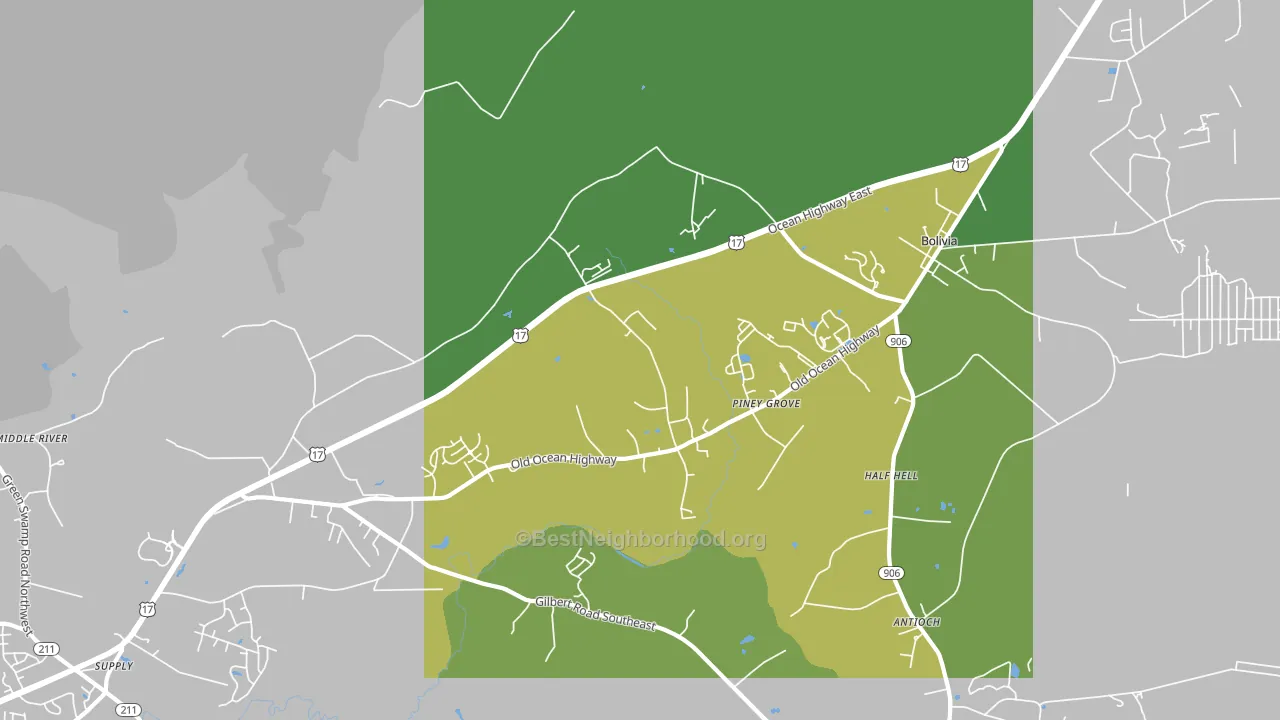
About 66% of adults in Piney Grove typically vote, near the U.S. average of about 62%. Among adults in Piney Grove, ~27% vote Democratic, ~39% Republican, and ~34% don't vote. The map below shows estimated turnout by block group.
How Piney Grove compares
Among cities within 25 miles, Piney Grove leans more Republican than 22 of 55 neighbors.
Piney Grove runs about 15 points more Republican than North Carolina as a whole.
Politics vary noticeably by neighborhood within Piney Grove. The west side is the most Republican-leaning (R+37) and the south side is the least Republican-leaning (R+7), a spread of about 30 points.
Why Piney Grove leans the way it does
This analysis examined 14,881 data points per city to find what predicts political lean and turnout. The items below are a few correlations that stood out for Piney Grove, not a ranked or complete list of what matters most.
Areas with low college attainment vote Republican. About 13% of adults in Piney Grove hold a bachelor's degree, about 14 points below the North Carolina average of 27%. A high family-household share predicts Republican voting, and about 77% of households in Piney Grove are family households, above 83% of cities.
Park access and Republican lean
Places with low park coverage tend to lean Republican; Piney Grove, NC sits below the national average on this measure. Park access does not change how people vote; it tends to track denser, higher-income areas.
Why turnout in Piney Grove looks the way it does
Turnout in Piney Grove sits close to the national pattern. Routine healthcare access, homeownership, education, and food security all land near their national averages here. Learn more about the findings and methodology on the political spectrum map.
Nearby Cities
- Bolivia, NC R+34
- Lennon Crossroads, NC R+35
- Varnum, NC R+30
- Varnamtown, NC R+50
- Boiling Spring Lakes, NC R+43
- Town Creek, NC R+39
- St. James, NC R+27
- Supply, NC R+43
- Oak Island, NC R+30
- Funston, NC R+33
Cities with Similar Populations
- Scotland, IN R+61
- Salt Creek, OR R+25
- Chapel Hill, MS R+8
- Rea Valley, AR R+63
- Council, VA R+68
- Sissons Corner, VA R+18
- Smith Mills, NY R+36
- Toms Prairie, IL R+73
- Dennysville, ME R+26
- Trigg Furnace, KY R+58
Sources and methodology
Precinct-level voting records used to fit the model come from North Carolina State Board of Elections, distributed by the Voting and Election Science Team. Demographic inputs come from the U.S. Census Bureau (ACS 5-year estimates and the 2020 Decennial Census). Health and environmental inputs come from the CDC (PLACES and the Environmental Justice Index). Land cover comes from the USGS and EPA. Election-day and lead-up weather come from PRISM 4km daily grids and the NOAA Global Historical Climatology Network. Mail-voting and election-administration patterns come from the MIT Election Lab's Survey of the Performance of American Elections. Block-group crime detail comes from CrimeGrade. Internet data and modeling support provided by ISPreports.org.
Modeling and analysis by the BestNeighborhood data science team. Full methodology and findings: political spectrum map.
Methodology reviewed by the BestNeighborhood data team. Last updated May 2026.