Preston County is a Republican stronghold. About 21% of voters here vote Democratic and 79% Republican.
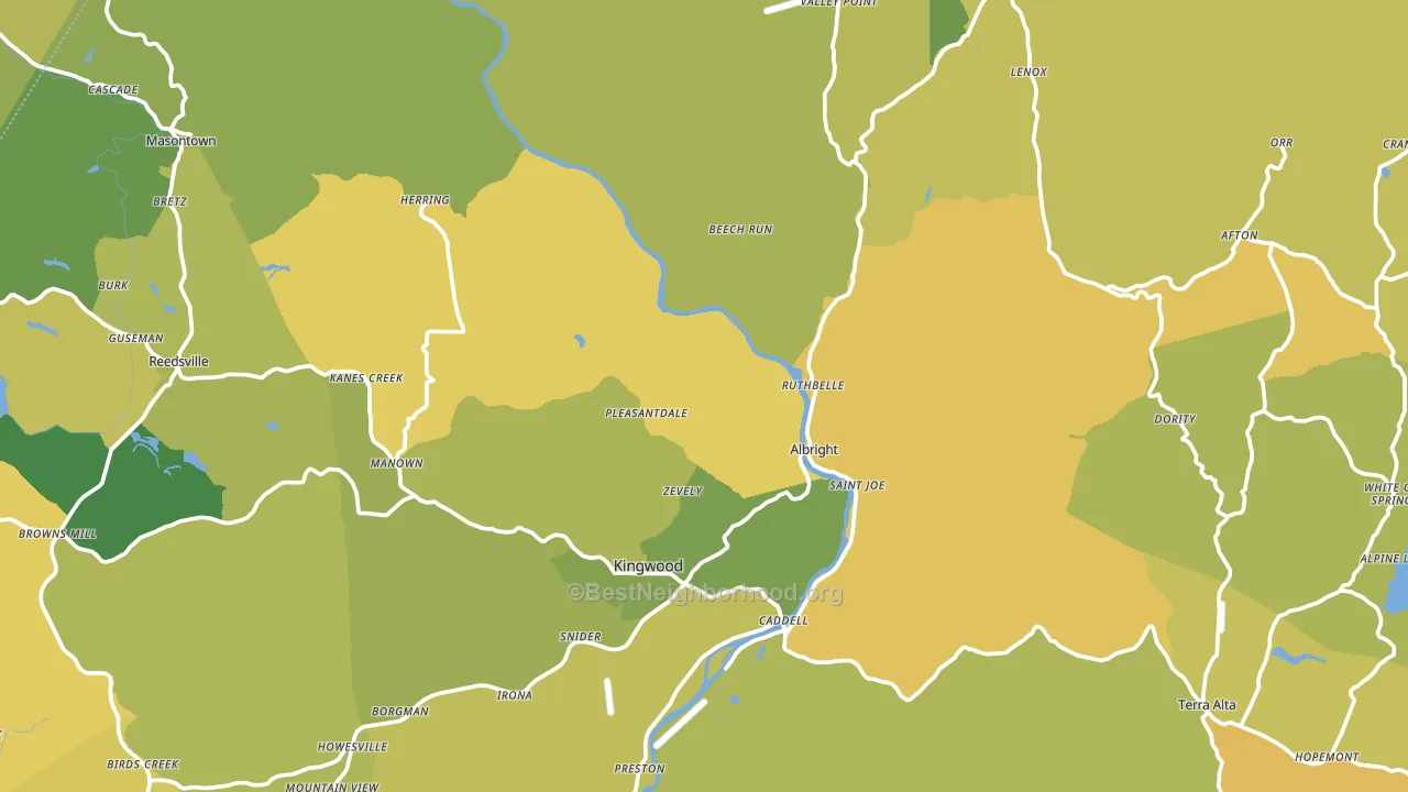
About 60% of adults in Preston County typically vote, near the U.S. average of about 62%. Among adults in Preston County, ~13% vote Democratic, ~47% Republican, and ~40% don't vote. The map below shows estimated turnout by block group.
How Preston County compares
Among counties within 50 miles, Preston County leans more Republican than 12 of 14 neighbors.
Preston County runs about 16 points more Republican than West Virginia as a whole.
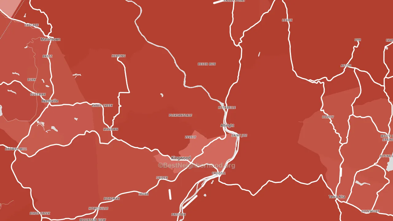
Politics vary noticeably by city within Preston County. The southeast side is the most Republican-leaning (R+67) and the northeast side is the least Republican-leaning (R+46), a spread of about 22 points.
Why Preston County leans the way it does
Density, race composition, education, and family structure all sit close to their national averages in Preston County. The lean here lands roughly where demographic data alone would predict.
Walkability and Republican lean
Places with a low walkability score tend to lean Republican; Preston County, WV sits in the bottom quarter nationally on this measure. A walkable street grid does not change how people vote; it mostly reflects how urban a place is.
Why turnout in Preston County looks the way it does
Turnout in Preston County sits close to the national pattern. Routine healthcare access, homeownership, education, and food security all land near their national averages here. Learn more about the findings and methodology on the political spectrum map.
Nearby Counties
- Monongalia County, WV D+4
- Garrett County, MD R+50
- Taylor County, WV R+55
- Marion County, WV R+37
- Tucker County, WV R+50
- Fayette County, PA R+36
- Barbour County, WV R+60
- Greene County, PA R+43
- Harrison County, WV R+41
- Mineral County, WV R+58
Counties with Similar Populations
- Whitley County, IN R+51
- Miami County, KS R+39
- Monroe County, MS R+31
- Scotland County, NC D+2
- Ford County, KS R+26
- Lee County, IL R+21
- Platte County, NE R+48
- Marshall County, TN R+54
- Emmet County, MI R+10
- Brookings County, SD R+25
Sources and methodology
Precinct-level voting records used to fit the model come from West Virginia Secretary of State, Elections, distributed by the Voting and Election Science Team. Demographic inputs come from the U.S. Census Bureau (ACS 5-year estimates and the 2020 Decennial Census). Health and environmental inputs come from the CDC (PLACES and the Environmental Justice Index). Land cover comes from the USGS and EPA. Election-day and lead-up weather come from PRISM 4km daily grids and the NOAA Global Historical Climatology Network. Mail-voting and election-administration patterns come from the MIT Election Lab's Survey of the Performance of American Elections. Block-group crime detail comes from CrimeGrade. Internet data and modeling support provided by ISPreports.org.
Modeling and analysis by the BestNeighborhood data science team. Full methodology and findings: political spectrum map.
Methodology reviewed by the BestNeighborhood data team. Last updated May 2026.