Salt Springs is a Democratic stronghold. About 80% of voters here vote Democratic and 20% Republican.
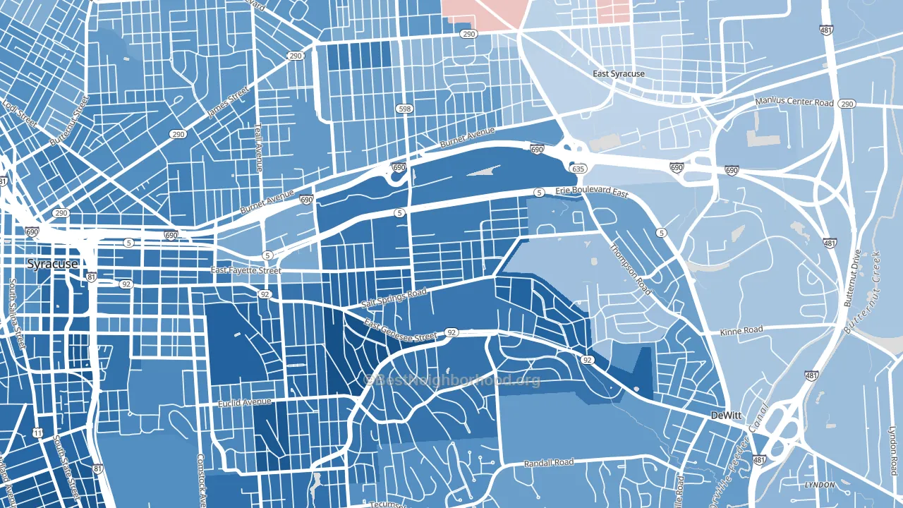
About 47% of adults in Salt Springs typically vote, below the U.S. average of about 62%. Among adults in Salt Springs, ~38% vote Democratic, ~9% Republican, and ~53% don't vote. The map below shows estimated turnout by block group.
How Salt Springs compares
Among neighborhoods within 5 miles, Salt Springs leans more Democratic than 13 of 22 neighbors.
Salt Springs runs about 47 points more Democratic than New York as a whole.
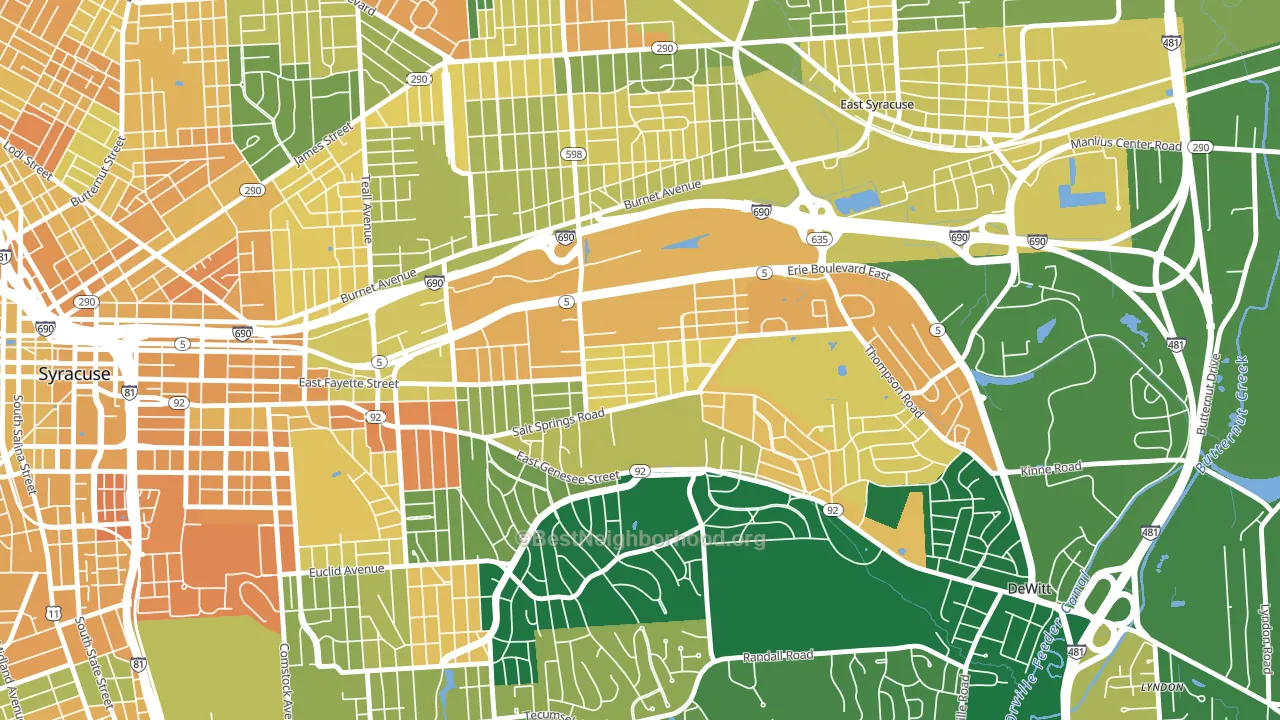
Politics vary noticeably by block within Salt Springs. The southwest side is the most Democratic-leaning (D+76) and the east side is the least Democratic-leaning (D+36), a spread of about 39 points.
Why Salt Springs leans the way it does
This analysis examined 14,881 data points per neighborhood to find what predicts political lean and turnout. The items below are a few correlations that stood out for Salt Springs, not a ranked or complete list of what matters most.
Areas with many never-married adults vote Democratic. About 56% of adults in Salt Springs have never been married, well above similar-sized neighborhoods (around 39%).
Population density and Democratic lean
Places with high population density tend to lean Democratic; Salt Springs, Syracuse, NY sits above the national average on this measure.
Why turnout in Salt Springs looks the way it does
Turnout in Salt Springs sits close to the national pattern. Routine healthcare access, homeownership, education, and food security all land near their national averages here. Learn more about the findings and methodology on the political spectrum map.
Nearby Neighborhoods
- Meadowbrook, Syracuse, NY D+63
- Eastwood, Syracuse, NY D+37
- Westcott, Syracuse, NY D+68
- Lincoln Park-Syracuse, Syracuse, NY D+42
- Near Eastside, Syracuse, NY D+69
- University-Syracuse, Syracuse, NY D+74
- University Hill, Syracuse, NY D+58
- Near Northeast, Syracuse, NY D+48
- Downtown Syracuse, Syracuse, NY D+63
- Northside, Syracuse, NY D+27
Neighborhoods with Similar Populations
- Corbett, Tucson, AZ D+21
- Cal-Gisler, Oxnard, CA D+41
- Brookside, Tulsa, OK D+16
- Brookland, Washington, DC D+92
- Enterprise, Redding, CA R+13
- Se Heights, Albuquerque, NM D+55
- Harris Ranch, Boise, ID D+13
- Interlake, Bellevue, WA D+49
- Town and Country North, Cockeysville, MD D+42
- North Westchester Meadows, Grand Prairie, TX D+23
Sources and methodology
Precinct-level voting records used to fit the model come from New York State Board of Elections, distributed by the Voting and Election Science Team. Demographic inputs come from the U.S. Census Bureau (ACS 5-year estimates and the 2020 Decennial Census). Health and environmental inputs come from the CDC (PLACES and the Environmental Justice Index). Land cover comes from the USGS and EPA. Election-day and lead-up weather come from PRISM 4km daily grids and the NOAA Global Historical Climatology Network. Mail-voting and election-administration patterns come from the MIT Election Lab's Survey of the Performance of American Elections. Block-group crime detail comes from CrimeGrade. Internet data and modeling support provided by ISPreports.org.
Modeling and analysis by the BestNeighborhood data science team. Full methodology and findings: political spectrum map.
Methodology reviewed by the BestNeighborhood data team. Last updated May 2026.