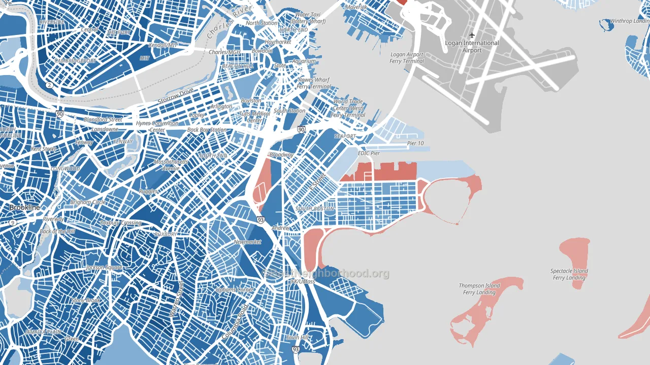
South Boston leans heavily Democratic by roughly 48 points: about 74% of voters vote Democratic and 26% Republican.
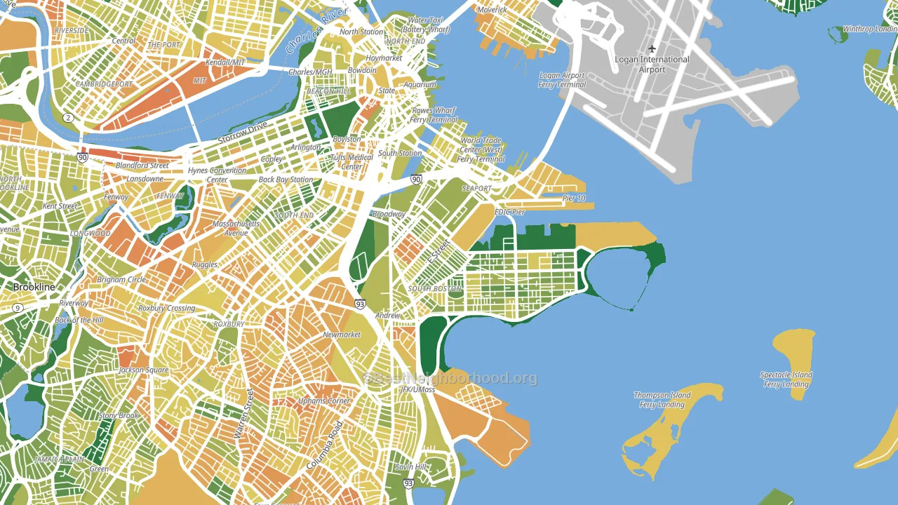
About 57% of adults in South Boston typically vote, near the U.S. average of about 62%. Among adults in South Boston, ~42% vote Democratic, ~15% Republican, and ~43% don't vote. The map below shows estimated turnout by block group.
How South Boston compares
Among neighborhoods within 5 miles, South Boston leans more Democratic than 5 of 40 neighbors.
South Boston runs about 23 points more Democratic than Massachusetts as a whole.
Politics vary noticeably by block within South Boston. The north side is the most Democratic-leaning (D+53) and the southwest side is the least Democratic-leaning (D+43), a spread of about 10 points.
Why South Boston leans the way it does
This analysis examined 14,881 data points per neighborhood to find what predicts political lean and turnout. The items below are a few correlations that stood out for South Boston, not a ranked or complete list of what matters most.
Areas with high college attainment vote Democratic. About 64% of adults in South Boston hold a bachelor's degree, about 36 points above the U.S. average of 28%. A high never-married share predicts Democratic voting, and about 56% of adults in South Boston have never been married, above 89% of neighborhoods.
Population density and Democratic lean
Places with high population density tend to lean Democratic; South Boston, Boston, MA sits in the top tenth nationally on this measure.
Why turnout in South Boston looks the way it does
Renters vote less often than owners. About 69% of households in South Boston rent, about 44 points above the U.S. average of 25%. Learn more about the findings and methodology on the political spectrum map.
Nearby Neighborhoods
Neighborhoods with Similar Populations
- Chinquapin Park-Belvedere, Baltimore, MD D+73
- Beverly, Chicago, IL D+50
- Bario Logan, San Diego, CA D+39
- East Garfield Park, Chicago, IL D+79
- Five Points, Toledo, OH D+28
- University Heights, Newark, NJ D+67
- North Central Westminster, Westminster, CO D+22
- Macalester-Groveland, St. Paul, MN D+68
- Greektown, Chicago, IL D+59
- Los Neitos, West Whittier-Los Nietos, CA D+27
Sources and methodology
Precinct-level voting records used to fit the model come from Massachusetts Secretary of the Commonwealth, Elections, distributed by the Voting and Election Science Team. Demographic inputs come from the U.S. Census Bureau (ACS 5-year estimates and the 2020 Decennial Census). Health and environmental inputs come from the CDC (PLACES and the Environmental Justice Index). Land cover comes from the USGS and EPA. Election-day and lead-up weather come from PRISM 4km daily grids and the NOAA Global Historical Climatology Network. Mail-voting and election-administration patterns come from the MIT Election Lab's Survey of the Performance of American Elections. Block-group crime detail comes from CrimeGrade. Internet data and modeling support provided by ISPreports.org.
Modeling and analysis by the BestNeighborhood data science team. Full methodology and findings: political spectrum map.
Methodology reviewed by the BestNeighborhood data team. Last updated May 2026.