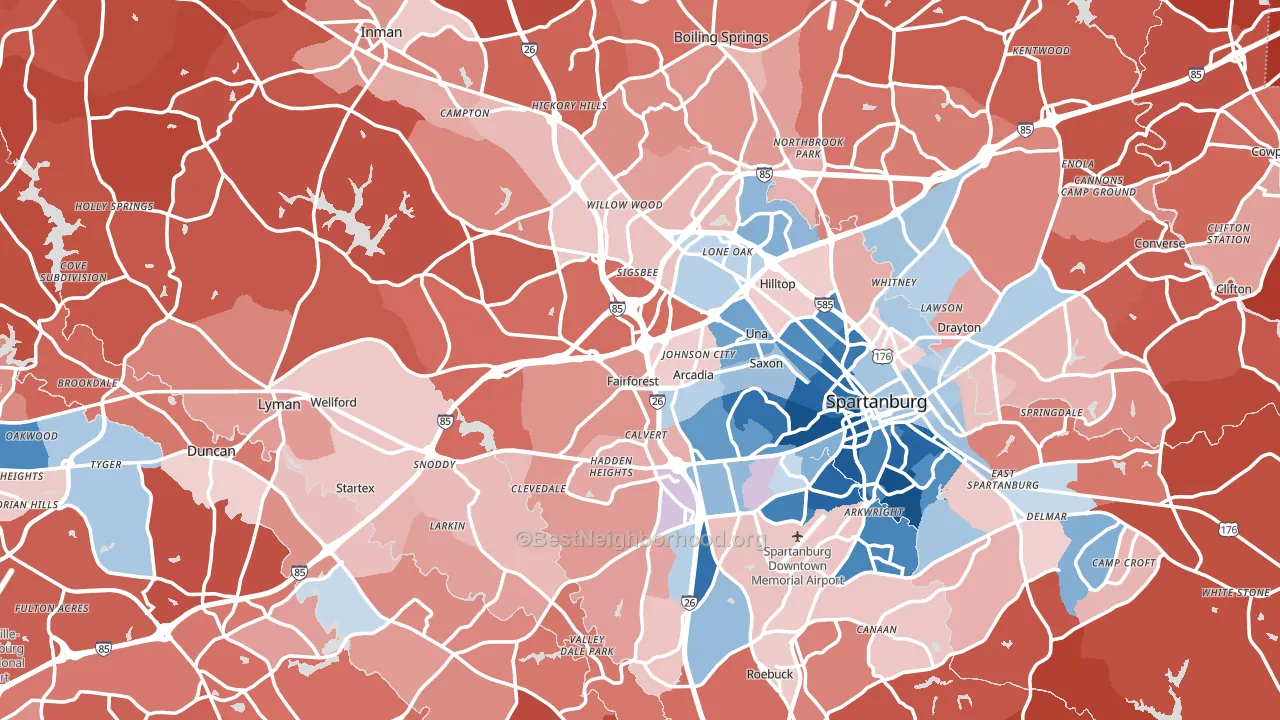
Spartanburg County leans Republican by roughly 26 points: about 37% of voters vote Democratic and 63% Republican.
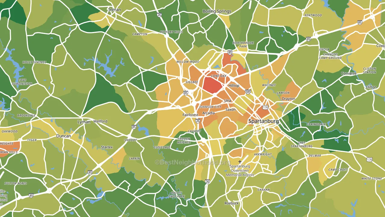
About 67% of adults in Spartanburg County typically vote, near the U.S. average of about 62%. Among adults in Spartanburg County, ~25% vote Democratic, ~42% Republican, and ~33% don't vote. The map below shows estimated turnout by block group.
How Spartanburg County compares
Among counties within 50 miles, Spartanburg County leans more Republican than 3 of 12 neighbors.
Spartanburg County runs about 7 points more Republican than South Carolina as a whole.
Politics vary noticeably by city within Spartanburg County. The east side runs the most Democratic (Even) and the northwest side runs the most Republican (R+57), a spread of about 57 points.
Why Spartanburg County leans the way it does
This analysis examined 14,881 data points per county to find what predicts political lean and turnout. The items below are a few correlations that stood out for Spartanburg County, not a ranked or complete list of what matters most.
Spartanburg County votes Republican even though it is densely developed (about 51%, well above the South Carolina average of 24%). State and regional patterns outweigh the Democratic lean that density usually predicts here.
Non-English at home and voter turnout
Places with a low non-English-at-home share tend to turn out at a higher rate; Spartanburg County, SC sits in the bottom quarter nationally on this measure.
Why turnout in Spartanburg County looks the way it does
Turnout in Spartanburg County sits close to the national pattern. Routine healthcare access, homeownership, education, and food security all land near their national averages here. Learn more about the findings and methodology on the political spectrum map.
Nearby Counties
- Greenville County, SC R+14
- Cherokee County, SC R+42
- Polk County, NC R+31
- Union County, SC R+28
- Rutherford County, NC R+46
- Laurens County, SC R+35
- Cleveland County, NC R+33
- Henderson County, NC R+16
- Pickens County, SC R+43
- Anderson County, SC R+43
Counties with Similar Populations
- Weld County, CO R+17
- St. Lucie County, FL R+5
- Luzerne County, PA R+14
- Boulder County, CO D+52
- Durham County, NC D+59
- Howard County, MD D+40
- Lancaster County, NE D+7
- Fayette County, KY D+24
- Escambia County, FL R+13
- Henrico County, VA D+31
Sources and methodology
Precinct-level voting records used to fit the model come from South Carolina State Election Commission, distributed by the Voting and Election Science Team. Demographic inputs come from the U.S. Census Bureau (ACS 5-year estimates and the 2020 Decennial Census). Health and environmental inputs come from the CDC (PLACES and the Environmental Justice Index). Land cover comes from the USGS and EPA. Election-day and lead-up weather come from PRISM 4km daily grids and the NOAA Global Historical Climatology Network. Mail-voting and election-administration patterns come from the MIT Election Lab's Survey of the Performance of American Elections. Block-group crime detail comes from CrimeGrade. Internet data and modeling support provided by ISPreports.org.
Modeling and analysis by the BestNeighborhood data science team. Full methodology and findings: political spectrum map.
Methodology reviewed by the BestNeighborhood data team. Last updated May 2026.