St. Lucie County is a true toss-up. About 48% of voters here vote Democratic and 52% Republican.
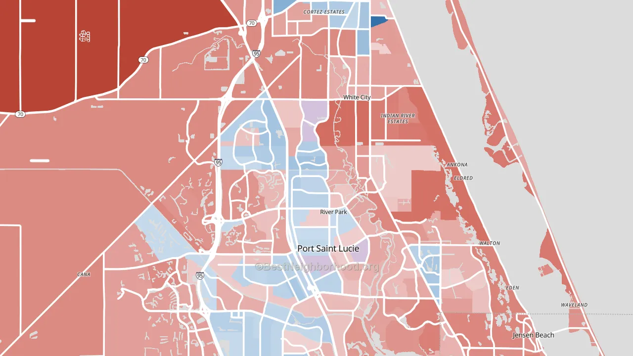
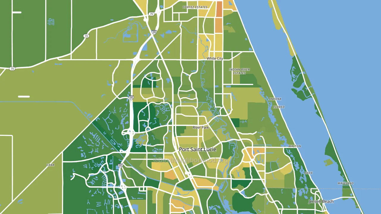
About 71% of adults in St. Lucie County typically vote, above the U.S. average of about 62%. Among adults in St. Lucie County, ~34% vote Democratic, ~37% Republican, and ~29% don't vote. The map below shows estimated turnout by block group.
How St. Lucie County compares
Among counties within 50 miles, St. Lucie County is the least Republican-leaning.
St. Lucie County runs about 8 points more Democratic than Florida as a whole.
Politics vary noticeably by city within St. Lucie County. The north side runs the most Democratic (D+39) and the northwest side runs the most Republican (R+26), a spread of about 65 points.
Why St. Lucie County leans the way it does
Density, race composition, education, and family structure all sit close to their national averages in St. Lucie County. The lean here lands roughly where demographic data alone would predict.
Paved land cover and Democratic lean
Places with extensive paved surfaces tend to lean Democratic; St. Lucie County, FL sits in the top tenth nationally on this measure. Paved ground does not change how people vote; it mostly reflects how urban and built-up a place is.
Why turnout in St. Lucie County looks the way it does
Areas with limited routine healthcare access turn out at lower rates. St. Lucie County is in the bottom quarter nationally for routine-care measures such as insurance coverage, preventive screenings, and dental visits. Learn more about the findings and methodology on the political spectrum map.
Nearby Counties
- Martin County, FL R+25
- Indian River County, FL R+21
- Okeechobee County, FL R+46
- Palm Beach County, FL D+5
- Glades County, FL R+47
- Brevard County, FL R+19
- Highlands County, FL R+33
- Hendry County, FL R+26
- Broward County, FL D+20
- Osceola County, FL Even
Counties with Similar Populations
- Weld County, CO R+17
- Spartanburg County, SC R+25
- Boulder County, CO D+52
- Howard County, MD D+40
- Luzerne County, PA R+14
- Durham County, NC D+59
- Henrico County, VA D+31
- Cumberland County, NC D+20
- Lancaster County, NE D+7
- Fayette County, KY D+24
Sources and methodology
Precinct-level voting records used to fit the model come from Florida Division of Elections, distributed by the Voting and Election Science Team. Demographic inputs come from the U.S. Census Bureau (ACS 5-year estimates and the 2020 Decennial Census). Health and environmental inputs come from the CDC (PLACES and the Environmental Justice Index). Land cover comes from the USGS and EPA. Election-day and lead-up weather come from PRISM 4km daily grids and the NOAA Global Historical Climatology Network. Mail-voting and election-administration patterns come from the MIT Election Lab's Survey of the Performance of American Elections. Block-group crime detail comes from CrimeGrade. Internet data and modeling support provided by ISPreports.org.
Modeling and analysis by the BestNeighborhood data science team. Full methodology and findings: political spectrum map.
Methodology reviewed by the BestNeighborhood data team. Last updated May 2026.