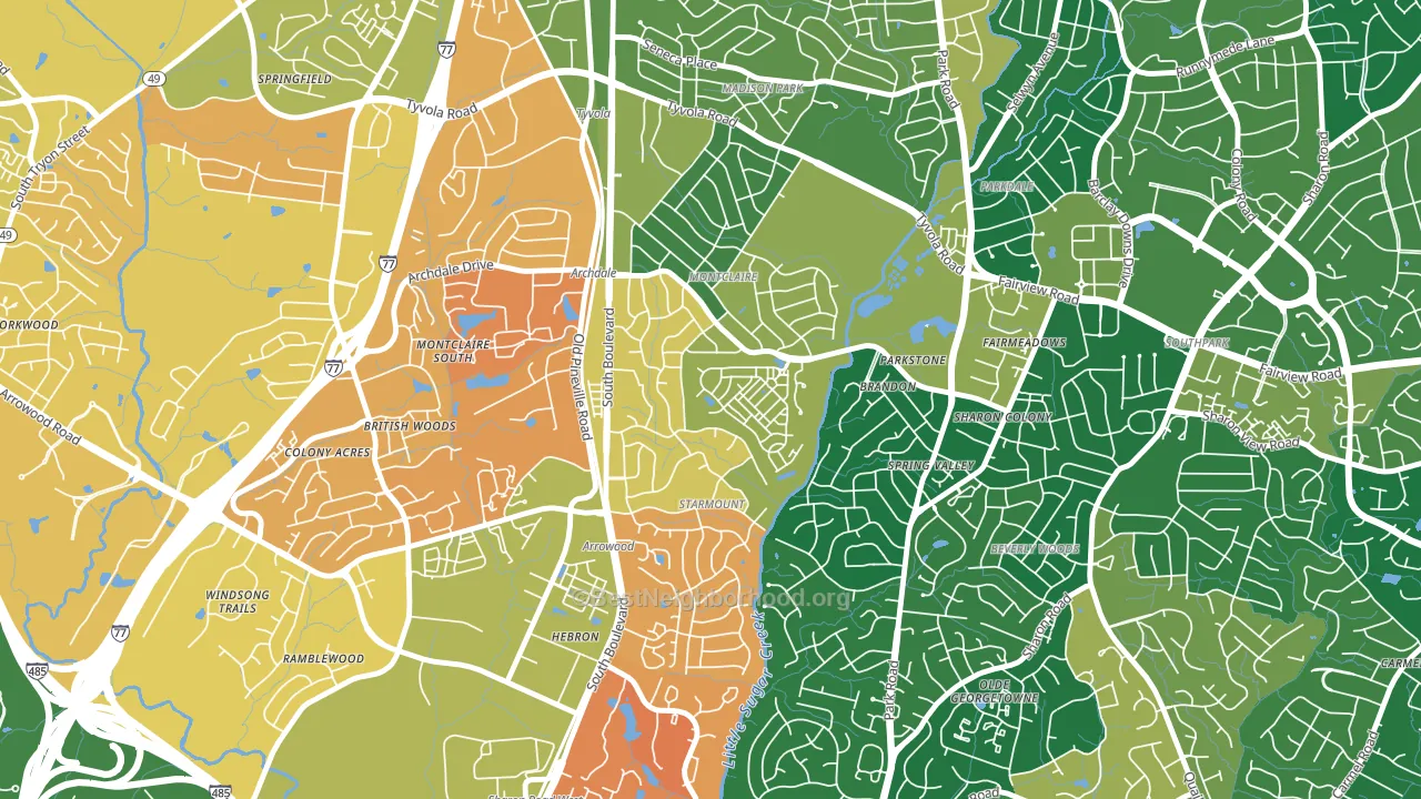
Starmount leans heavily Democratic by roughly 32 points: about 66% of voters vote Democratic and 34% Republican.
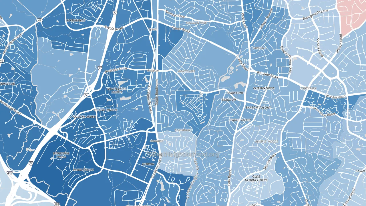
About 66% of adults in Starmount typically vote, near the U.S. average of about 62%. Among adults in Starmount, ~44% vote Democratic, ~22% Republican, and ~34% don't vote. The map below shows estimated turnout by block group.
How Starmount compares
Among neighborhoods within 5 miles, Starmount leans more Democratic than 20 of 30 neighbors.
Starmount runs about 35 points more Democratic than North Carolina as a whole. North Carolina leans Republican overall, while Starmount is one of the few Democratic-leaning pockets.
Why Starmount leans the way it does
This analysis examined 14,881 data points per neighborhood to find what predicts political lean and turnout. The items below are a few correlations that stood out for Starmount, not a ranked or complete list of what matters most.
Starmount votes against the grain of North Carolina. North Carolina leans Republican overall, while Starmount runs about 35 points more Democratic. High college attainment predicts Democratic voting, and Starmount sits in the top quarter (about 58%, above 78% of neighborhoods). A high never-married share predicts Democratic voting, and about 48% of adults in Starmount have never been married, above 79% of neighborhoods.
Park access and Democratic lean
Places with heavy park coverage tend to lean Democratic; Starmount, Charlotte, NC sits in the top quarter nationally on this measure. Park access does not change how people vote; it tends to track denser, higher-income areas.
Why turnout in Starmount looks the way it does
Turnout in Starmount sits close to the national pattern. Routine healthcare access, homeownership, education, and food security all land near their national averages here. Learn more about the findings and methodology on the political spectrum map.
Nearby Neighborhoods
- Closeburn-Glenkirk, Charlotte, NC D+24
- Quail Hollow, Charlotte, NC D+15
- Montclaire South, Charlotte, NC D+52
- Starmount Forest-Charlotte, Charlotte, NC D+40
- Madison Park, Charlotte, NC D+24
- Beverly Woods, Charlotte, NC D+7
- Barclay Downs, Charlotte, NC D+14
- Sharon Woods, Charlotte, NC D+12
- Collingwood, Charlotte, NC D+36
- Sterling, Charlotte, NC D+48
Neighborhoods with Similar Populations
- Country Club Heights, Charlotte, NC D+52
- Marston, Littleton, CO D+22
- Gray Haven, Dundalk, MD R+18
- Great Brook Valley, Worcester, MA D+31
- Ellaville, Hyattsville, MD D+73
- Upper Laurel, Oakland, CA D+77
- Shorewood, Seattle, WA D+45
- Willert Park, Buffalo, NY D+83
- Madison Condominium, Falls Church, VA D+45
- South Louisville, Louisville, KY D+40
Sources and methodology
Precinct-level voting records used to fit the model come from North Carolina State Board of Elections, distributed by the Voting and Election Science Team. Demographic inputs come from the U.S. Census Bureau (ACS 5-year estimates and the 2020 Decennial Census). Health and environmental inputs come from the CDC (PLACES and the Environmental Justice Index). Land cover comes from the USGS and EPA. Election-day and lead-up weather come from PRISM 4km daily grids and the NOAA Global Historical Climatology Network. Mail-voting and election-administration patterns come from the MIT Election Lab's Survey of the Performance of American Elections. Block-group crime detail comes from CrimeGrade. Internet data and modeling support provided by ISPreports.org.
Modeling and analysis by the BestNeighborhood data science team. Full methodology and findings: political spectrum map.
Methodology reviewed by the BestNeighborhood data team. Last updated May 2026.