Takoma Park is a Democratic stronghold. About 92% of voters here vote Democratic and 8% Republican.
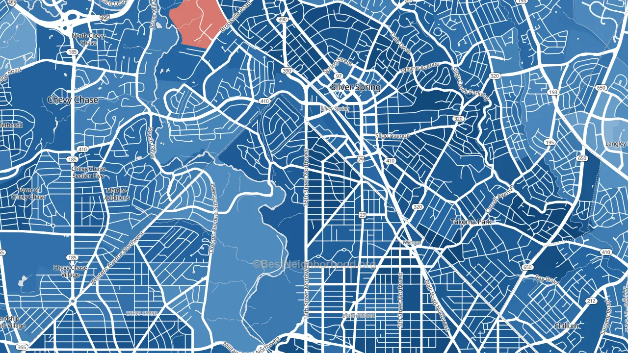
About 90% of adults in Takoma Park typically vote, above the U.S. average of about 62%. Among adults in Takoma Park, ~83% vote Democratic, ~7% Republican, and ~10% don't vote. The map below shows estimated turnout by block group.
How Takoma Park compares
Among neighborhoods within 5 miles, Takoma Park leans more Democratic than 21 of 26 neighbors.
Politically, Takoma Park sits close to the rest of the District of Columbia.
Why Takoma Park leans the way it does
This analysis examined 14,881 data points per neighborhood to find what predicts political lean and turnout. The items below are a few correlations that stood out for Takoma Park, not a ranked or complete list of what matters most.
Areas with high college attainment vote Democratic. About 77% of adults in Takoma Park hold a bachelor's degree, about 49 points above the U.S. average of 28%.
Park access and Democratic lean
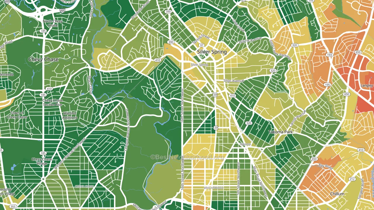
Places with heavy park coverage tend to lean Democratic; Takoma Park, Washington, DC sits in the top quarter nationally on this measure. Park access does not change how people vote; it tends to track denser, higher-income areas.
Why turnout in Takoma Park looks the way it does
Areas with strong routine healthcare access turn out at higher rates. Takoma Park is in the top quarter nationally for routine-care measures such as insurance coverage, preventive screenings, and dental visits. The dental-visit rate here is about 78%, about 18 points above the U.S. average of 60%. Homeowners vote more often than renters, and about 92% of households in Takoma Park own their home, compared to around 62% in nearby neighborhoods. Learn more about the findings and methodology on the political spectrum map.
Nearby Neighborhoods
- Carroll Manor, Takoma Park, MD D+84
- Brightwood, Washington, DC D+77
- Fort Totten-Upper Northeast, Washington, DC D+83
- Barnaby Woods, Washington, DC D+74
- New Hampshire Gardens, Takoma Park, MD D+78
- Forest Glen, Silver Spring, MD D+75
- Chevy Chase, Washington, DC D+79
- Petworth, Washington, DC D+86
- Langley Park, Hyattsville, MD D+41
- Green Meadows, Chillum, MD D+53
Neighborhoods with Similar Populations
- Ridgeview-Webster, San Diego, CA D+37
- Roosevelt, Seattle, WA D+77
- Canaryville, Chicago, IL R+3
- Bryant, Seattle, WA D+78
- Holiday Hills, Lexington, KY D+25
- Jefferson Square, Omaha, NE D+43
- Davie Heights, Davie, FL D+8
- Schorsch, Chicago, IL D+12
- New Horizons, Santa Ana, CA D+33
- Edgewood, Cranston, RI D+43
Sources and methodology
Precinct-level voting records used to fit the model come from District of Columbia Board of Elections, distributed by the Voting and Election Science Team. Demographic inputs come from the U.S. Census Bureau (ACS 5-year estimates and the 2020 Decennial Census). Health and environmental inputs come from the CDC (PLACES and the Environmental Justice Index). Land cover comes from the USGS and EPA. Election-day and lead-up weather come from PRISM 4km daily grids and the NOAA Global Historical Climatology Network. Mail-voting and election-administration patterns come from the MIT Election Lab's Survey of the Performance of American Elections. Block-group crime detail comes from CrimeGrade. Internet data and modeling support provided by ISPreports.org.
Modeling and analysis by the BestNeighborhood data science team. Full methodology and findings: political spectrum map.
Methodology reviewed by the BestNeighborhood data team. Last updated May 2026.