Talbot County leans slightly Democratic by roughly 12 points: about 56% of voters vote Democratic and 44% Republican.
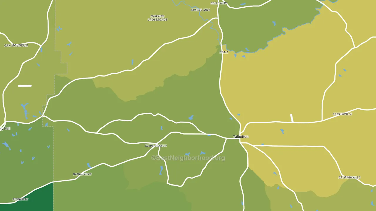
About 69% of adults in Talbot County typically vote, above the U.S. average of about 62%. Among adults in Talbot County, ~39% vote Democratic, ~30% Republican, and ~31% don't vote. The map below shows estimated turnout by block group.
How Talbot County compares
Among counties within 50 miles, Talbot County leans more Democratic than 19 of 23 neighbors.
Talbot County runs about 14 points more Democratic than Georgia as a whole. Georgia is roughly evenly split, and Talbot County sits clearly on the Democratic side.
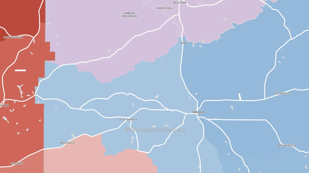
Politics vary noticeably by city within Talbot County. The east side runs the most Democratic (D+38) and the southwest side runs the most Republican (R+7), a spread of about 44 points.
Why Talbot County leans the way it does
This analysis examined 14,881 data points per county to find what predicts political lean and turnout. The items below are a few correlations that stood out for Talbot County, not a ranked or complete list of what matters most.
Rural, majority-Black areas of the Southern Black Belt vote Democratic, against the usual rural pattern. About 53% of residents in Talbot County are Black or African American, about 29 points above the Georgia average of 25%. Talbot County runs against the grain of Georgia, a Democratic-leaning outlier in a roughly evenly split state.
Paved land cover and Republican lean
Places with little paved surface tend to lean Republican; Talbot County, GA sits in the bottom tenth nationally on this measure. Paved ground does not change how people vote; it mostly reflects how urban and built-up a place is.
Why turnout in Talbot County looks the way it does
Limited routine healthcare access lines up with lower turnout, and Talbot County sits in the bottom quarter on routine-care measures. Learn more about the findings and methodology on the political spectrum map.
Nearby Counties
- Harris County, GA R+45
- Upson County, GA R+30
- Marion County, GA R+29
- Meriwether County, GA R+22
- Taylor County, GA R+22
- Muscogee County, GA D+25
- Pike County, GA R+70
- Chattahoochee County, GA R+14
- Russell County, AL D+6
- Troup County, GA R+11
Counties with Similar Populations
- Lander County, NV R+63
- Ottawa County, KS R+63
- San Saba County, TX R+68
- Covington City, VA R+29
- Prince of Wales-Hyder Census Area, AK R+18
- Ransom County, ND R+46
- Emporia City, VA D+43
- Alfalfa County, OK R+76
- McCook County, SD R+54
- Lincoln County, CO R+61
Sources and methodology
Precinct-level voting records used to fit the model come from Georgia Elections Division, distributed by the Voting and Election Science Team. Demographic inputs come from the U.S. Census Bureau (ACS 5-year estimates and the 2020 Decennial Census). Health and environmental inputs come from the CDC (PLACES and the Environmental Justice Index). Land cover comes from the USGS and EPA. Election-day and lead-up weather come from PRISM 4km daily grids and the NOAA Global Historical Climatology Network. Mail-voting and election-administration patterns come from the MIT Election Lab's Survey of the Performance of American Elections. Block-group crime detail comes from CrimeGrade. Internet data and modeling support provided by ISPreports.org.
Modeling and analysis by the BestNeighborhood data science team. Full methodology and findings: political spectrum map.
Methodology reviewed by the BestNeighborhood data team. Last updated May 2026.