Marion County leans Republican by roughly 30 points: about 35% of voters vote Democratic and 65% Republican.
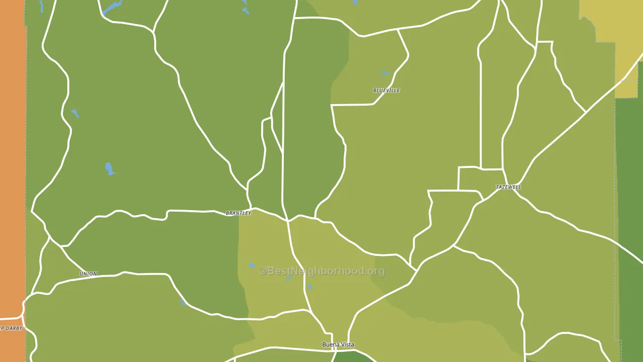
About 71% of adults in Marion County typically vote, above the U.S. average of about 62%. Among adults in Marion County, ~25% vote Democratic, ~46% Republican, and ~29% don't vote. The map below shows estimated turnout by block group.
How Marion County compares
Among counties within 50 miles, Marion County leans more Republican than 15 of 19 neighbors.
Marion County runs about 27 points more Republican than Georgia as a whole.
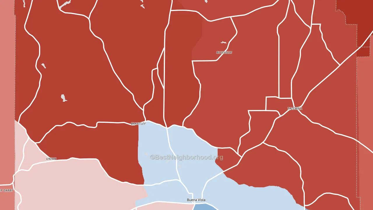
Politics vary noticeably by city within Marion County. The southeast side runs the most Democratic (D+23) and the northwest side runs the most Republican (R+68), a spread of about 91 points.
Why Marion County leans the way it does
This analysis examined 14,881 data points per county to find what predicts political lean and turnout. The items below are a few correlations that stood out for Marion County, not a ranked or complete list of what matters most.
Areas with many family households vote Republican. About 72% of households in Marion County are family households, about 5 points above the U.S. average of 67%. Rural areas vote Republican, and Marion County sits in the bottom quarter on density (about 6%, below 92% of counties).
Paved land cover and Republican lean
Places with little paved surface tend to lean Republican; Marion County, GA sits in the bottom tenth nationally on this measure. Paved ground does not change how people vote; it mostly reflects how urban and built-up a place is.
Why turnout in Marion County looks the way it does
Areas with limited routine healthcare access turn out at lower rates. Marion County is in the bottom quarter nationally for routine-care measures such as insurance coverage, preventive screenings, and dental visits. Learn more about the findings and methodology on the political spectrum map.
Nearby Counties
- Schley County, GA R+60
- Chattahoochee County, GA R+14
- Taylor County, GA R+22
- Talbot County, GA D+12
- Webster County, GA R+16
- Muscogee County, GA D+25
- Stewart County, GA D+12
- Sumter County, GA D+13
- Macon County, GA D+22
- Harris County, GA R+45
Counties with Similar Populations
- Adair County, IA R+46
- Harney County, OR R+47
- Doniphan County, KS R+58
- Wheeler County, GA R+31
- Kingman County, KS R+58
- Conejos County, CO R+25
- Nicholas County, KY R+60
- East Carroll Parish, LA D+18
- Cleveland County, AR R+69
- Worth County, IA R+37
Sources and methodology
Precinct-level voting records used to fit the model come from Georgia Elections Division, distributed by the Voting and Election Science Team. Demographic inputs come from the U.S. Census Bureau (ACS 5-year estimates and the 2020 Decennial Census). Health and environmental inputs come from the CDC (PLACES and the Environmental Justice Index). Land cover comes from the USGS and EPA. Election-day and lead-up weather come from PRISM 4km daily grids and the NOAA Global Historical Climatology Network. Mail-voting and election-administration patterns come from the MIT Election Lab's Survey of the Performance of American Elections. Block-group crime detail comes from CrimeGrade. Internet data and modeling support provided by ISPreports.org.
Modeling and analysis by the BestNeighborhood data science team. Full methodology and findings: political spectrum map.
Methodology reviewed by the BestNeighborhood data team. Last updated May 2026.