Tift County leans Republican by roughly 22 points: about 39% of voters vote Democratic and 61% Republican.
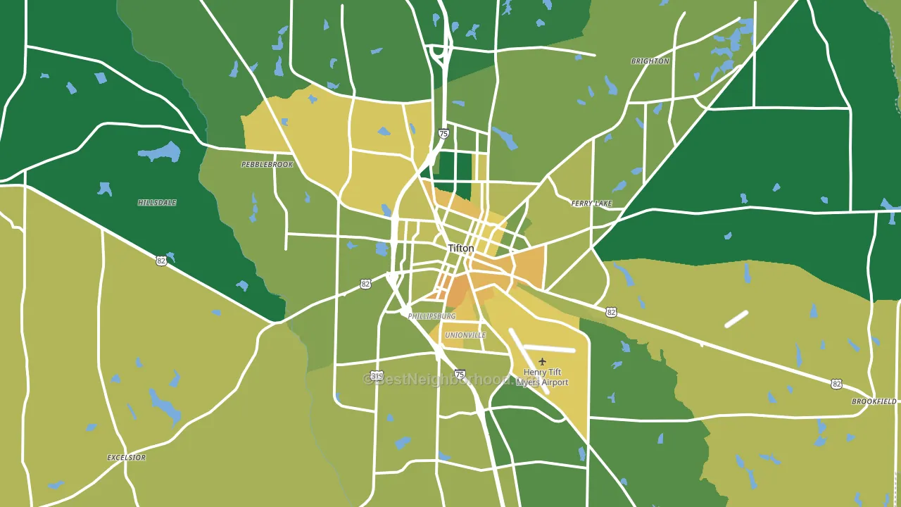
About 68% of adults in Tift County typically vote, above the U.S. average of about 62%. Among adults in Tift County, ~26% vote Democratic, ~42% Republican, and ~32% don't vote. The map below shows estimated turnout by block group.
How Tift County compares
Among counties within 50 miles, Tift County leans more Republican than 7 of 18 neighbors.
Tift County runs about 20 points more Republican than Georgia as a whole.
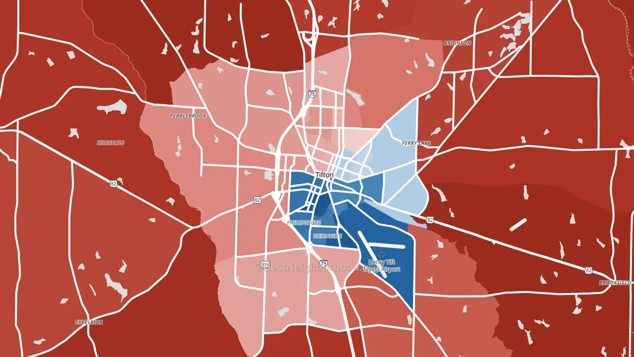
Politics vary noticeably by city within Tift County. The south side runs the most Democratic (D+34) and the northeast side runs the most Republican (R+59), a spread of about 94 points.
Why Tift County leans the way it does
This analysis examined 14,881 data points per county to find what predicts political lean and turnout. The items below are a few correlations that stood out for Tift County, not a ranked or complete list of what matters most.
Tift County votes Republican even though it is densely developed (about 50%, well above the Georgia average of 26%). State and regional patterns outweigh the Democratic lean that density usually predicts here.
Preventive-care access and voter turnout
Places with limited routine preventive-care access tend to turn out at a lower rate; Tift County, GA sits in the bottom quarter nationally on this measure. Dental visits do not drive turnout; the rate reflects income, insurance, and healthcare access, which line up with who votes.
Why turnout in Tift County looks the way it does
Areas with limited routine healthcare access turn out at lower rates. Tift County is in the bottom quarter nationally for routine-care measures such as insurance coverage, preventive screenings, and dental visits. Learn more about the findings and methodology on the political spectrum map.
Nearby Counties
- Irwin County, GA R+43
- Turner County, GA R+19
- Worth County, GA R+49
- Berrien County, GA R+66
- Cook County, GA R+34
- Colquitt County, GA R+36
- Ben Hill County, GA R+17
- Wilcox County, GA R+33
- Crisp County, GA R+7
- Lanier County, GA R+43
Counties with Similar Populations
- Tallapoosa County, AL R+39
- Benton County, MN R+30
- Isanti County, MN R+34
- Wharton County, TX R+33
- Clatsop County, OR D+6
- Cheatham County, TN R+55
- Baxter County, AR R+51
- Tioga County, PA R+50
- McClain County, OK R+60
- Cooke County, TX R+57
Sources and methodology
Precinct-level voting records used to fit the model come from Georgia Elections Division, distributed by the Voting and Election Science Team. Demographic inputs come from the U.S. Census Bureau (ACS 5-year estimates and the 2020 Decennial Census). Health and environmental inputs come from the CDC (PLACES and the Environmental Justice Index). Land cover comes from the USGS and EPA. Election-day and lead-up weather come from PRISM 4km daily grids and the NOAA Global Historical Climatology Network. Mail-voting and election-administration patterns come from the MIT Election Lab's Survey of the Performance of American Elections. Block-group crime detail comes from CrimeGrade. Internet data and modeling support provided by ISPreports.org.
Modeling and analysis by the BestNeighborhood data science team. Full methodology and findings: political spectrum map.
Methodology reviewed by the BestNeighborhood data team. Last updated May 2026.