U Street Corridor is a Democratic stronghold. About 90% of voters here vote Democratic and 10% Republican.
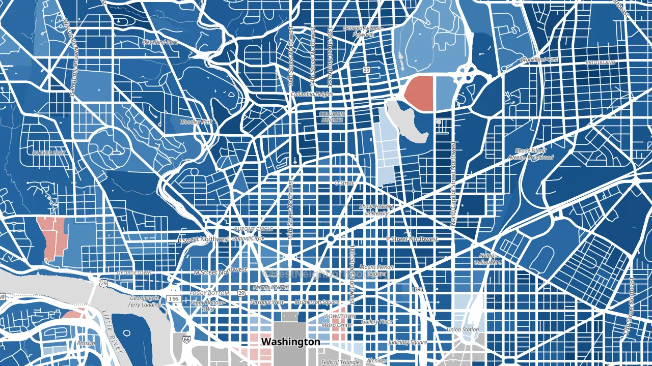
About 71% of adults in U Street Corridor typically vote, above the U.S. average of about 62%. Among adults in U Street Corridor, ~63% vote Democratic, ~7% Republican, and ~30% don't vote. The map below shows estimated turnout by block group.
How U Street Corridor compares
Among neighborhoods within 5 miles, U Street Corridor leans more Democratic than 33 of 52 neighbors.
Politically, U Street Corridor sits close to the rest of the District of Columbia.
Politics vary noticeably by block within U Street Corridor. The south side is the most Democratic-leaning (D+87) and the north side is the least Democratic-leaning (D+73), a spread of about 14 points.
Why U Street Corridor leans the way it does
This analysis examined 14,881 data points per neighborhood to find what predicts political lean and turnout. The items below are a few correlations that stood out for U Street Corridor, not a ranked or complete list of what matters most.
Dense areas vote Democratic. More than 99% of residents in U Street Corridor live in densely developed areas, about 64 points above the U.S. average of 36%. High college attainment predicts Democratic voting, and U Street Corridor sits in the top quarter (about 84%, above 98% of neighborhoods). A high never-married share predicts Democratic voting, and about 63% of adults in U Street Corridor have never been married, above 95% of neighborhoods.
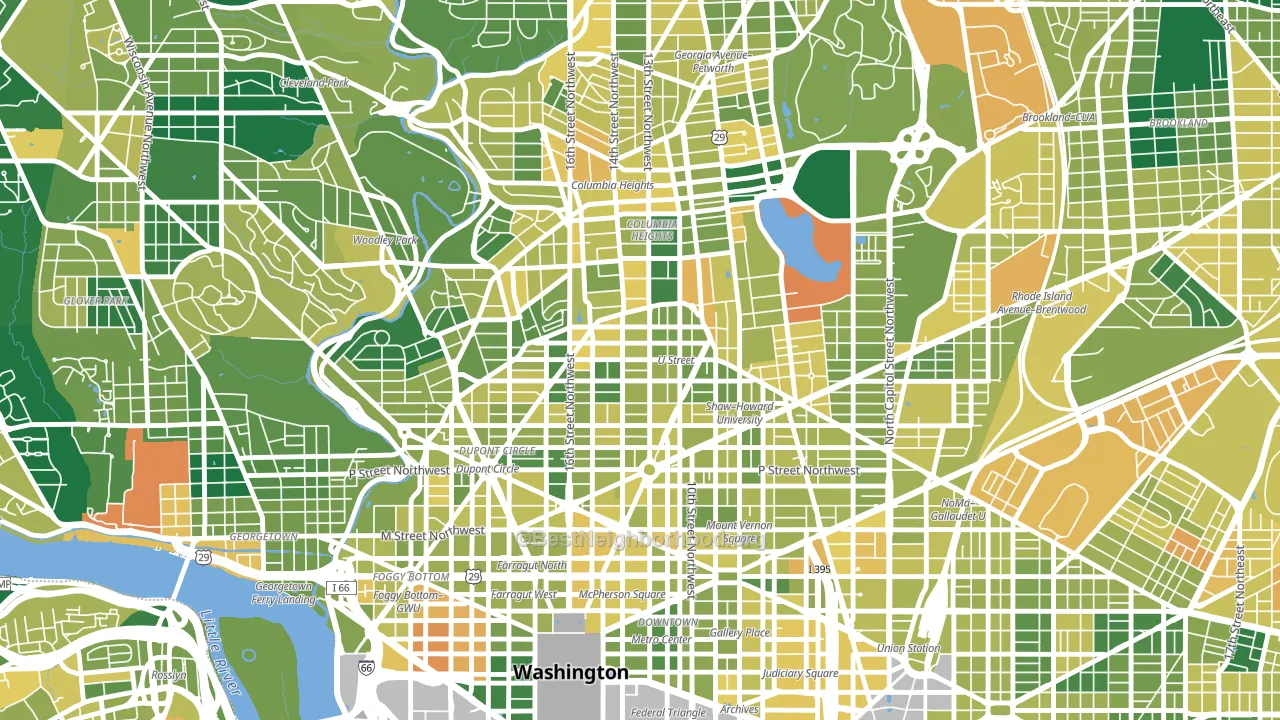
Population density and Democratic lean
Places with high population density tend to lean Democratic; U Street Corridor, Washington, DC sits in the top tenth nationally on this measure.
Why turnout in U Street Corridor looks the way it does
Areas with strong routine healthcare access turn out at higher rates. U Street Corridor is in the top quarter nationally for routine-care measures such as insurance coverage, preventive screenings, and dental visits. The dental-visit rate here is about 77%, about 17 points above the U.S. average of 60%. Learn more about the findings and methodology on the political spectrum map.
Nearby Neighborhoods
- Logan Circle, Washington, DC D+77
- Adams Morgan, Washington, DC D+83
- Dupont Circle, Washington, DC D+78
- Columbia Heights, Washington, DC D+83
- Ledroit Park, Washington, DC D+88
- Shaw, Washington, DC D+84
- Mt Vernon Square, Washington, DC D+74
- Mount Pleasant, Washington, DC D+83
- Downtown, Washington, DC D+71
- Woodley Park, Washington, DC D+80
Neighborhoods with Similar Populations
- Riviera, Santa Barbara, CA D+49
- Hyde Park, Cincinnati, OH D+38
- Cypress Park, Los Angeles, CA D+51
- Hillsborough, Raleigh, NC D+55
- Far South, Columbus, OH R+8
- New Downtown, Los Angeles, CA D+54
- Point Place, Toledo, OH R+4
- Angel Park Lindell, Las Vegas, NV D+11
- Valley Station, Louisville, KY R+15
- South Englewood, Chicago, IL D+83
Sources and methodology
Precinct-level voting records used to fit the model come from District of Columbia Board of Elections, distributed by the Voting and Election Science Team. Demographic inputs come from the U.S. Census Bureau (ACS 5-year estimates and the 2020 Decennial Census). Health and environmental inputs come from the CDC (PLACES and the Environmental Justice Index). Land cover comes from the USGS and EPA. Election-day and lead-up weather come from PRISM 4km daily grids and the NOAA Global Historical Climatology Network. Mail-voting and election-administration patterns come from the MIT Election Lab's Survey of the Performance of American Elections. Block-group crime detail comes from CrimeGrade. Internet data and modeling support provided by ISPreports.org.
Modeling and analysis by the BestNeighborhood data science team. Full methodology and findings: political spectrum map.
Methodology reviewed by the BestNeighborhood data team. Last updated May 2026.