Logan Circle is a Democratic stronghold. About 89% of voters here vote Democratic and 11% Republican.
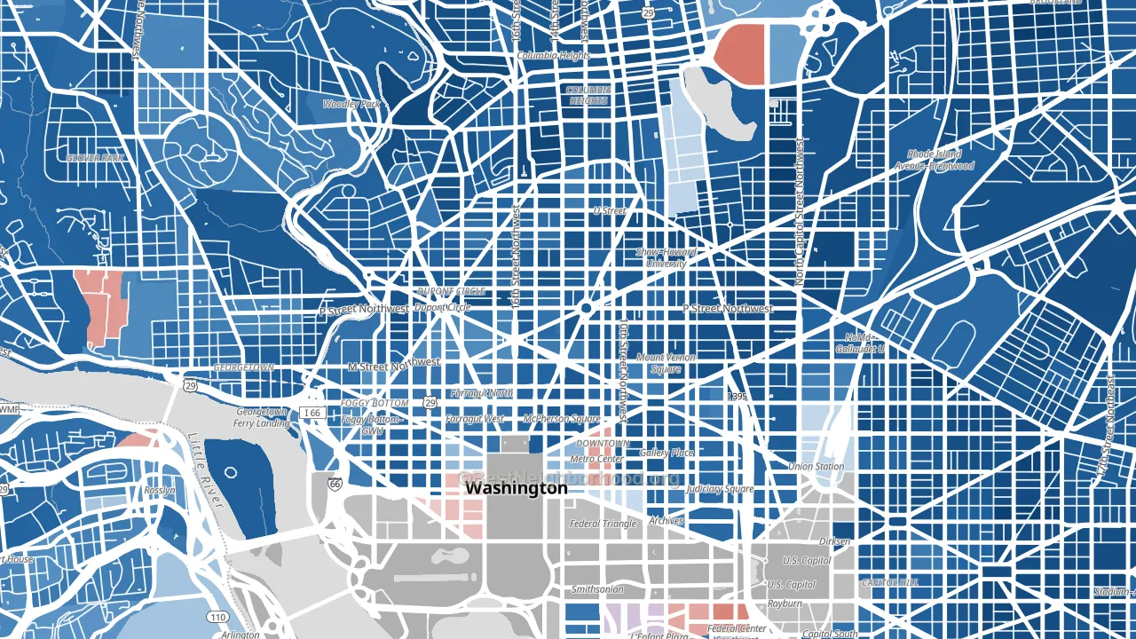
About 61% of adults in Logan Circle typically vote, near the U.S. average of about 62%. Among adults in Logan Circle, ~54% vote Democratic, ~7% Republican, and ~39% don't vote. The map below shows estimated turnout by block group.
How Logan Circle compares
Among neighborhoods within 5 miles, Logan Circle leans more Democratic than 31 of 54 neighbors.
Logan Circle runs about 6 points more Republican than the District of Columbia as a whole.
Politics vary noticeably by block within Logan Circle. The northwest side is the most Democratic-leaning (D+85) and the southwest side is the least Democratic-leaning (D+71), a spread of about 14 points.
Why Logan Circle leans the way it does
This analysis examined 14,881 data points per neighborhood to find what predicts political lean and turnout. The items below are a few correlations that stood out for Logan Circle, not a ranked or complete list of what matters most.
Dense areas vote Democratic. More than 99% of residents in Logan Circle live in densely developed areas, about 64 points above the U.S. average of 36%. High college attainment predicts Democratic voting, and Logan Circle sits in the top quarter (about 82%, above 97% of neighborhoods). A high never-married share predicts Democratic voting, and about 63% of adults in Logan Circle have never been married, above 95% of neighborhoods.
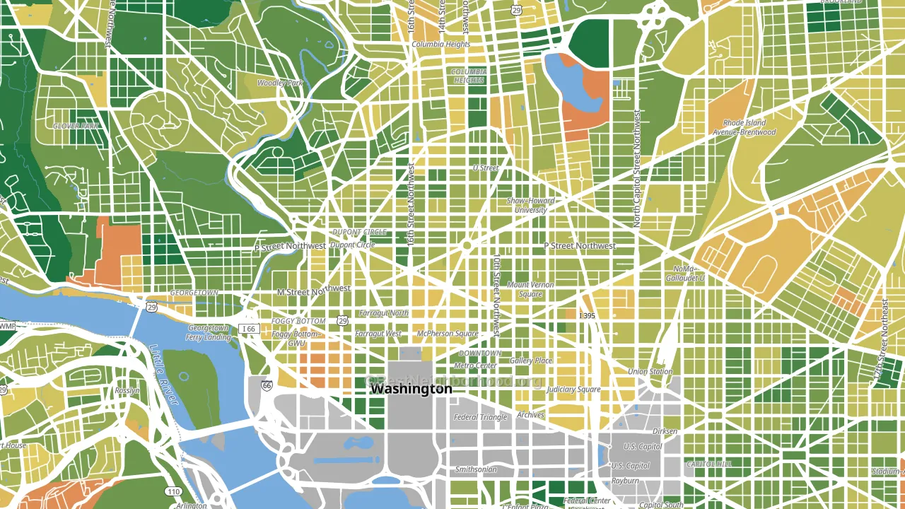
Population density and Democratic lean
Places with high population density tend to lean Democratic; Logan Circle, Washington, DC sits in the top tenth nationally on this measure.
Why turnout in Logan Circle looks the way it does
Strong routine healthcare access lines up with higher turnout, and Logan Circle sits in the top quarter on routine-care measures. Learn more about the findings and methodology on the political spectrum map.
Nearby Neighborhoods
- U Street Corridor, Washington, DC D+80
- Dupont Circle, Washington, DC D+78
- Downtown, Washington, DC D+71
- Shaw, Washington, DC D+84
- Mt Vernon Square, Washington, DC D+74
- Adams Morgan, Washington, DC D+83
- Ledroit Park, Washington, DC D+88
- Foggy Bottom, Washington, DC D+69
- Columbia Heights, Washington, DC D+83
- Mount Pleasant, Washington, DC D+83
Neighborhoods with Similar Populations
- Bluffview, Dallas, TX D+11
- West Meadows, Tampa, FL D+15
- Squirrel Hill South, Pittsburgh, PA D+61
- Rocky-Fork Blacklick Accord, Westerville, OH D+18
- Dutchtown, St. Louis, MO D+64
- Acres Home, Houston, TX D+71
- Victory Hills, Kansas City, KS D+38
- North Aurora, Aurora, CO D+39
- Greenwell Springs-Central Area, Baton Rouge, LA D+35
- South Westminster, Westminster, CO D+20
Sources and methodology
Precinct-level voting records used to fit the model come from District of Columbia Board of Elections, distributed by the Voting and Election Science Team. Demographic inputs come from the U.S. Census Bureau (ACS 5-year estimates and the 2020 Decennial Census). Health and environmental inputs come from the CDC (PLACES and the Environmental Justice Index). Land cover comes from the USGS and EPA. Election-day and lead-up weather come from PRISM 4km daily grids and the NOAA Global Historical Climatology Network. Mail-voting and election-administration patterns come from the MIT Election Lab's Survey of the Performance of American Elections. Block-group crime detail comes from CrimeGrade. Internet data and modeling support provided by ISPreports.org.
Modeling and analysis by the BestNeighborhood data science team. Full methodology and findings: political spectrum map.
Methodology reviewed by the BestNeighborhood data team. Last updated May 2026.