Uptown is a Democratic stronghold. About 84% of voters here vote Democratic and 16% Republican.
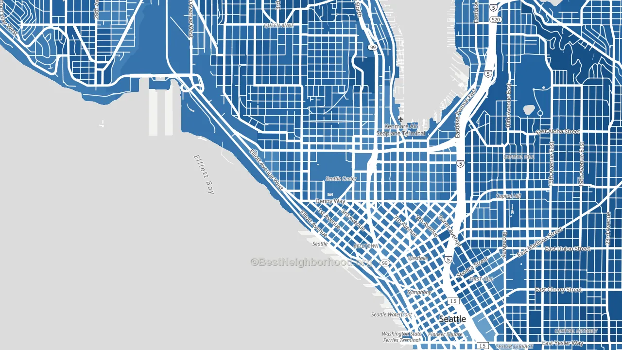
About 59% of adults in Uptown typically vote, near the U.S. average of about 62%. Among adults in Uptown, ~50% vote Democratic, ~9% Republican, and ~41% don't vote. The map below shows estimated turnout by block group.
How Uptown compares
Among neighborhoods within 5 miles, Uptown leans more Democratic than 11 of 37 neighbors.
Uptown runs about 51 points more Democratic than Washington as a whole.
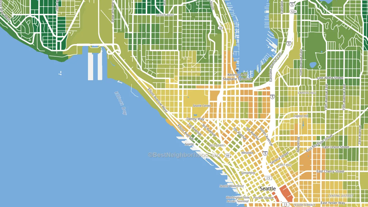
Politics vary noticeably by block within Uptown. The northwest side is the most Democratic-leaning (D+75) and the east side is the least Democratic-leaning (D+57), a spread of about 18 points.
Why Uptown leans the way it does
This analysis examined 14,881 data points per neighborhood to find what predicts political lean and turnout. The items below are a few correlations that stood out for Uptown, not a ranked or complete list of what matters most.
Areas with high college attainment vote Democratic. About 71% of adults in Uptown hold a bachelor's degree, about 43 points above the U.S. average of 28%. A high never-married share predicts Democratic voting, and about 55% of adults in Uptown have never been married, above 89% of neighborhoods.
Paved land cover and Democratic lean
Places with extensive paved surfaces tend to lean Democratic; Uptown, Seattle, WA sits in the top tenth nationally on this measure. Paved ground does not change how people vote; it mostly reflects how urban and built-up a place is.
Why turnout in Uptown looks the way it does
Renters vote less often than owners. About 78% of households in Uptown rent, about 53 points above the U.S. average of 25%. Strong routine healthcare access lines up with higher turnout, and Uptown sits in the top quarter on routine-care measures. Learn more about the findings and methodology on the political spectrum map.
Nearby Neighborhoods
- Belltown, Seattle, WA D+62
- South Lake Union, Seattle, WA D+57
- Westlake, Seattle, WA D+64
- Queen Anne, Seattle, WA D+74
- First Hill, Seattle, WA D+69
- Interbay, Seattle, WA D+74
- Capitol Hill, Seattle, WA D+79
- Pioneer Square, Seattle, WA D+58
- Eastlake, Seattle, WA D+76
- International District, Seattle, WA D+61
Neighborhoods with Similar Populations
- Overlake, Bellevue, WA D+42
- Potrero, San Francisco, CA D+79
- West Elsdon, Chicago, IL D+28
- Foggy Bottom, Washington, DC D+69
- Grandview, Glendale, CA Even
- Bach, Ann Arbor, MI D+72
- Chimney Lakes, Jacksonville, FL D+5
- Huntridge, Las Vegas, NV D+29
- Far Northeast-Houston, Houston, TX D+5
- Auburn Gresham, Chicago, IL D+84
Sources and methodology
Precinct-level voting records used to fit the model come from Washington Secretary of State, Elections, distributed by the Voting and Election Science Team. Demographic inputs come from the U.S. Census Bureau (ACS 5-year estimates and the 2020 Decennial Census). Health and environmental inputs come from the CDC (PLACES and the Environmental Justice Index). Land cover comes from the USGS and EPA. Election-day and lead-up weather come from PRISM 4km daily grids and the NOAA Global Historical Climatology Network. Mail-voting and election-administration patterns come from the MIT Election Lab's Survey of the Performance of American Elections. Block-group crime detail comes from CrimeGrade. Internet data and modeling support provided by ISPreports.org.
Modeling and analysis by the BestNeighborhood data science team. Full methodology and findings: political spectrum map.
Methodology reviewed by the BestNeighborhood data team. Last updated May 2026.