Potrero is a Democratic stronghold. About 89% of voters here vote Democratic and 11% Republican.
[sc name="abovemapcta"]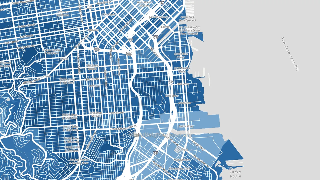 [bestneighborhood_map_controls]
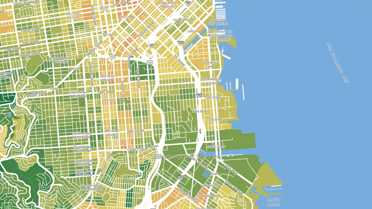
About 65% of adults in Potrero typically vote, near the U.S. average of about 62%. Among adults in Potrero, ~58% vote Democratic, ~7% Republican, and ~35% don't vote. The map below shows estimated turnout by block group.
 [bestneighborhood_map_controls]
How Potrero compares
Among neighborhoods within 5 miles, Potrero leans more Democratic than 31 of 38 neighbors.
Potrero runs about 59 points more Democratic than California as a whole.
Why Potrero leans the way it does
This analysis examined 14,881 data points per neighborhood to find what predicts political lean and turnout. The items below are a few correlations that stood out for Potrero, not a ranked or complete list of what matters most.
Areas with high college attainment vote Democratic. About 81% of adults in Potrero hold a bachelor's degree, about 53 points above the U.S. average of 28%. A high never-married share predicts Democratic voting, and about 52% of adults in Potrero have never been married, above 85% of neighborhoods.
Population density and Democratic lean
Places with high population density tend to lean Democratic; Potrero, San Francisco, CA sits in the top tenth nationally on this measure.
Why turnout in Potrero looks the way it does
Areas with strong routine healthcare access turn out at higher rates. Potrero is in the top quarter nationally for routine-care measures such as insurance coverage, preventive screenings, and dental visits. The dental-visit rate here is about 74%, about 14 points above the U.S. average of 60%. Learn more about the findings and methodology on the political spectrum map.
[one_half]Nearby Neighborhoods
- Mission, San Francisco, CA D+72
- South of Market, San Francisco, CA D+61
- Liberty Street Historic District, San Francisco, CA D+81
- Bernal Heights, San Francisco, CA D+78
- Silver Terrace, San Francisco, CA D+36
- Downtown San Francisco, San Francisco, CA D+56
- Duboce Triangle, San Francisco, CA D+83
- Noe Valley, San Francisco, CA D+82
- Bayview, San Francisco, CA D+57
- Castro-Upper Market, San Francisco, CA D+82
Neighborhoods with Similar Populations
- Overlake, Bellevue, WA D+42
- Uptown, Seattle, WA D+69
- Far Northeast-Houston, Houston, TX D+5
- West Elsdon, Chicago, IL D+28
- Edgewood-Kirkwood, Atlanta, GA D+75
- Foggy Bottom, Washington, DC D+69
- Grandview, Glendale, CA Even
- Bach, Ann Arbor, MI D+72
- Arden Heights, Staten Island, NY R+47
- Chimney Lakes, Jacksonville, FL D+5
Sources and methodology
Precinct-level voting records used to fit the model come from California Secretary of State, Elections, distributed by the Voting and Election Science Team. Demographic inputs come from the U.S. Census Bureau (ACS 5-year estimates and the 2020 Decennial Census). Health and environmental inputs come from the CDC (PLACES and the Environmental Justice Index). Land cover comes from the USGS and EPA. Election-day and lead-up weather come from PRISM 4km daily grids and the NOAA Global Historical Climatology Network. Mail-voting and election-administration patterns come from the MIT Election Lab's Survey of the Performance of American Elections. Block-group crime detail comes from CrimeGrade. Internet data and modeling support provided by ISPreports.org.
Modeling and analysis by the BestNeighborhood data science team. Full methodology and findings: political spectrum map.
Methodology reviewed by the BestNeighborhood data team. Last updated May 2026.