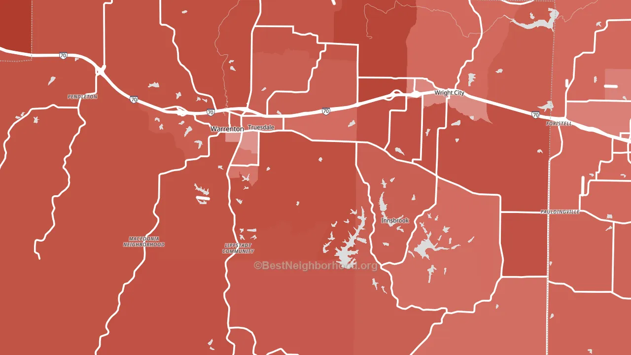
Warren County leans heavily Republican by roughly 50 points: about 25% of voters vote Democratic and 75% Republican.
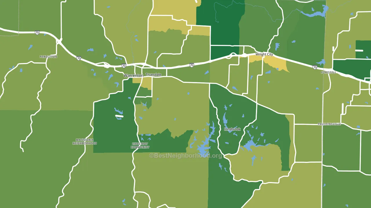
About 77% of adults in Warren County typically vote, above the U.S. average of about 62%. Among adults in Warren County, ~19% vote Democratic, ~58% Republican, and ~23% don't vote. The map below shows estimated turnout by block group.
How Warren County compares
Among counties within 50 miles, Warren County leans more Republican than 8 of 14 neighbors.
Warren County runs about 31 points more Republican than Missouri as a whole.
Politics vary noticeably by city within Warren County. The northwest side is the most Republican-leaning (R+60) and the northeast side is the least Republican-leaning (R+44), a spread of about 16 points.
Why Warren County leans the way it does
This analysis examined 14,881 data points per county to find what predicts political lean and turnout. The items below are a few correlations that stood out for Warren County, not a ranked or complete list of what matters most.
Areas with many family households vote Republican. About 72% of households in Warren County are family households, about 6 points above the U.S. average of 67%.
Frequent mental distress and voter turnout
Places with a low frequent-mental-distress rate tend to turn out at a higher rate; Warren County, MO sits in the bottom quarter nationally on this measure. Reported mental distress does not drive turnout; it reflects economic and health conditions tied to voting.
Why turnout in Warren County looks the way it does
Homeowners vote more often than renters. About 81% of households in Warren County own their home, about 6 points above the U.S. average of 75%. Learn more about the findings and methodology on the political spectrum map.
Nearby Counties
- Lincoln County, MO R+51
- Montgomery County, MO R+56
- St. Charles County, MO R+14
- Franklin County, MO R+48
- Gasconade County, MO R+58
- Calhoun County, IL R+56
- St. Louis County, MO D+28
- Pike County, MO R+55
- Jefferson County, MO R+39
- Jersey County, IL R+44
Counties with Similar Populations
- Madison County, NE R+50
- Uintah County, UT R+67
- Wapello County, IA R+26
- Perry County, OH R+56
- Fannin County, TX R+58
- Lincoln County, TN R+64
- Washington County, TX R+37
- Adams County, IN R+60
- Livingston County, IL R+38
- Lincoln County, ME Even
Sources and methodology
Precinct-level voting records used to fit the model come from Missouri Secretary of State, Elections, distributed by the Voting and Election Science Team. Demographic inputs come from the U.S. Census Bureau (ACS 5-year estimates and the 2020 Decennial Census). Health and environmental inputs come from the CDC (PLACES and the Environmental Justice Index). Land cover comes from the USGS and EPA. Election-day and lead-up weather come from PRISM 4km daily grids and the NOAA Global Historical Climatology Network. Mail-voting and election-administration patterns come from the MIT Election Lab's Survey of the Performance of American Elections. Block-group crime detail comes from CrimeGrade. Internet data and modeling support provided by ISPreports.org.
Modeling and analysis by the BestNeighborhood data science team. Full methodology and findings: political spectrum map.
Methodology reviewed by the BestNeighborhood data team. Last updated May 2026.