Willamette is a true toss-up. About 51% of voters here vote Democratic and 49% Republican.
[sc name="abovemapcta"]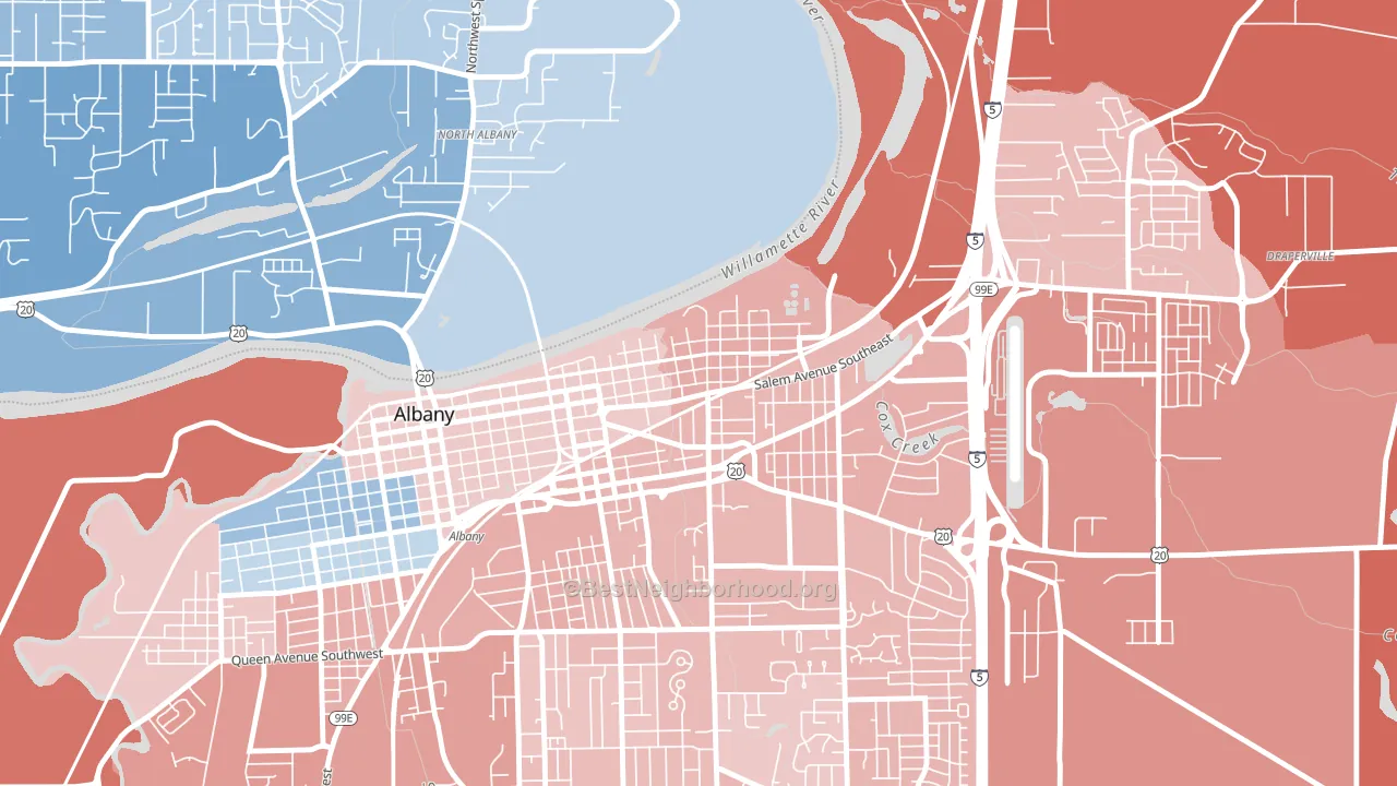 [bestneighborhood_map_controls]
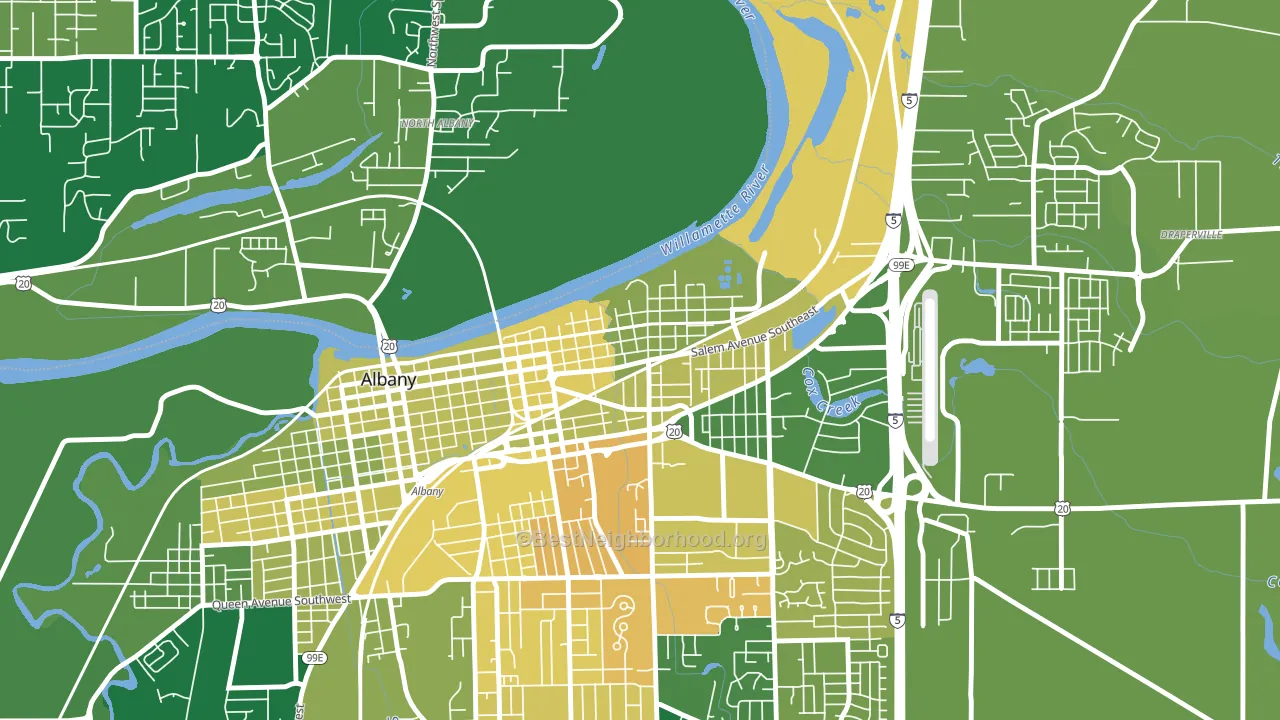
About 59% of adults in Willamette typically vote, near the U.S. average of about 62%. Among adults in Willamette, ~30% vote Democratic, ~29% Republican, and ~41% don't vote. The map below shows estimated turnout by block group.
 [bestneighborhood_map_controls]
How Willamette compares
Among neighborhoods within 5 miles, Willamette sits roughly in the middle of the political spectrum, with 4 neighbors leaning further in the place's direction and 1 leaning the other way.
Willamette runs about 12 points more Republican than Oregon as a whole.
Politics vary noticeably by block within Willamette. The northwest side runs the most Democratic (D+6) and the northeast side runs the most Republican (R+10), a spread of about 16 points.
Why Willamette leans the way it does
Density, race composition, education, and family structure all sit close to their national averages in Willamette. The lean here lands roughly where demographic data alone would predict.
Cancer-screening access and voter turnout
Places with low colon-cancer-screening access tend to turn out at a lower rate; Willamette, Albany, OR sits below the national average on this measure. Cancer screening does not drive turnout; it reflects income, insurance, and healthcare access.
Why turnout in Willamette looks the way it does
Turnout in Willamette sits close to the national pattern. Routine healthcare access, homeownership, education, and food security all land near their national averages here. Learn more about the findings and methodology on the political spectrum map.
[one_half]Nearby Neighborhoods
- Santiam, Albany, OR Even
- Periwinkle, Albany, OR R+5
- East Albany, Albany, OR R+18
- North Albany, Albany, OR D+15
- South Albany, Albany, OR R+8
- South Corvallis Neighbors, Corvallis, OR D+52
- Southeast Mill Creek, Salem, OR R+6
- Grant, Salem, OR D+35
- Oak Park, Salem, OR D+19
- Santa Clara, Eugene, OR D+19
Neighborhoods with Similar Populations
- Coytesville, Fort Lee, NJ D+17
- Reedy Creek, Richmond, VA D+70
- Jackson Heights, Mobile, AL D+10
- North Richland, Richland, WA D+9
- Wailea, Kihei, HI D+20
- Wedge, Woodinville, WA D+36
- Boltons Landing, Charleston, SC D+7
- Cloutier Court, Wilmington, DE D+26
- Broadacres Homes, Athens, GA D+56
- Yalecrest, Salt Lake City, UT D+61
Sources and methodology
Precinct-level voting records used to fit the model come from Oregon Secretary of State, Elections Division, distributed by the Voting and Election Science Team. Demographic inputs come from the U.S. Census Bureau (ACS 5-year estimates and the 2020 Decennial Census). Health and environmental inputs come from the CDC (PLACES and the Environmental Justice Index). Land cover comes from the USGS and EPA. Election-day and lead-up weather come from PRISM 4km daily grids and the NOAA Global Historical Climatology Network. Mail-voting and election-administration patterns come from the MIT Election Lab's Survey of the Performance of American Elections. Block-group crime detail comes from CrimeGrade. Internet data and modeling support provided by ISPreports.org.
Modeling and analysis by the BestNeighborhood data science team. Full methodology and findings: political spectrum map.
Methodology reviewed by the BestNeighborhood data team. Last updated May 2026.