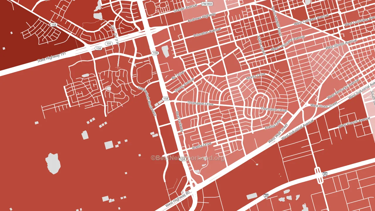
Wilshire Park leans heavily Republican by roughly 48 points: about 26% of voters vote Democratic and 74% Republican.
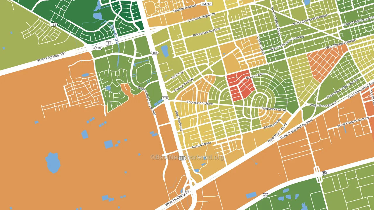
About 53% of adults in Wilshire Park typically vote, below the U.S. average of about 62%. Among adults in Wilshire Park, ~14% vote Democratic, ~39% Republican, and ~47% don't vote. The map below shows estimated turnout by block group.
How Wilshire Park compares
Wilshire Park sits in a sparsely populated area with few comparable neighborhoods nearby.
Wilshire Park runs about 34 points more Republican than Texas as a whole.
Why Wilshire Park leans the way it does
This analysis examined 14,881 data points per neighborhood to find what predicts political lean and turnout. The items below are a few correlations that stood out for Wilshire Park, not a ranked or complete list of what matters most.
Car-dependent areas vote Republican. About 80% of residents in Wilshire Park drive to work alone, about 6 points above the U.S. average of 74%.
Preventive-care access and voter turnout
Places with limited routine preventive-care access tend to turn out at a lower rate; Wilshire Park, Midland, TX sits below the national average on this measure. Dental visits do not drive turnout; the rate reflects income, insurance, and healthcare access, which line up with who votes.
Why turnout in Wilshire Park looks the way it does
Areas with limited routine healthcare access turn out at lower rates. Wilshire Park is in the bottom quarter nationally for routine-care measures such as insurance coverage, preventive screenings, and dental visits. The uninsured rate here is about 22%, about 12 points above the U.S. average of 10%. Learn more about the findings and methodology on the political spectrum map.
Nearby Neighborhoods
- Permian Estates, Midland, TX R+42
- Wydewood Estates, Midland, TX R+53
- Bonham, San Angelo, TX R+34
- Angelo Heights, San Angelo, TX R+22
- Southland, San Angelo, TX R+43
- Central, San Angelo, TX R+30
- College Hills, San Angelo, TX R+29
- Santa Rita, San Angelo, TX R+25
- Reagan, San Angelo, TX R+20
- University Pines, Lubbock, TX R+27
Neighborhoods with Similar Populations
- Dixon, Provo, UT R+14
- Midwest, Detroit, MI D+84
- Merrill Park, Milwaukee, WI D+67
- River Point, West Warwick, RI D+11
- Durant Manor, Oakland, CA D+60
- Heritage East, Albuquerque, NM D+13
- Harborview-Seahurst-Glenhaven, Everett, WA D+13
- Olympus Pointe, Roseville, CA Even
- Point Pleasant Manor, Brick, NJ R+31
- Colonial Manor, Sacramento, CA D+26
Sources and methodology
Precinct-level voting records used to fit the model come from Texas Secretary of State, Elections Division, distributed by the Voting and Election Science Team. Demographic inputs come from the U.S. Census Bureau (ACS 5-year estimates and the 2020 Decennial Census). Health and environmental inputs come from the CDC (PLACES and the Environmental Justice Index). Land cover comes from the USGS and EPA. Election-day and lead-up weather come from PRISM 4km daily grids and the NOAA Global Historical Climatology Network. Mail-voting and election-administration patterns come from the MIT Election Lab's Survey of the Performance of American Elections. Block-group crime detail comes from CrimeGrade. Internet data and modeling support provided by ISPreports.org.
Modeling and analysis by the BestNeighborhood data science team. Full methodology and findings: political spectrum map.
Methodology reviewed by the BestNeighborhood data team. Last updated May 2026.