Windsor Park is a Democratic stronghold. About 79% of voters here vote Democratic and 21% Republican.
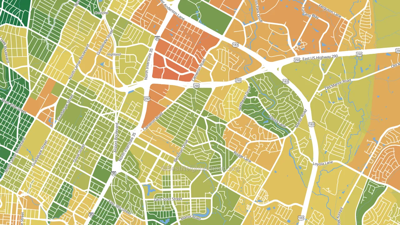
About 52% of adults in Windsor Park typically vote, below the U.S. average of about 62%. Among adults in Windsor Park, ~41% vote Democratic, ~11% Republican, and ~48% don't vote. The map below shows estimated turnout by block group.
How Windsor Park compares
Among neighborhoods within 5 miles, Windsor Park leans more Democratic than 15 of 33 neighbors.
Windsor Park runs about 73 points more Democratic than Texas as a whole. Texas leans Republican overall, while Windsor Park is one of the few Democratic-leaning pockets.
Why Windsor Park leans the way it does
This analysis examined 14,881 data points per neighborhood to find what predicts political lean and turnout. The items below are a few correlations that stood out for Windsor Park, not a ranked or complete list of what matters most.
Windsor Park votes against the grain of Texas. Texas leans Republican overall, while Windsor Park runs about 73 points more Democratic.
Population density and Democratic lean
Places with high population density tend to lean Democratic; Windsor Park, Austin, TX sits in the top quarter nationally on this measure.
Why turnout in Windsor Park looks the way it does
Areas with limited routine healthcare access turn out at lower rates. Windsor Park is in the bottom quarter nationally for routine-care measures such as insurance coverage, preventive screenings, and dental visits. Renters vote less often than owners, and about 64% of households in Windsor Park rent, about 39 points above the U.S. average of 25%. Learn more about the findings and methodology on the political spectrum map.
Nearby Neighborhoods
Neighborhoods with Similar Populations
- Broadmeadow Brook, Worcester, MA D+25
- Mineral Springs-Rumble Road, Charlotte, NC D+62
- Petosky-Otsego, Detroit, MI D+86
- Hillsboro West End, Nashville, TN D+45
- Walker, Maywood, CA D+39
- Southside, Easton, PA D+29
- Victoria, Riverside, CA D+3
- Wright Area, Santa Rosa, CA D+29
- Rossmoyne, Glendale, CA D+13
- Richmond, Lehigh Acres, FL R+11
Sources and methodology
Precinct-level voting records used to fit the model come from Texas Secretary of State, Elections Division, distributed by the Voting and Election Science Team. Demographic inputs come from the U.S. Census Bureau (ACS 5-year estimates and the 2020 Decennial Census). Health and environmental inputs come from the CDC (PLACES and the Environmental Justice Index). Land cover comes from the USGS and EPA. Election-day and lead-up weather come from PRISM 4km daily grids and the NOAA Global Historical Climatology Network. Mail-voting and election-administration patterns come from the MIT Election Lab's Survey of the Performance of American Elections. Block-group crime detail comes from CrimeGrade. Internet data and modeling support provided by ISPreports.org.
Modeling and analysis by the BestNeighborhood data science team. Full methodology and findings: political spectrum map.
Methodology reviewed by the BestNeighborhood data team. Last updated May 2026.