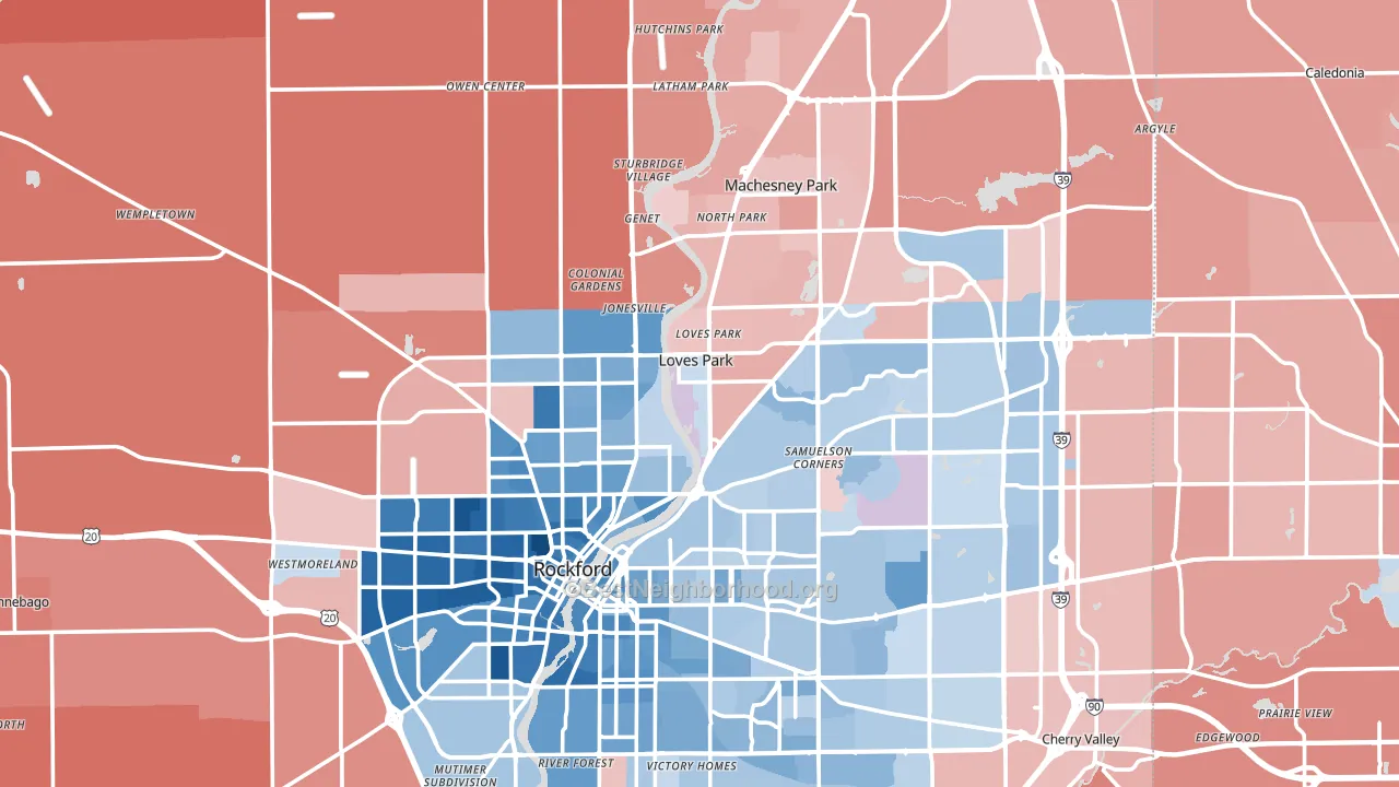
Winnebago County leans slightly Democratic by roughly 8 points: about 54% of voters vote Democratic and 46% Republican.
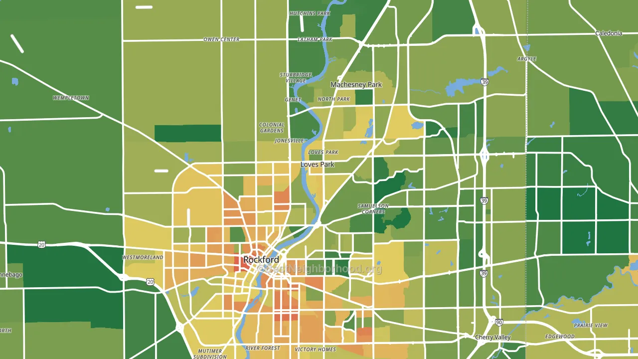
About 68% of adults in Winnebago County typically vote, above the U.S. average of about 62%. Among adults in Winnebago County, ~37% vote Democratic, ~31% Republican, and ~32% don't vote. The map below shows estimated turnout by block group.
How Winnebago County compares
Among counties within 50 miles, Winnebago County leans more Democratic than 10 of 11 neighbors.
Politically, Winnebago County sits close to the rest of Illinois.
Politics vary noticeably by city within Winnebago County. The west side runs the most Democratic (D+32) and the northwest side runs the most Republican (R+22), a spread of about 54 points.
Why Winnebago County leans the way it does
This analysis examined 14,881 data points per county to find what predicts political lean and turnout. The items below are a few correlations that stood out for Winnebago County, not a ranked or complete list of what matters most.
Dense areas vote Democratic. About 80% of residents in Winnebago County live in densely developed areas, about 43 points above the U.S. average of 36%. A high never-married share predicts Democratic voting, and about 34% of adults in Winnebago County have never been married, above 82% of counties.
Paved land cover and Democratic lean
Places with extensive paved surfaces tend to lean Democratic; Winnebago County, IL sits in the top tenth nationally on this measure. Paved ground does not change how people vote; it mostly reflects how urban and built-up a place is.
Why turnout in Winnebago County looks the way it does
Turnout in Winnebago County sits close to the national pattern. Routine healthcare access, homeownership, education, and food security all land near their national averages here. Learn more about the findings and methodology on the political spectrum map.
Nearby Counties
- Boone County, IL R+15
- Ogle County, IL R+28
- Rock County, WI Even
- Stephenson County, IL R+14
- DeKalb County, IL D+3
- Walworth County, WI R+17
- McHenry County, IL R+5
- Green County, WI R+11
- Lee County, IL R+21
- Kane County, IL D+13
Counties with Similar Populations
- Ingham County, MI D+31
- Benton County, AR R+26
- Dauphin County, PA D+12
- San Luis Obispo County, CA D+8
- York County, SC R+17
- Merced County, CA R+3
- Anchorage Municipality, AK D+20
- Leon County, FL D+26
- Alachua County, FL D+22
- Lexington County, SC R+30
Sources and methodology
Precinct-level voting records used to fit the model come from Illinois State Board of Elections, distributed by the Voting and Election Science Team. Demographic inputs come from the U.S. Census Bureau (ACS 5-year estimates and the 2020 Decennial Census). Health and environmental inputs come from the CDC (PLACES and the Environmental Justice Index). Land cover comes from the USGS and EPA. Election-day and lead-up weather come from PRISM 4km daily grids and the NOAA Global Historical Climatology Network. Mail-voting and election-administration patterns come from the MIT Election Lab's Survey of the Performance of American Elections. Block-group crime detail comes from CrimeGrade. Internet data and modeling support provided by ISPreports.org.
Modeling and analysis by the BestNeighborhood data science team. Full methodology and findings: political spectrum map.
Methodology reviewed by the BestNeighborhood data team. Last updated May 2026.