Yonkers leans Democratic by roughly 24 points: about 62% of voters vote Democratic and 38% Republican.
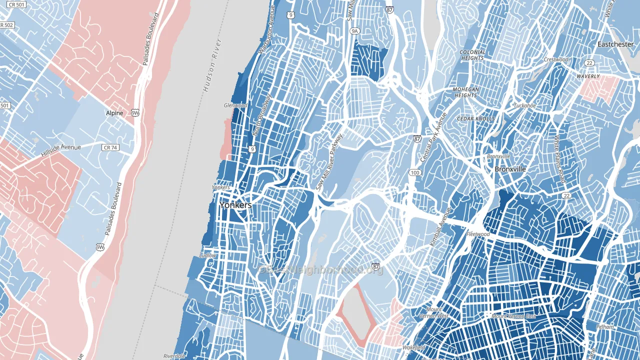
About 50% of adults in Yonkers typically vote, below the U.S. average of about 62%. Among adults in Yonkers, ~31% vote Democratic, ~19% Republican, and ~50% don't vote. The map below shows estimated turnout by block group.
How Yonkers compares
Among cities within 25 miles, Yonkers leans more Democratic than 255 of 321 neighbors.
Yonkers runs about 12 points more Democratic than New York as a whole.
Politics vary noticeably by neighborhood within Yonkers. The west side runs the most Democratic (D+44) and the east side runs the most Republican (Even), a spread of about 45 points.
Why Yonkers leans the way it does
This analysis examined 14,881 data points per city to find what predicts political lean and turnout. The items below are a few correlations that stood out for Yonkers, not a ranked or complete list of what matters most.
Dense areas vote Democratic. About 96% of residents in Yonkers live in densely developed areas, about 60 points above the U.S. average of 36%. High college attainment predicts Democratic voting, and Yonkers sits in the top quarter (about 32%, above 77% of cities). A high never-married share predicts Democratic voting, and about 40% of adults in Yonkers have never been married, above 93% of cities.
Paved land cover and Democratic lean
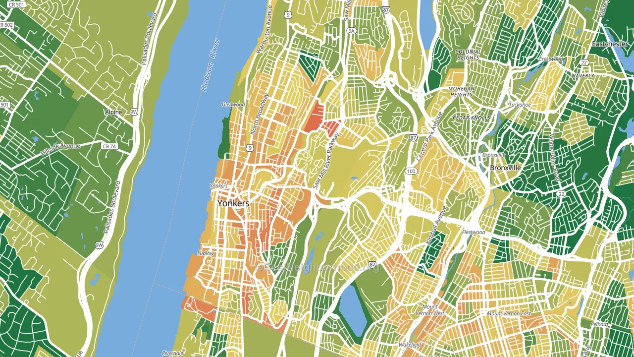
Places with extensive paved surfaces tend to lean Democratic; Yonkers, NY sits in the top tenth nationally on this measure. Paved ground does not change how people vote; it mostly reflects how urban and built-up a place is.
Why turnout in Yonkers looks the way it does
Areas with limited routine healthcare access turn out at lower rates. Yonkers is in the bottom quarter nationally for routine-care measures such as insurance coverage, preventive screenings, and dental visits. Renters vote less often than owners, and about 57% of households in Yonkers rent, compared to around 25% in nearby cities. High food insecurity lines up with lower turnout, and about 24% of adults in Yonkers report food insecurity, above 89% of cities. Learn more about the findings and methodology on the political spectrum map.
Nearby Cities
- Bronxville, NY D+26
- Mount Vernon, NY D+69
- Tuckahoe, NY D+13
- Alpine, NJ Even
- Hastings-on-Hudson, NY D+51
- Pelham, NY D+42
- Eastchester, NY D+9
- DeMarest, NJ D+15
- Cresskill, NJ Even
- Tenafly, NJ D+26
Cities with Similar Populations
- Clarksville, TN R+11
- Savannah, GA D+38
- Fort Lauderdale, FL D+23
- Oceanside, CA D+9
- Salem, OR D+13
- Lancaster, CA D+14
- Huntington Beach, CA R+4
- Cape Coral, FL R+29
- Kissimmee, FL D+3
- Alafaya, FL D+4
Sources and methodology
Precinct-level voting records used to fit the model come from New York State Board of Elections, distributed by the Voting and Election Science Team. Demographic inputs come from the U.S. Census Bureau (ACS 5-year estimates and the 2020 Decennial Census). Health and environmental inputs come from the CDC (PLACES and the Environmental Justice Index). Land cover comes from the USGS and EPA. Election-day and lead-up weather come from PRISM 4km daily grids and the NOAA Global Historical Climatology Network. Mail-voting and election-administration patterns come from the MIT Election Lab's Survey of the Performance of American Elections. Block-group crime detail comes from CrimeGrade. Internet data and modeling support provided by ISPreports.org.
Modeling and analysis by the BestNeighborhood data science team. Full methodology and findings: political spectrum map.
Methodology reviewed by the BestNeighborhood data team. Last updated May 2026.