
Population 1,011 · Census ACS 2020–24
Choose a measure to map it.Tap a measure to map it. Swipe the row for more. Arrows show the change since 2006–10.
Median age by neighborhoodHistory and comparison ↓︎
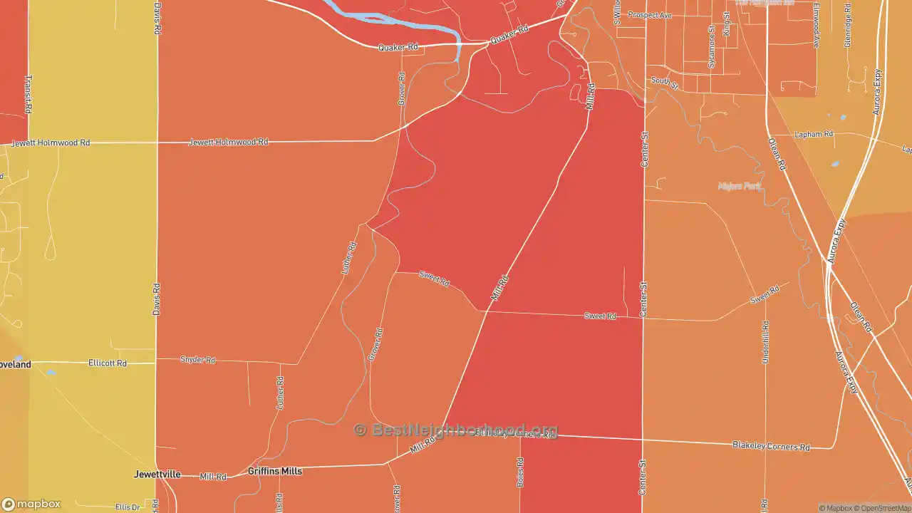
Younger residents
Older residents
Colorblind friendly
off
More maps of Taylorshire: Best Neighborhoods · Walk Grade · Household income · Home prices · Race · Politics · Traffic noise · Internet
Population and households in Taylorshire
Household size in Taylorshire
| Period | Taylorshire | Buffalo area | New York | U.S. |
|---|---|---|---|---|
| 2006–10 | 2.35 | 2.41 | 2.68 | 2.68 |
| 2010–14 | 2.58 | 2.39 | 2.72 | 2.73 |
| 2015–19 | 2.47 | 2.33 | 2.69 | 2.71 |
| 2020–24 | 2.58 | 2.33 | 2.65 | 2.65 |
| Change | +0.22 | −0.08 | −0.03 | −0.03 |
At 2.58 people per household, Taylorshire sits close to the national average of 2.65. The typical household here is bigger than in the Buffalo area overall, where it has 2.33 people. Household size has climbed from 2.35 in 2006–10, but in a place this small, survey estimates can swing a lot from one release to the next.
Household size: the average number of people living in each occupied home. Source: BestNeighborhood calculations from U.S. Census Bureau ACS 5-year block-group estimates (table B25010).
Median age in Taylorshire
| Period | Taylorshire | Buffalo area | New York | U.S. |
|---|---|---|---|---|
| 2006–10 | 44.9 | 40.4 | 38.3 | 37.7 |
| 2010–14 | 41.5 | 41.2 | 39.0 | 38.6 |
| 2015–19 | 47.3 | 41.9 | 40.2 | 39.6 |
| 2020–24 | 45.9 | 42.0 | 40.8 | 40.1 |
| Change | +1.0 | +1.6 | +2.5 | +2.3 |
With a median age of 45.9, Taylorshire is noticeably older than the country as a whole (40.1), an age mix that tilts toward empty nesters and retirees.
Median age: the age that splits residents into two equal halves. Source: BestNeighborhood calculations from U.S. Census Bureau ACS 5-year block-group estimates (table B01002).
Single-parent households in Taylorshire
| Period | Taylorshire | Buffalo area | New York | U.S. |
|---|---|---|---|---|
| 2006–10 | 4.1% | 11.7% | 13.1% | 12.3% |
| 2010–14 | 10.3% | 12.1% | 12.7% | 12.3% |
| 2015–19 | 5.0% | 11.2% | 11.6% | 11.6% |
| 2020–24 | 8.7% | 11.5% | 11.6% | 11.6% |
| Change | +4.6 pts | −0.2 pts | −1.5 pts | −0.6 pts |
Single-parent households are less common in Taylorshire than nationally: 8.7%, against 11.6%.
Single-parent households: households where one adult with no spouse present lives with children under 18. Source: BestNeighborhood calculations from U.S. Census Bureau ACS 5-year block-group estimates (table B11003).
Housing in Taylorshire
Renters in Taylorshire
| Period | Taylorshire | Buffalo area | New York | U.S. |
|---|---|---|---|---|
| 2006–10 | 21.0% | 32.9% | 44.8% | 33.3% |
| 2010–14 | 18.1% | 33.8% | 46.2% | 35.6% |
| 2015–19 | 24.0% | 34.3% | 46.2% | 36.0% |
| 2020–24 | 18.5% | 33.2% | 45.7% | 34.8% |
| Change | −2.5 pts | +0.3 pts | +0.9 pts | +1.5 pts |
Taylorshire is largely a place of homeowners: only 18.5% of households rent, far below the national share of 34.8%. Owner-heavy areas like this tend to see less turnover. About a third of owners (32.7%) have paid off their mortgages, below the national share of 39.8%.
Renters: occupied homes that are rented rather than owned. Source: BestNeighborhood calculations from U.S. Census Bureau ACS 5-year block-group estimates (table B25003).
Vacant homes in Taylorshire
| Period | Taylorshire | Buffalo area | New York | U.S. |
|---|---|---|---|---|
| 2006–10 | 4.7% | 10.6% | 10.3% | 11.4% |
| 2010–14 | 3.1% | 10.3% | 10.4% | 11.4% |
| 2015–19 | 6.7% | 10.0% | 11.0% | 11.1% |
| 2020–24 | 9.1% | 8.4% | 9.7% | 9.6% |
| Change | +4.3 pts | −2.2 pts | −0.6 pts | −1.8 pts |
Vacancy in Taylorshire is close to the national rate: 9.1% of homes are empty, against 9.6%.
Vacant homes: homes with no one living in them, including vacation homes and homes for sale or rent. Source: BestNeighborhood calculations from U.S. Census Bureau ACS 5-year block-group estimates (table B25002).
Age of homes in Taylorshire
| Period | Taylorshire | Buffalo area | New York | U.S. |
|---|---|---|---|---|
| 2006–10 | 1965 | 1957 | 1956 | 1974 |
| 2010–14 | 1963 | 1958 | 1957 | 1975 |
| 2015–19 | 1972 | 1958 | 1958 | 1977 |
| 2020–24 | 1983 | 1960 | 1961 | 1980 |
| Change | +17 | +3 | +5 | +6 |
Homes in Taylorshire are about the same age as the nation's housing: the median home was built in 1983, versus 1980 nationally. Homes here are newer than in the Buffalo area as a whole, where the median home dates to 1960.
Age of homes: the year that splits the housing stock into older and newer halves. Source: BestNeighborhood calculations from U.S. Census Bureau ACS 5-year block-group estimates (table B25035).
Rent in Taylorshire
| Period | Taylorshire | Buffalo area | New York | U.S. |
|---|---|---|---|---|
| 2006–10 | $777 | $728 | $1,095 | $965 |
| 2010–14 | $750 | $783 | $1,201 | $1,040 |
| 2015–19 | $791 | $873 | $1,426 | $1,213 |
| 2020–24 | $997 | $1,126 | $1,794 | $1,571 |
| Change | +$220 | +$398 | +$698 | +$606 |
Rent in Taylorshire runs $997 a month at the median, utilities included, well below the U.S. median of $1,571. The typical renter here spends 24.5% of household income on rent, comfortably under the 30% mark often used to define affordable rent, and a smaller share than renters pay nationally.
Rent: monthly rent plus the utilities renters pay themselves. Source: BestNeighborhood calculations from U.S. Census Bureau ACS 5-year block-group estimates (table B25064).
Education in Taylorshire
Bachelor's degrees in Taylorshire
| Period | Taylorshire | Buffalo area | New York | U.S. |
|---|---|---|---|---|
| 2006–10 | 31.5% | 27.6% | 31.9% | 28.4% |
| 2010–14 | 44.0% | 29.6% | 33.4% | 29.6% |
| 2015–19 | 44.9% | 32.3% | 36.2% | 32.1% |
| 2020–24 | 41.3% | 35.6% | 39.8% | 35.6% |
| Change | +9.8 pts | +8.0 pts | +8.0 pts | +7.2 pts |
Just over four in ten adults 25 and older in Taylorshire (41.3%) have a bachelor's degree or higher, a bit above the national share of 35.6%.
Bachelor's degrees: adults 25 and older with a bachelor's degree or higher. Source: BestNeighborhood calculations from U.S. Census Bureau ACS 5-year block-group estimates (table B15003).
High school graduates in Taylorshire
| Period | Taylorshire | Buffalo area | New York | U.S. |
|---|---|---|---|---|
| 2006–10 | 92.6% | 88.2% | 84.0% | 84.9% |
| 2010–14 | 94.7% | 89.8% | 84.9% | 86.1% |
| 2015–19 | 98.1% | 91.2% | 86.5% | 87.7% |
| 2020–24 | 91.7% | 91.9% | 87.3% | 89.3% |
| Change | −0.9 pts | +3.7 pts | +3.3 pts | +4.3 pts |
High school completion in Taylorshire is a bit above the national rate: 91.7% of adults have a diploma or equivalent, against 89.3%. The Buffalo area as a whole looks much the same.
High school graduates: adults 25 and older with a high school diploma, GED or more. Source: BestNeighborhood calculations from U.S. Census Bureau ACS 5-year block-group estimates (table B15003).
Jobs in Taylorshire
| Period | Taylorshire | Buffalo area | New York | U.S. |
|---|---|---|---|---|
| 2006–10 | 3.8% | 8.0% | 7.7% | 8.1% |
| 2010–14 | 4.1% | 8.5% | 9.2% | 9.4% |
| 2015–19 | 3.5% | 4.8% | 5.7% | 5.6% |
| 2020–24 | 7.4% | 5.4% | 6.6% | 5.4% |
| Change | +3.6 pts | −2.6 pts | −1.2 pts | −2.7 pts |
Unemployment runs high in Taylorshire: 7.4% of the labor force was out of work and looking, against 5.4% nationally. Each figure pools five years of surveys (2020–24), so it describes that whole stretch rather than today's job market.
Unemployment: people looking for work as a share of everyone working or looking. Source: BestNeighborhood calculations from U.S. Census Bureau ACS 5-year block-group estimates (table B23025).
Taylorshire compared with nearby cities
| City | Household size | Median age | Single parents | Renters | Vacant homes | Median year built | Median rent | Bachelor's degree | High school diploma | Unemployment |
|---|---|---|---|---|---|---|---|---|---|---|
| Taylorshire | 2.58 | 45.9 | 8.7% | 18.5% | 9.1% | 1983 | $997 | 41.3% | 91.7% | 7.4% |
| East Aurora | 2.36 | 50.3 | 6.3% | 13.8% | 5.8% | 1961 | $1,071 | 47.3% | 96.7% | 3.9% |
| West Falls | 2.54 | 49.1 | 5.4% | 9.8% | 11.7% | 1969 | $871 | 38.8% | 95.7% | 2.4% |
| South Wales | 2.50 | 46.0 | 6.7% | 8.3% | 3.4% | 1969 | $1,001 | 32.1% | 96.4% | 2.7% |
| Orchard Park | 2.35 | 48.0 | 5.8% | 26.6% | 4.4% | 1976 | $1,371 | 52.4% | 97.6% | 4.2% |
| Colden | 2.24 | 42.9 | 7.1% | 44.3% | 4.5% | 1973 | $1,241 | 38.5% | 98.4% | 3.1% |
| Elma | 2.57 | 44.3 | 7.3% | 12.2% | 4.8% | 1972 | $1,168 | 44.2% | 97.6% | 5.0% |
| Wales Hollow | 2.48 | 49.2 | 0.7% | 13.5% | 3.4% | 1964 | $950 | 25.2% | 97.0% | 0.6% |
| Marilla | 2.63 | 45.7 | 2.1% | 6.7% | 6.6% | 1972 | $974 | 38.1% | 94.8% | 2.4% |
| Holland | 2.24 | 50.8 | 7.6% | 12.8% | 6.4% | 1968 | $811 | 23.1% | 94.0% | 3.7% |
| West Seneca | 2.27 | 44.5 | 8.8% | 23.2% | 6.6% | 1966 | $1,074 | 34.4% | 94.5% | 4.7% |
All figures 2020–24.
Cities with similar populations: Stewart, MS · Green City, MO · Guilderland Center, NY · Hanover, CT · Hanover, WV · Hartstown, PA · Henderson, MO · Hilshire Village, TX · Spraggs, PA · St. Thomas, MO
About these numbers
Every figure on this page is a BestNeighborhood calculation from the Census Bureau's American Community Survey (ACS), built up from the Census block groups that make up Taylorshire. Each ACS 5-year release pools five years of responses; this page shows the last 15 releases, 2006–10 through 2020–24. Neighboring releases share four of their five years, so they move gradually and small changes between them are within the survey's margin of error; in small places the lines can jump from one release to the next for the same reason. The maps show the same measures for each neighborhood, ranked against the whole country.
No other site shows detail at this level for free. We are able to keep this site free by receiving a small commission from the referring links on this page. Please share or cite this page if you aren’t able to otherwise support our work.