
Best Neighborhoods in Phoenix, AZ
2026–2027 edition · Data updated July 2026
Every neighborhood in the Phoenix metro, scored on 40 measures of daily life and ranked to fit what matters to you. The averages hide a wide spread here, so the area matters as much as the address. To work out which city fits you best, start with the best places to live tool.
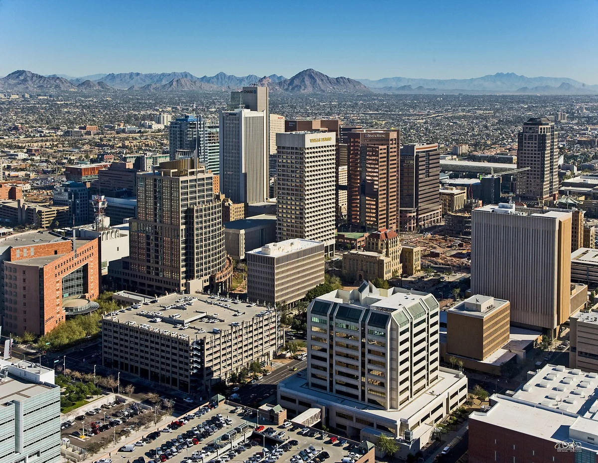
Photo by DPPed, CC BY-SA 3.0, via commons
Phoenix ranks 105th of 387 U.S. metro areas on the BestNeighborhood index, and 1st of 7 Arizona metro areas. Paychecks stretch further here than almost anywhere else: the median household brings in $98,466, everyday costs sit below the national average, and a strong job market ranks near the top of the country. The main drawbacks are air quality, summer heat, and long commutes.
Show off this ranking with the free Best Places to Live badge for your site.
Map of the best neighborhoods in the Phoenix metro
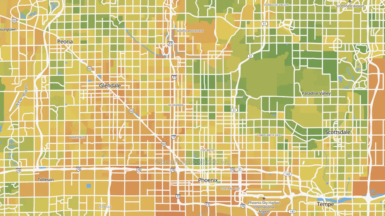
BestNeighborhood is the only ranking that scores 40 measures of daily life neighborhood by neighborhood and lets you re-weight every one of them yourself.
The best areas in Phoenix
The towns and districts of the Phoenix metro, ranked by the BestNeighborhood standard score across every neighborhood in each, highest scoring first. Each note says how that part differs from the rest of the metro.
Chandler
More adults hold degrees, local pay stretches further, and incomes run higher.
Gilbert, San Tan Valley & Queen Creek
More households have young kids and more residents vote.
Fountain Hills
Health care is easier to reach, though more homes sit empty.
Downtown Phoenix
Homes cost more.
Mesa
Schools score higher, though heat risk is higher.
Glendale, Peoria & Surprise
Scores close to Mesa, except that commutes are longer here.
Perryville & Gila Bend
Biking is worse and streets are more car-dependent.
Tempe
Transit reaches more jobs, though crime runs higher.
Avondale, Goodyear & Buckeye
Scores close to Tempe, except that prices have run up less here.
Phoenix shows why a single number is not enough. Some neighborhoods score in the bottom 1% of the country and others in the top 1%. Pick the area first, then the home.
Phoenix's strengths and weaknesses
Phoenix lands in the middle because its strengths and weaknesses roughly balance. The weather, cell coverage, and a strong job market carry most of that.
The one real hole is air quality, near the bottom of the country. Summer heat and long commutes also cost it ground. That varies block to block rather than evenly, and the map below shows where.
Where Phoenix ranks high
- Nice weatherabout 189 pleasant days a year, better than 96% of metro areas
- Cell coverageBetter than 99% of metro areas
- Local economyBetter than 92% of metro areas
- Disaster safetyBetter than 91% of metro areas
- Cost of living vs incomeBetter than 81% of metro areas
Where Phoenix ranks low
- Air qualityBetter than only 2% of metro areas
- Heat safetyBetter than only 4% of metro areas
- Short commute26.4 minutes each way, better than only 17% of metro areas
- QuietBetter than only 17% of metro areas
- Healthcare accessBetter than only 27% of metro areas
What it costs to buy a home in Phoenix
A household needs to earn about $119,000 a year to comfortably buy the median Phoenix home, at 20% down and today's 30-year rate. That runs well above the area's median income of $98,466, so buying stretches a typical household.
Where the monthly payment goes
Assumes a 20% down payment, a 6.7% 30-year fixed rate, and a 28% share of income going to the payment. The rate is the 2026-08-20 30-year fixed average, series MORTGAGE30US from the St. Louis Fed, which publishes Freddie Mac's weekly survey. Against the median home value, property tax uses Phoenix's effective rate of 0.45%, and insurance is estimated at 0.4% of home value a year.
Renting versus buying
At today's prices, buying tends to cost more than renting for about the first 9 years, then pulls ahead as rent keeps rising and the mortgage builds equity. The chart tracks the running cost of each.
Who lives in Phoenix
Phoenix's age mix sits close to the national median.
Residents by age
Racial and ethnic makeup has its own map. See the race and diversity map for Phoenix.
Who works in Phoenix, and how
Work in Phoenix centers on health care & social and retail trade. Unemployment is close to the national rate, and jobs are growing.
Largest industries
How people get to work
- Drive or carpool 75%
- Work from home 21%
- Transit, walk, or bike 5%
Life in Phoenix
Phoenix has fewer places to eat and drink per resident than most metro areas. That concentrates in some parts of Phoenix and thins out in others, which the map shows.
Is Phoenix growing, and who is moving in?
Phoenix has grown about 16% over the last decade. The largest inbound stream comes from Los Angeles, CA.
Where new residents come from
Where people leaving Phoenix go
Move counts are the latest county-to-county migration flows, each county grouped into its metro.
What the weather is like in Phoenix, month by month
Phoenix sees roughly 189 pleasant days a year. July highs average about 110 degrees. January highs sit near 69, with lows near 44. The comfortable stretch runs November through March.
Show the monthly temperatures
| Month | Avg high | Avg | Avg low |
|---|---|---|---|
| January | 69° | 56° | 44° |
| April | 90° | 76° | 61° |
| July | 110° | 98° | 85° |
| October | 92° | 78° | 65° |
Flying in and out of Phoenix
Phoenix Sky Harbor International sits about 8 miles away. It is a large hub and boarded 25.2 million passengers in 2025, with 177 nonstop destinations.
The best schools in and around Phoenix
Schools across Phoenix average a C+, better than 49% of metro areas.
Top elementary schools
- Basis Chandler Primary - North CampusA+ · 92% proficient
- Knox Gifted AcademyA+ · 91% proficient
- Weinberg Gifted AcademyA+ · 89% proficient
Top middle schools
- Arizona College Prep Middle SchoolA+ · 87% proficient
- Franklin Junior High SchoolA+ · 79% proficient
- Cocopah Middle SchoolA+ · 65% proficient
Top high schools
- Basis ChandlerA+ · 85% proficient
- Basis PhoenixA+ · 85% proficient
- University High SchoolA+ · 85% proficient
Grades come from K-12 test scores, with scores projected for schools missing data. See every Phoenix school and its grade on SchoolGrade.
Phoenix measure by measure
Cards are ordered by how much each measure matters to you, so the ones you weighted highest come first. Expand to see every measure. Percentages compare Phoenix against the other 386 metro areas.
Who Phoenix suits
Remote workers
Cost of living against local pay beats 81% of metro areas and 21% already work from home.
Common questions about living in Phoenix
Is Phoenix a good place to live?
Using BestNeighborhood's default rankings, Phoenix ranks 105th of 387 metro areas, and 1st of 7 Arizona metro areas. It scores highest on the weather, cell coverage, and a strong job market, and lowest on air quality and summer heat. How good it is for you depends on which of those you weight most, which the map lets you set.
Is Phoenix expensive to live in?
The median home is worth $473,772. The overall cost of living runs about 1% below the national average. Set against a $98,466 median income, cost of living beats 81% of metro areas.
Is Phoenix safe?
Phoenix is safer than 40% of metro areas. Safety varies a lot by neighborhood. Crime costs an estimated $385 per resident a year.
What is the weather like in Phoenix?
July highs average about 110 degrees, and January highs near 69 with lows near 44. That works out to about 189 pleasant days a year, more than 96% of metro areas.
What are the best neighborhoods in Phoenix?
Using the default rankings, the highest-scoring areas are Chandler, Gilbert, San Tan Valley & Queen Creek, and Fountain Hills. The ranked list and the re-weightable map above let you re-sort them for your own priorities.
Is Phoenix good for families?
Schools beat 49% of metro areas, crime safety beats 40%, and childcare runs $1,087 a month.
Is Phoenix good for remote workers?
Cost of living against local pay beats 81% of metro areas, though advertised internet speeds beat only 46% of metro areas. About 21% of workers already work from home.
Compare Phoenix with other metro areas
Sources and methodology
Every measure on this page is scored for each neighborhood, then rolled up to Phoenix. Scores are absolute rather than ranked, which means a 60 in Phoenix represents the same real quantity as a 60 anywhere else, and the ranking is a weighted average of those absolutes. The map colors come from a national scale calibrated against a population weighted random sample of 5,000 neighborhoods. That absolute scoring is what no other places-to-live ranking does: it puts a single neighborhood, a town, a metro, and a state on one scale, so the same 40 measures answer both which metro to move to and which street inside it to buy on. Read the full methodology.
Phoenix detail on BestNeighborhood maps:
- Walk Grade for Phoenix: walkability, transit, and biking, measured on the real street network rather than by straight line distance.
- Noise in Phoenix: road, rail, and aviation sound modeling calibrated against federal ground truth measurements.
- Conservative vs liberal map of Phoenix: precinct level election results apportioned to neighborhoods.
- Mobile and cell coverage in Phoenix: carrier by carrier coverage behind the cell score.
Phoenix detail on related sites:
- CrimeGrade: neighborhood crime rates behind the crime safety score.
- ISPreports.org: provider by provider internet availability and advertised speeds.
- CoverageWatch: the car insurance premiums behind the cheap car insurance score.
Federal and public data:
- U.S. Census Bureau American Community Survey: income, home value, rent, vacancy, commute time and mode, educational attainment, home age, age structure, household type, industry, and race.
- U.S. Census Bureau Population Estimates Program: population growth and net migration behind the population-change section.
- NOAA Global Surface Summary of the Day: the daily station record behind the monthly temperatures and the pleasant-day count.
- FAA Passenger Boarding Data: airport size and annual passenger counts.
- Freddie Mac Primary Mortgage Market Survey: the 30-year fixed rate used in the cost-to-buy estimate.
- FBI Crime Data Explorer: reported offenses behind the tangible crime cost estimate.
- U.S. EPA Air Quality System: five year average air quality index.
- FEMA National Risk Index: expected annual loss from natural hazards.
- CDC PLACES: disease burden, preventable risk, and barriers to care.
- National Center for Education Statistics: school enrollment and assessment inputs behind the school grade.
- FCC National Broadband Map: internet and wireless availability.
- U.S. Bureau of Labor Statistics: employment and job growth behind the local economy score.
- Religious activity uses a proprietary religious signal measurement.
Your priorities
Move a slider to say how much a measure matters. Zero turns it off.