Atwater Village is a Democratic stronghold. About 76% of voters here vote Democratic and 24% Republican.
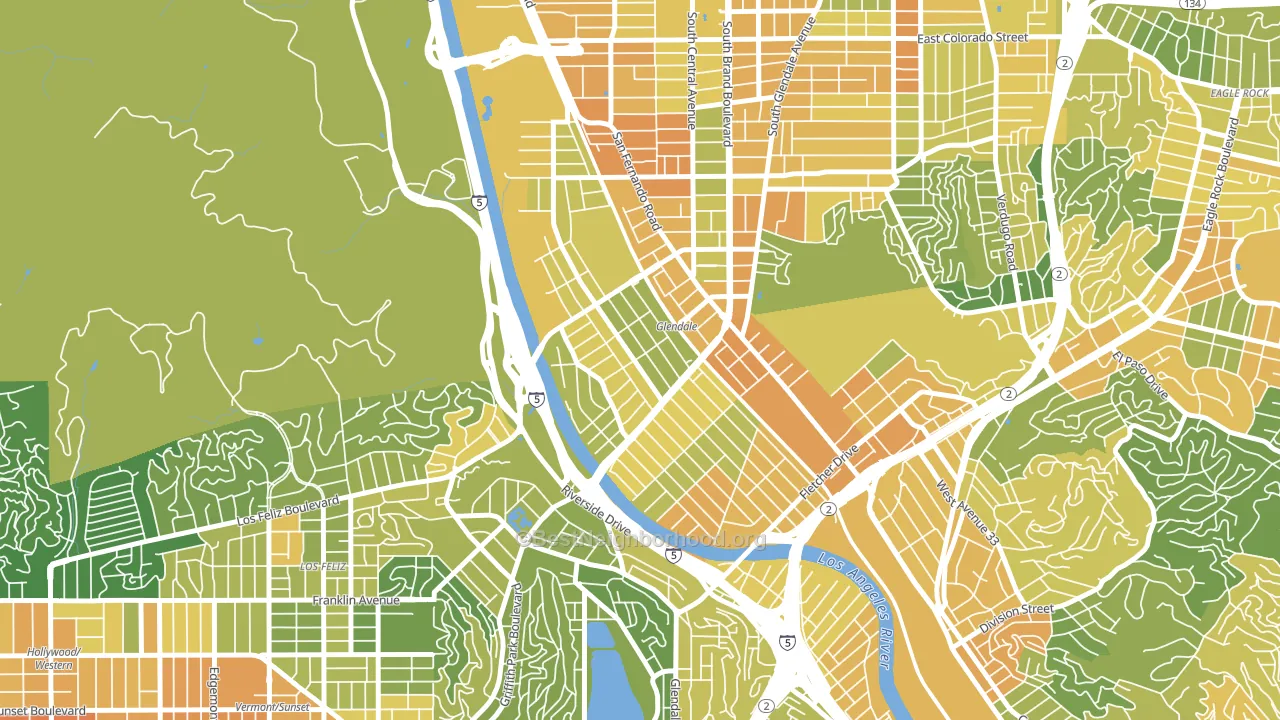
About 52% of adults in Atwater Village typically vote, below the U.S. average of about 62%. Among adults in Atwater Village, ~40% vote Democratic, ~12% Republican, and ~48% don't vote. The map below shows estimated turnout by block group.
How Atwater Village compares
Among neighborhoods within 5 miles, Atwater Village leans more Democratic than 30 of 36 neighbors.
Atwater Village runs about 33 points more Democratic than California as a whole.
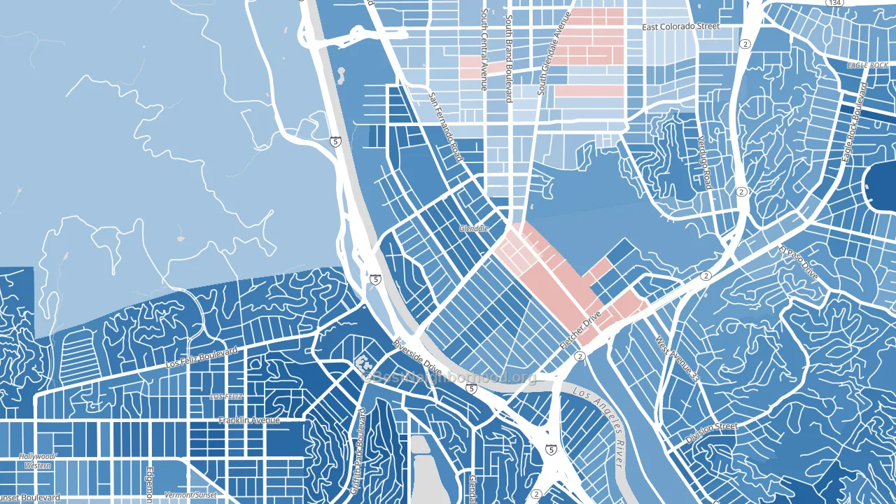
Politics vary noticeably by block within Atwater Village. The northwest side is the most Democratic-leaning (D+59) and the southeast side is the least Democratic-leaning (D+42), a spread of about 17 points.
Why Atwater Village leans the way it does
Density, race composition, education, and family structure all sit close to their national averages in Atwater Village. The lean here lands roughly where demographic data alone would predict.
Paved land cover and Democratic lean
Places with extensive paved surfaces tend to lean Democratic; Atwater Village, Los Angeles, CA sits in the top tenth nationally on this measure. Paved ground does not change how people vote; it mostly reflects how urban and built-up a place is.
Why turnout in Atwater Village looks the way it does
Crowded housing lines up with lower turnout. About 11% of homes in Atwater Village have more than one occupant per room, above 93% of neighborhoods. Renters vote less often than owners, and about 65% of households in Atwater Village rent, about 40 points above the U.S. average of 25%. Learn more about the findings and methodology on the political spectrum map.
Nearby Neighborhoods
- Tropico, Glendale, CA D+18
- Pacific Edison, Glendale, CA D+18
- Adams Hill, Glendale, CA D+25
- Mariposa, Glendale, CA D+9
- Los Feliz, Los Angeles, CA D+64
- Glassell Park, Los Angeles, CA D+48
- Vineyard-Los Angeles, Glendale, CA D+18
- Somerset, Glendale, CA D+23
- City Center, Glendale, CA D+18
- Citrus Grove, Glendale, CA D+5
Neighborhoods with Similar Populations
- Darlington, Pawtucket, RI D+22
- South End, Burlington, VT D+68
- Otay Mesa West, San Diego, CA D+20
- East Oak Hill, Austin, TX D+41
- Hyannis, Barnstable Town, MA D+18
- Gold Coast, Alameda, CA D+64
- East Cambridge, Cambridge, MA D+65
- Hollywood Riviera, Redondo Beach, CA D+25
- Georgetown, Savannah, GA D+16
- South Lake Union, Seattle, WA D+57
Sources and methodology
Precinct-level voting records used to fit the model come from California Secretary of State, Elections, distributed by the Voting and Election Science Team. Demographic inputs come from the U.S. Census Bureau (ACS 5-year estimates and the 2020 Decennial Census). Health and environmental inputs come from the CDC (PLACES and the Environmental Justice Index). Land cover comes from the USGS and EPA. Election-day and lead-up weather come from PRISM 4km daily grids and the NOAA Global Historical Climatology Network. Mail-voting and election-administration patterns come from the MIT Election Lab's Survey of the Performance of American Elections. Block-group crime detail comes from CrimeGrade. Internet data and modeling support provided by ISPreports.org.
Modeling and analysis by the BestNeighborhood data science team. Full methodology and findings: political spectrum map.
Methodology reviewed by the BestNeighborhood data team. Last updated May 2026.