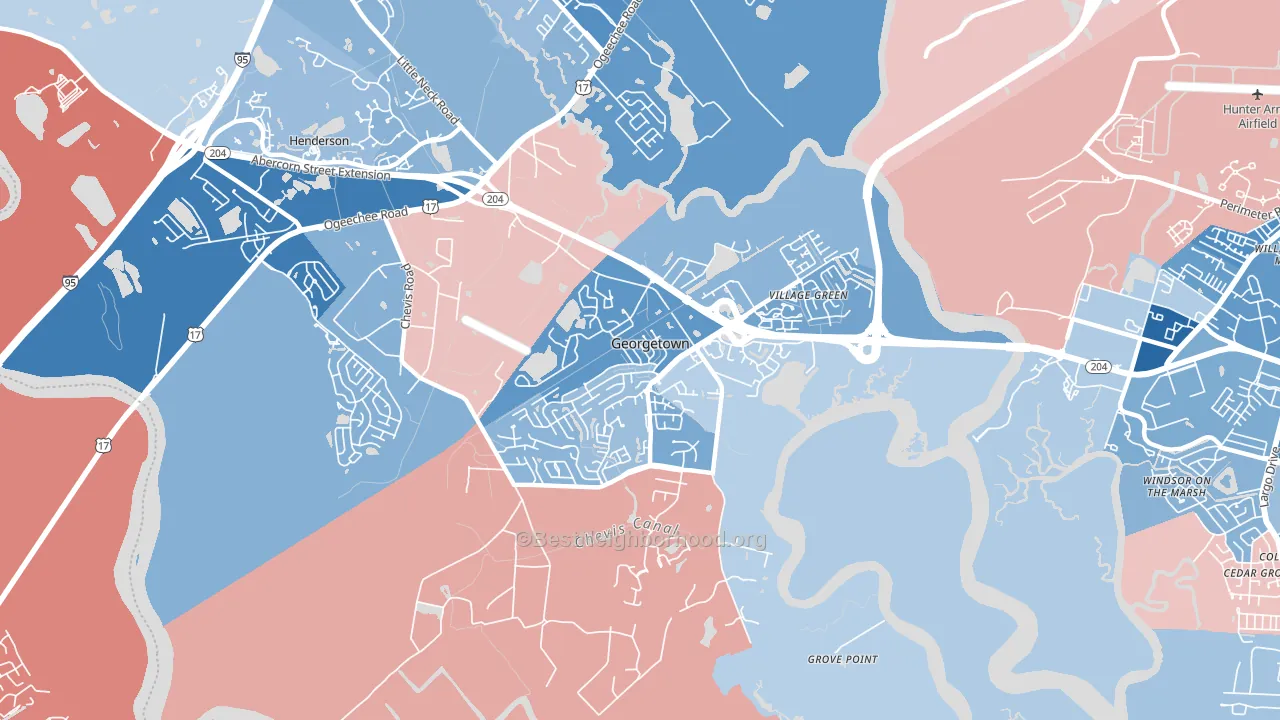
Georgetown leans Democratic by roughly 16 points: about 58% of voters vote Democratic and 42% Republican.
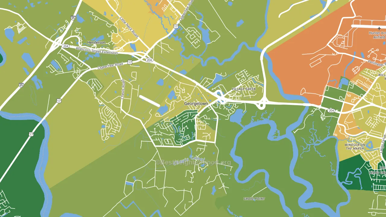
About 67% of adults in Georgetown typically vote, near the U.S. average of about 62%. Among adults in Georgetown, ~39% vote Democratic, ~28% Republican, and ~33% don't vote. The map below shows estimated turnout by block group.
How Georgetown compares
Georgetown sits in a sparsely populated area with few comparable neighborhoods nearby.
Georgetown runs about 18 points more Democratic than Georgia as a whole. Georgia is roughly evenly split, and Georgetown sits clearly on the Democratic side.
Politics vary noticeably by block within Georgetown. The east side is the most Democratic-leaning (D+20) and the northwest side is the least Democratic-leaning (D+2), a spread of about 18 points.
Why Georgetown leans the way it does
This analysis examined 14,881 data points per neighborhood to find what predicts political lean and turnout. The items below are a few correlations that stood out for Georgetown, not a ranked or complete list of what matters most.
Rural, majority-Black areas of the Southern Black Belt vote Democratic, against the usual rural pattern. About 44% of residents in Georgetown are Black or African American, about 20 points above the Georgia average of 25%. Georgetown runs against the grain of Georgia, a Democratic-leaning outlier in a roughly evenly split state.
Paved land cover and Republican lean
Places with little paved surface tend to lean Republican; Georgetown, Savannah, GA sits in the bottom quarter nationally on this measure. Paved ground does not change how people vote; it mostly reflects how urban and built-up a place is.
Why turnout in Georgetown looks the way it does
Turnout in Georgetown sits close to the national pattern. Routine healthcare access, homeownership, education, and food security all land near their national averages here. Learn more about the findings and methodology on the political spectrum map.
Nearby Neighborhoods
- Wilshire Estates-Savannah Mall, Savannah, GA D+43
- Windsor Forest, Savannah, GA D+24
- Hunter Army Airfield, Savannah, GA D+4
- Paradise Park, Savannah, GA D+29
- Chatham Parkway, Savannah, GA D+42
- Ardmore-Gould Estates-Olin Heights, Savannah, GA D+36
- Midtown Savannah, Savannah, GA D+71
- Boltons Landing, Charleston, SC D+7
- White Gables, Summerville, SC R+27
- Charleston Historic District, Charleston, SC D+12
Neighborhoods with Similar Populations
- Hollywood Riviera, Redondo Beach, CA D+25
- Gold Coast, Alameda, CA D+64
- Otay Mesa West, San Diego, CA D+20
- Detroit Shoreway, Cleveland, OH D+50
- Atwater Village, Los Angeles, CA D+53
- Darlington, Pawtucket, RI D+22
- St. Lucie West, Port St. Lucie, FL R+18
- South End, Burlington, VT D+68
- Springwells, Detroit, MI D+29
- East Oak Hill, Austin, TX D+41
Sources and methodology
Precinct-level voting records used to fit the model come from Georgia Elections Division, distributed by the Voting and Election Science Team. Demographic inputs come from the U.S. Census Bureau (ACS 5-year estimates and the 2020 Decennial Census). Health and environmental inputs come from the CDC (PLACES and the Environmental Justice Index). Land cover comes from the USGS and EPA. Election-day and lead-up weather come from PRISM 4km daily grids and the NOAA Global Historical Climatology Network. Mail-voting and election-administration patterns come from the MIT Election Lab's Survey of the Performance of American Elections. Block-group crime detail comes from CrimeGrade. Internet data and modeling support provided by ISPreports.org.
Modeling and analysis by the BestNeighborhood data science team. Full methodology and findings: political spectrum map.
Methodology reviewed by the BestNeighborhood data team. Last updated May 2026.