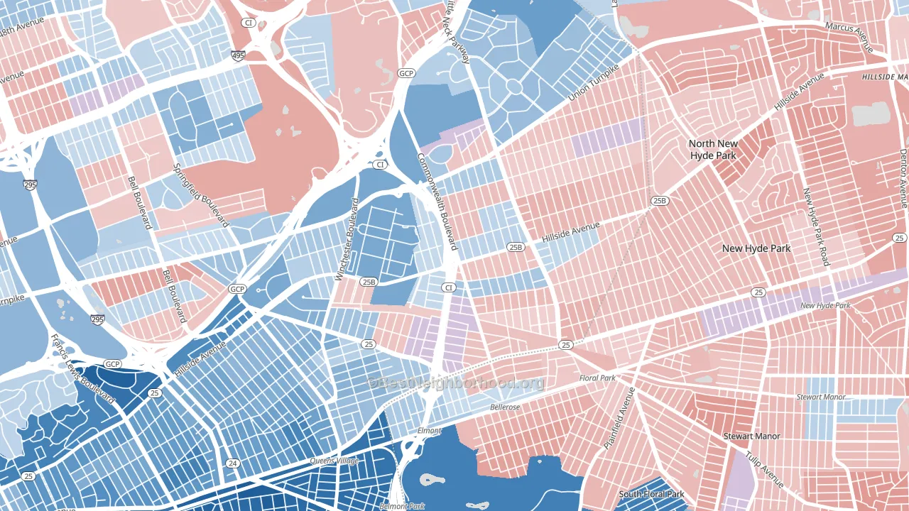
Bellerose leans slightly Democratic by roughly 8 points: about 54% of voters vote Democratic and 46% Republican.
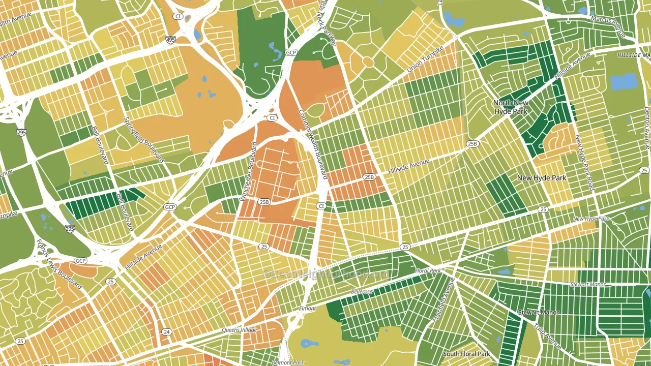
About 49% of adults in Bellerose typically vote, below the U.S. average of about 62%. Among adults in Bellerose, ~26% vote Democratic, ~23% Republican, and ~51% don't vote. The map below shows estimated turnout by block group.
How Bellerose compares
Among neighborhoods within 5 miles, Bellerose leans more Democratic than 5 of 16 neighbors.
Bellerose runs about 5 points more Republican than New York as a whole.
Politics vary noticeably by block within Bellerose. The northwest side is the most Democratic-leaning (D+15) and the east side is the least Democratic-leaning (D+2), a spread of about 13 points.
Why Bellerose leans the way it does
Density, race composition, education, and family structure all sit close to their national averages in Bellerose. The lean here lands roughly where demographic data alone would predict.
Walkability and Democratic lean
Places with a highly walkable street grid tend to lean Democratic; Bellerose, Queens, NY sits in the top quarter nationally on this measure. A walkable street grid does not change how people vote; it mostly reflects how urban a place is.
Why turnout in Bellerose looks the way it does
Crowded housing lines up with lower turnout. About 8% of homes in Bellerose have more than one occupant per room, above 88% of neighborhoods. Learn more about the findings and methodology on the political spectrum map.
Nearby Neighborhoods
- Glen Oaks, Queens, NY D+8
- Queens Village, Queens, NY D+50
- Douglaston-Little Neck, Queens, NY D+3
- Oakland Gardens, Queens, NY Even
- Hollis, Queens, NY D+49
- University Gardens, Great Neck, NY D+10
- Bayside, Queens, NY D+9
- Cambria Heights, Queens, NY D+84
- St Albans, Queens, NY D+78
- Fresh Meadows, Queens, NY D+5
Neighborhoods with Similar Populations
- Jefferson, Cleveland, OH D+23
- South Southwest, San Antonio, TX D+21
- Upper Clinton Hill, Newark, NJ D+80
- Brooklyn Heights, Brooklyn, NY D+75
- Tampa Palms, Tampa, FL D+16
- Merrlam Park, St. Paul, MN D+65
- City Heights West, San Diego, CA D+41
- Chatham, Chicago, IL D+85
- North Sutton Area, Manhattan, NY D+55
- Greenwood, Brooklyn, NY D+62
Sources and methodology
Precinct-level voting records used to fit the model come from New York State Board of Elections, distributed by the Voting and Election Science Team. Demographic inputs come from the U.S. Census Bureau (ACS 5-year estimates and the 2020 Decennial Census). Health and environmental inputs come from the CDC (PLACES and the Environmental Justice Index). Land cover comes from the USGS and EPA. Election-day and lead-up weather come from PRISM 4km daily grids and the NOAA Global Historical Climatology Network. Mail-voting and election-administration patterns come from the MIT Election Lab's Survey of the Performance of American Elections. Block-group crime detail comes from CrimeGrade. Internet data and modeling support provided by ISPreports.org.
Modeling and analysis by the BestNeighborhood data science team. Full methodology and findings: political spectrum map.
Methodology reviewed by the BestNeighborhood data team. Last updated May 2026.