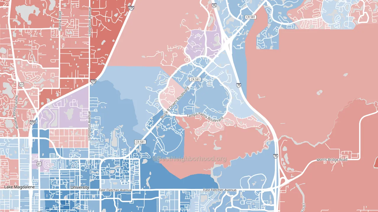
Tampa Palms leans Democratic by roughly 16 points: about 58% of voters vote Democratic and 42% Republican.
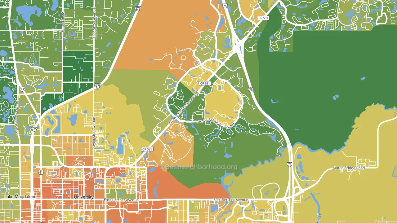
About 59% of adults in Tampa Palms typically vote, near the U.S. average of about 62%. Among adults in Tampa Palms, ~34% vote Democratic, ~25% Republican, and ~41% don't vote. The map below shows estimated turnout by block group.
How Tampa Palms compares
Among neighborhoods within 5 miles, Tampa Palms leans more Democratic than 2 of 5 neighbors.
Tampa Palms runs about 29 points more Democratic than Florida as a whole. Florida leans Republican overall, while Tampa Palms is one of the few Democratic-leaning pockets.
Politics vary noticeably by block within Tampa Palms. The southwest side runs the most Democratic (D+43) and the east side runs the most Republican (R+4), a spread of about 47 points.
Why Tampa Palms leans the way it does
This analysis examined 14,881 data points per neighborhood to find what predicts political lean and turnout. The items below are a few correlations that stood out for Tampa Palms, not a ranked or complete list of what matters most.
Areas with high college attainment vote Democratic. About 63% of adults in Tampa Palms hold a bachelor's degree, about 34 points above the U.S. average of 28%. Tampa Palms runs against the grain of Florida, a Democratic-leaning pocket in a Republican-leaning state.
Homeownership and voter turnout
Places with renter-heavy households tend to turn out at a lower rate; Tampa Palms, Tampa, FL sits in the bottom quarter nationally on this measure.
Why turnout in Tampa Palms looks the way it does
Turnout in Tampa Palms sits close to the national pattern. Routine healthcare access, homeownership, education, and food security all land near their national averages here. Learn more about the findings and methodology on the political spectrum map.
Nearby Neighborhoods
- Temple Park, Tampa, FL D+27
- Cross Fletcher, University, FL D+35
- West Meadows, Tampa, FL D+15
- Hunters Green, Tampa, FL D+9
- University Square, Tampa, FL D+36
- North Tampa, Tampa, FL D+38
- Temple Crest, Tampa, FL D+48
- Cory Lake Isles, Tampa, FL Even
- Sulphur Springs, Tampa, FL D+43
- Forest Hills, Tampa, FL R+8
Neighborhoods with Similar Populations
- City Heights West, San Diego, CA D+41
- North Sutton Area, Manhattan, NY D+55
- Upper Clinton Hill, Newark, NJ D+80
- Greenwood, Brooklyn, NY D+62
- Bellerose, Queens, NY D+7
- Jefferson, Cleveland, OH D+23
- South Southwest, San Antonio, TX D+21
- Brooklyn Heights, Brooklyn, NY D+75
- Park Hill, Denver, CO D+72
- Merrlam Park, St. Paul, MN D+65
Sources and methodology
Precinct-level voting records used to fit the model come from Florida Division of Elections, distributed by the Voting and Election Science Team. Demographic inputs come from the U.S. Census Bureau (ACS 5-year estimates and the 2020 Decennial Census). Health and environmental inputs come from the CDC (PLACES and the Environmental Justice Index). Land cover comes from the USGS and EPA. Election-day and lead-up weather come from PRISM 4km daily grids and the NOAA Global Historical Climatology Network. Mail-voting and election-administration patterns come from the MIT Election Lab's Survey of the Performance of American Elections. Block-group crime detail comes from CrimeGrade. Internet data and modeling support provided by ISPreports.org.
Modeling and analysis by the BestNeighborhood data science team. Full methodology and findings: political spectrum map.
Methodology reviewed by the BestNeighborhood data team. Last updated May 2026.