Brooklyn Heights is a Democratic stronghold. About 87% of voters here vote Democratic and 13% Republican.
[sc name="abovemapcta"]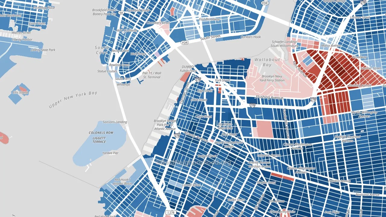 [bestneighborhood_map_controls]
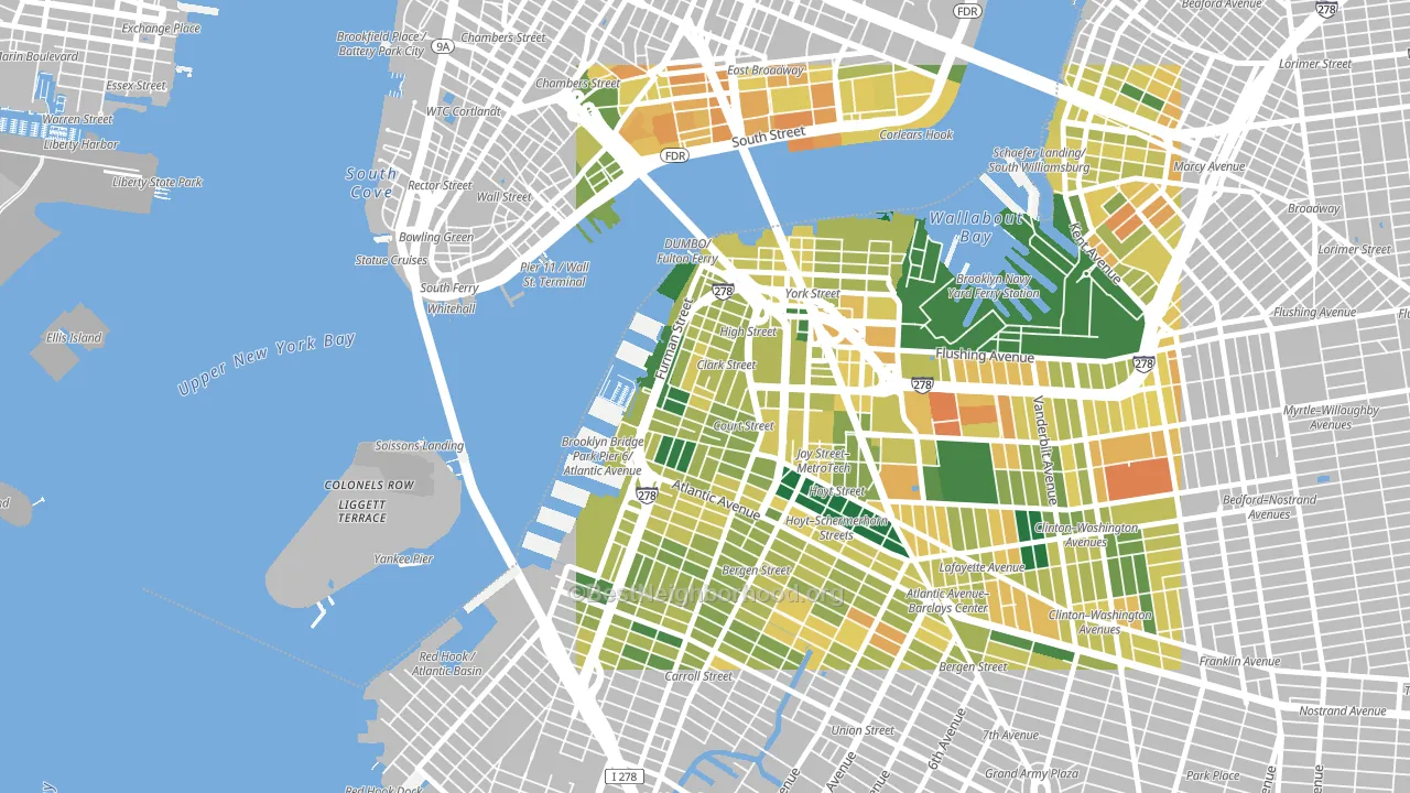
About 69% of adults in Brooklyn Heights typically vote, above the U.S. average of about 62%. Among adults in Brooklyn Heights, ~60% vote Democratic, ~9% Republican, and ~31% don't vote. The map below shows estimated turnout by block group.
 [bestneighborhood_map_controls]
How Brooklyn Heights compares
Among neighborhoods within 5 miles, Brooklyn Heights leans more Democratic than 38 of 50 neighbors.
Brooklyn Heights runs about 62 points more Democratic than New York as a whole.
Why Brooklyn Heights leans the way it does
This analysis examined 14,881 data points per neighborhood to find what predicts political lean and turnout. The items below are a few correlations that stood out for Brooklyn Heights, not a ranked or complete list of what matters most.
Dense areas vote Democratic. More than 99% of residents in Brooklyn Heights live in densely developed areas, about 64 points above the U.S. average of 36%. High college attainment predicts Democratic voting, and Brooklyn Heights sits in the top quarter (about 85%, in the top fraction of neighborhoods).
Preventive-care access and voter turnout
Places with strong routine preventive-care access tend to turn out at a higher rate; Brooklyn Heights, Brooklyn, NY sits in the top tenth nationally on this measure. Dental visits do not drive turnout; the rate reflects income, insurance, and healthcare access, which line up with who votes.
Why turnout in Brooklyn Heights looks the way it does
Areas with strong routine healthcare access turn out at higher rates. Brooklyn Heights is in the top quarter nationally for routine-care measures such as insurance coverage, preventive screenings, and dental visits. The dental-visit rate here is about 75%, about 15 points above the U.S. average of 60%. Learn more about the findings and methodology on the political spectrum map.
[one_half]Nearby Neighborhoods
- Dumbo, Brooklyn, NY D+76
- Cobble Hill, Brooklyn, NY D+79
- Downtown Brooklyn, Brooklyn, NY D+79
- Columbia Street Waterfront District, Brooklyn, NY D+78
- Boerum Hill, Brooklyn, NY D+77
- Financial District, Manhattan, NY D+58
- Carroll Gardens, Brooklyn, NY D+74
- Chinatown, Manhattan, NY D+41
- Lower East Side, Manhattan, NY D+47
- Red Hook, Brooklyn, NY D+62
Neighborhoods with Similar Populations
- South Southwest, San Antonio, TX D+21
- Jefferson, Cleveland, OH D+23
- Merrlam Park, St. Paul, MN D+65
- Chatham, Chicago, IL D+85
- Bellerose, Queens, NY D+7
- Alden Bridge, The Woodlands, TX R+24
- Westside, Santa Cruz, CA D+73
- Upper Clinton Hill, Newark, NJ D+80
- Park Forest-Louisiana North, Baton Rouge, LA D+45
- Southeast Yonkers, Yonkers, NY D+11
Sources and methodology
Precinct-level voting records used to fit the model come from New York State Board of Elections, distributed by the Voting and Election Science Team. Demographic inputs come from the U.S. Census Bureau (ACS 5-year estimates and the 2020 Decennial Census). Health and environmental inputs come from the CDC (PLACES and the Environmental Justice Index). Land cover comes from the USGS and EPA. Election-day and lead-up weather come from PRISM 4km daily grids and the NOAA Global Historical Climatology Network. Mail-voting and election-administration patterns come from the MIT Election Lab's Survey of the Performance of American Elections. Block-group crime detail comes from CrimeGrade. Internet data and modeling support provided by ISPreports.org.
Modeling and analysis by the BestNeighborhood data science team. Full methodology and findings: political spectrum map.
Methodology reviewed by the BestNeighborhood data team. Last updated May 2026.