Casey County is a Republican stronghold. About 14% of voters here vote Democratic and 86% Republican.
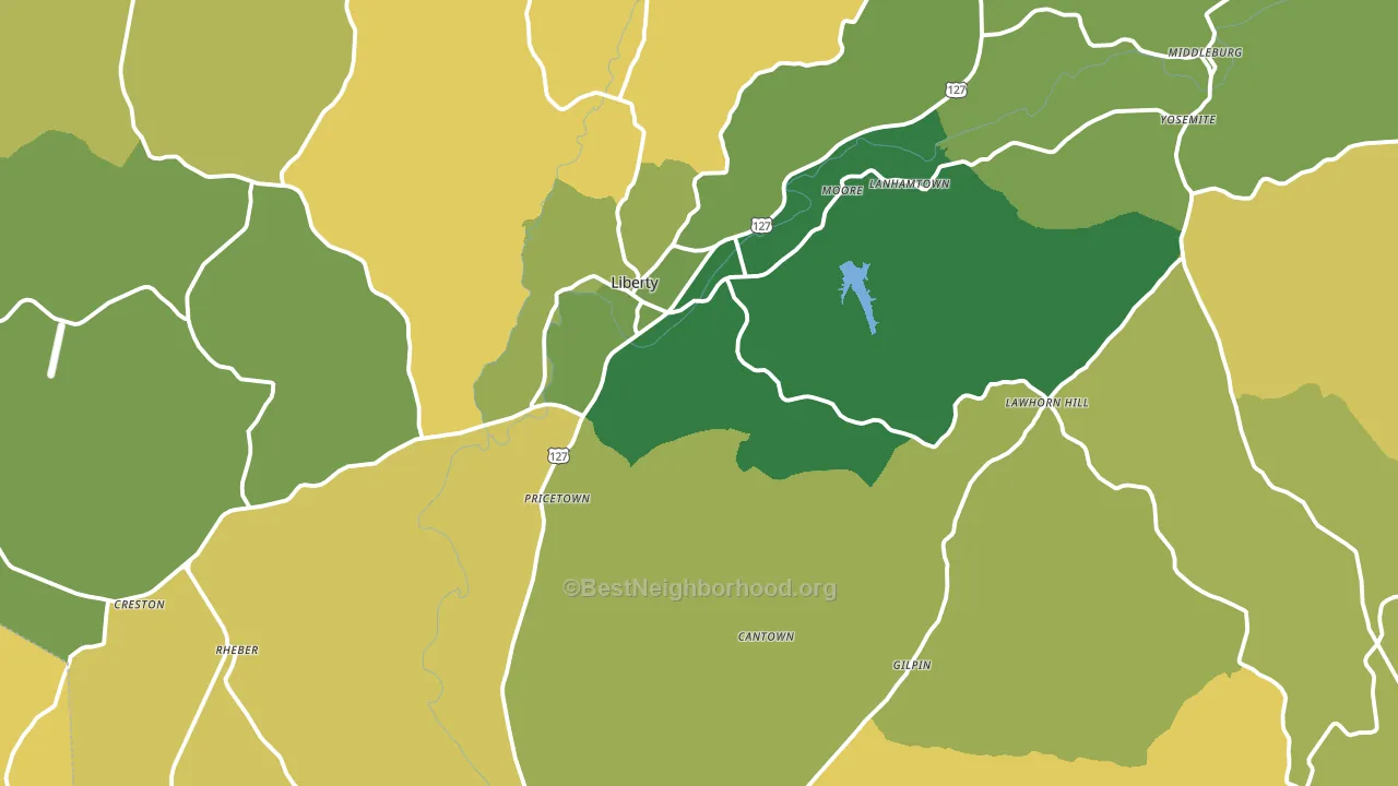
About 65% of adults in Casey County typically vote, near the U.S. average of about 62%. Among adults in Casey County, ~9% vote Democratic, ~56% Republican, and ~35% don't vote. The map below shows estimated turnout by block group.
How Casey County compares
Among counties within 50 miles, Casey County is the most Republican-leaning.
Casey County runs about 42 points more Republican than Kentucky as a whole.
Why Casey County leans the way it does
This analysis examined 14,881 data points per county to find what predicts political lean and turnout. The items below are a few correlations that stood out for Casey County, not a ranked or complete list of what matters most.
Areas with a high white share and below-average college attainment vote Republican. In Casey County, about 94% of residents are non-Hispanic white, about 21 points above the U.S. average of 72%; about 13% of adults hold a bachelor's degree, about 5 points below the Kentucky average of 19%. Rural areas vote Republican, and Casey County sits in the bottom quarter on density (about 9%, below 86% of counties).
Walkability and Republican lean
Places with a low walkability score tend to lean Republican; Casey County, KY sits in the bottom tenth nationally on this measure. A walkable street grid does not change how people vote; it mostly reflects how urban a place is.
Why turnout in Casey County looks the way it does
Areas with limited routine healthcare access turn out at lower rates. Casey County is in the bottom quarter nationally for routine-care measures such as insurance coverage, preventive screenings, and dental visits. The dental-visit rate here is about 49%, about 5 points below the Kentucky average of 54%. Learn more about the findings and methodology on the political spectrum map.
Nearby Counties
- Lincoln County, KY R+64
- Russell County, KY R+67
- Pulaski County, KY R+59
- Taylor County, KY R+50
- Adair County, KY R+62
- Boyle County, KY R+29
- Marion County, KY R+50
- Garrard County, KY R+59
- Rockcastle County, KY R+70
- Wayne County, KY R+65
Counties with Similar Populations
- Otoe County, NE R+39
- Neosho County, KS R+48
- Benton County, TN R+64
- Ashland County, WI Even
- Kanabec County, MN R+44
- Brunswick County, VA D+13
- Rockcastle County, KY R+70
- Bates County, MO R+60
- Sevier County, AR R+50
- Sequatchie County, TN R+68
Sources and methodology
Precinct-level voting records used to fit the model come from Kentucky State Board of Elections, distributed by the Voting and Election Science Team. Demographic inputs come from the U.S. Census Bureau (ACS 5-year estimates and the 2020 Decennial Census). Health and environmental inputs come from the CDC (PLACES and the Environmental Justice Index). Land cover comes from the USGS and EPA. Election-day and lead-up weather come from PRISM 4km daily grids and the NOAA Global Historical Climatology Network. Mail-voting and election-administration patterns come from the MIT Election Lab's Survey of the Performance of American Elections. Block-group crime detail comes from CrimeGrade. Internet data and modeling support provided by ISPreports.org.
Modeling and analysis by the BestNeighborhood data science team. Full methodology and findings: political spectrum map.
Methodology reviewed by the BestNeighborhood data team. Last updated May 2026.