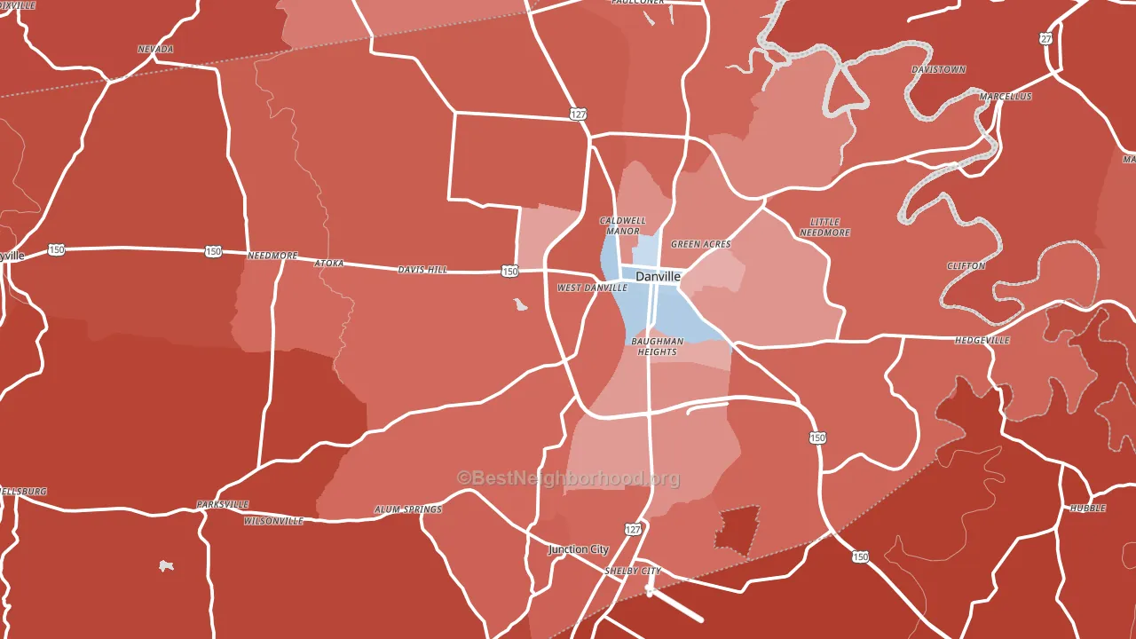
Boyle County leans Republican by roughly 30 points: about 35% of voters vote Democratic and 65% Republican.
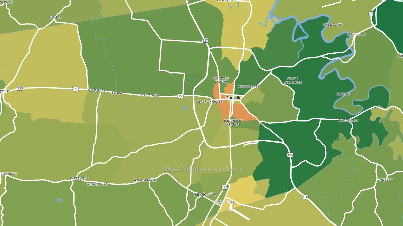
About 68% of adults in Boyle County typically vote, above the U.S. average of about 62%. Among adults in Boyle County, ~24% vote Democratic, ~44% Republican, and ~32% don't vote. The map below shows estimated turnout by block group.
How Boyle County compares
Among counties within 50 miles, Boyle County leans more Republican than 3 of 26 neighbors.
Politically, Boyle County sits close to the rest of Kentucky.
Politics vary noticeably by city within Boyle County. The southwest side is the most Republican-leaning (R+62) and the east side is the least Republican-leaning (R+14), a spread of about 48 points.
Why Boyle County leans the way it does
Density, race composition, education, and family structure all sit close to their national averages in Boyle County. The lean here lands roughly where demographic data alone would predict.
Walkability and Democratic lean
Places with a highly walkable street grid tend to lean Democratic; Boyle County, KY sits above the national average on this measure. A walkable street grid does not change how people vote; it mostly reflects how urban a place is.
Why turnout in Boyle County looks the way it does
Turnout in Boyle County sits close to the national pattern. Routine healthcare access, homeownership, education, and food security all land near their national averages here. Learn more about the findings and methodology on the political spectrum map.
Nearby Counties
- Mercer County, KY R+52
- Garrard County, KY R+59
- Lincoln County, KY R+64
- Jessamine County, KY R+35
- Washington County, KY R+58
- Casey County, KY R+72
- Marion County, KY R+50
- Anderson County, KY R+50
- Madison County, KY R+26
- Woodford County, KY R+29
Counties with Similar Populations
- Marshall County, WV R+50
- Hardin County, OH R+50
- Vernon County, WI R+19
- Trempealeau County, WI R+26
- Obion County, TN R+52
- Greene County, IN R+55
- McCurtain County, OK R+55
- Clare County, MI R+40
- Giles County, TN R+57
- Caroline County, VA R+15
Sources and methodology
Precinct-level voting records used to fit the model come from Kentucky State Board of Elections, distributed by the Voting and Election Science Team. Demographic inputs come from the U.S. Census Bureau (ACS 5-year estimates and the 2020 Decennial Census). Health and environmental inputs come from the CDC (PLACES and the Environmental Justice Index). Land cover comes from the USGS and EPA. Election-day and lead-up weather come from PRISM 4km daily grids and the NOAA Global Historical Climatology Network. Mail-voting and election-administration patterns come from the MIT Election Lab's Survey of the Performance of American Elections. Block-group crime detail comes from CrimeGrade. Internet data and modeling support provided by ISPreports.org.
Modeling and analysis by the BestNeighborhood data science team. Full methodology and findings: political spectrum map.
Methodology reviewed by the BestNeighborhood data team. Last updated May 2026.