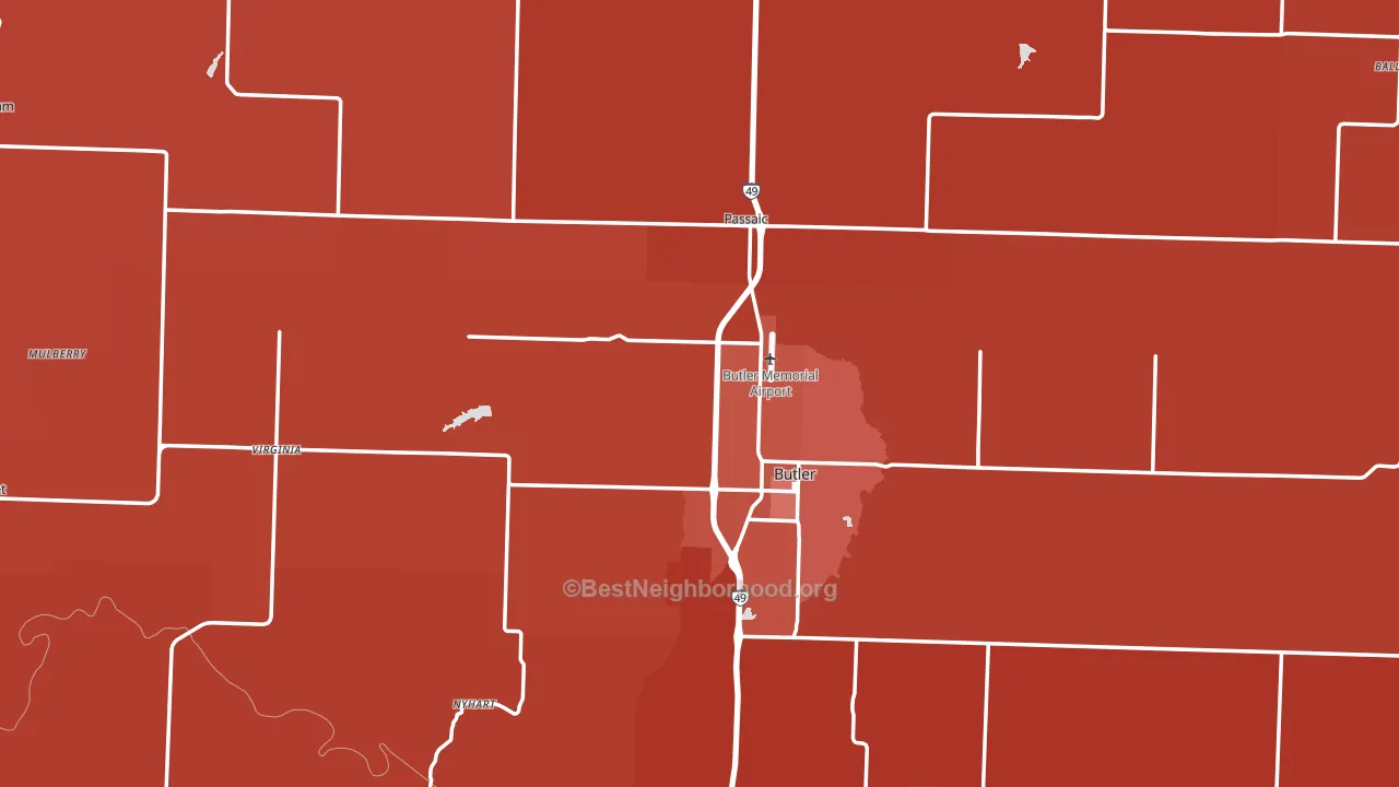
Bates County is a Republican stronghold. About 20% of voters here vote Democratic and 80% Republican.
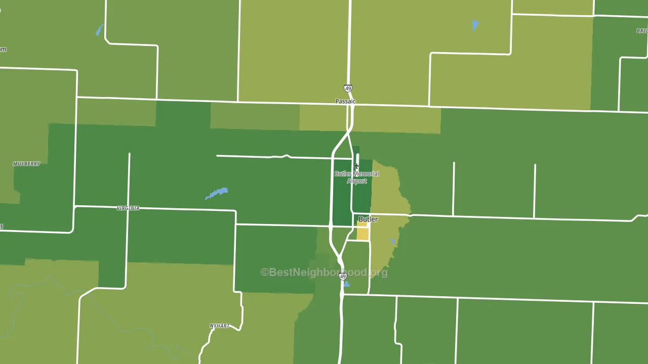
About 79% of adults in Bates County typically vote, above the U.S. average of about 62%. Among adults in Bates County, ~16% vote Democratic, ~63% Republican, and ~21% don't vote. The map below shows estimated turnout by block group.
How Bates County compares
Among counties within 50 miles, Bates County leans more Republican than 8 of 11 neighbors.
Bates County runs about 41 points more Republican than Missouri as a whole.
Politics vary noticeably by city within Bates County. The southeast side is the most Republican-leaning (R+71) and the south side is the least Republican-leaning (R+55), a spread of about 15 points.
Why Bates County leans the way it does
This analysis examined 14,881 data points per county to find what predicts political lean and turnout. The items below are a few correlations that stood out for Bates County, not a ranked or complete list of what matters most.
Areas with a high white share and below-average college attainment vote Republican. In Bates County, about 92% of residents are non-Hispanic white, about 20 points above the U.S. average of 72%; about 15% of adults hold a bachelor's degree, about 7 points below the Missouri average of 22%.
Frequent mental distress and voter turnout
Places with a low frequent-mental-distress rate tend to turn out at a higher rate; Bates County, MO sits in the bottom quarter nationally on this measure. Reported mental distress does not drive turnout; it reflects economic and health conditions tied to voting.
Why turnout in Bates County looks the way it does
Turnout in Bates County sits close to the national pattern. Routine healthcare access, homeownership, education, and food security all land near their national averages here. Learn more about the findings and methodology on the political spectrum map.
Nearby Counties
- Linn County, KS R+61
- Vernon County, MO R+56
- Cass County, MO R+32
- Miami County, KS R+39
- Henry County, MO R+54
- St. Clair County, MO R+64
- Bourbon County, KS R+48
- Cedar County, MO R+65
- Johnson County, MO R+35
- Anderson County, KS R+58
Counties with Similar Populations
- Rockcastle County, KY R+70
- Kanabec County, MN R+44
- Ashland County, WI Even
- Radford City, VA Even
- Trinity County, CA R+14
- Crawford County, WI R+26
- Appomattox County, VA R+44
- Casey County, KY R+72
- Union County, FL R+61
- Parke County, IN R+59
Sources and methodology
Precinct-level voting records used to fit the model come from Missouri Secretary of State, Elections, distributed by the Voting and Election Science Team. Demographic inputs come from the U.S. Census Bureau (ACS 5-year estimates and the 2020 Decennial Census). Health and environmental inputs come from the CDC (PLACES and the Environmental Justice Index). Land cover comes from the USGS and EPA. Election-day and lead-up weather come from PRISM 4km daily grids and the NOAA Global Historical Climatology Network. Mail-voting and election-administration patterns come from the MIT Election Lab's Survey of the Performance of American Elections. Block-group crime detail comes from CrimeGrade. Internet data and modeling support provided by ISPreports.org.
Modeling and analysis by the BestNeighborhood data science team. Full methodology and findings: political spectrum map.
Methodology reviewed by the BestNeighborhood data team. Last updated May 2026.