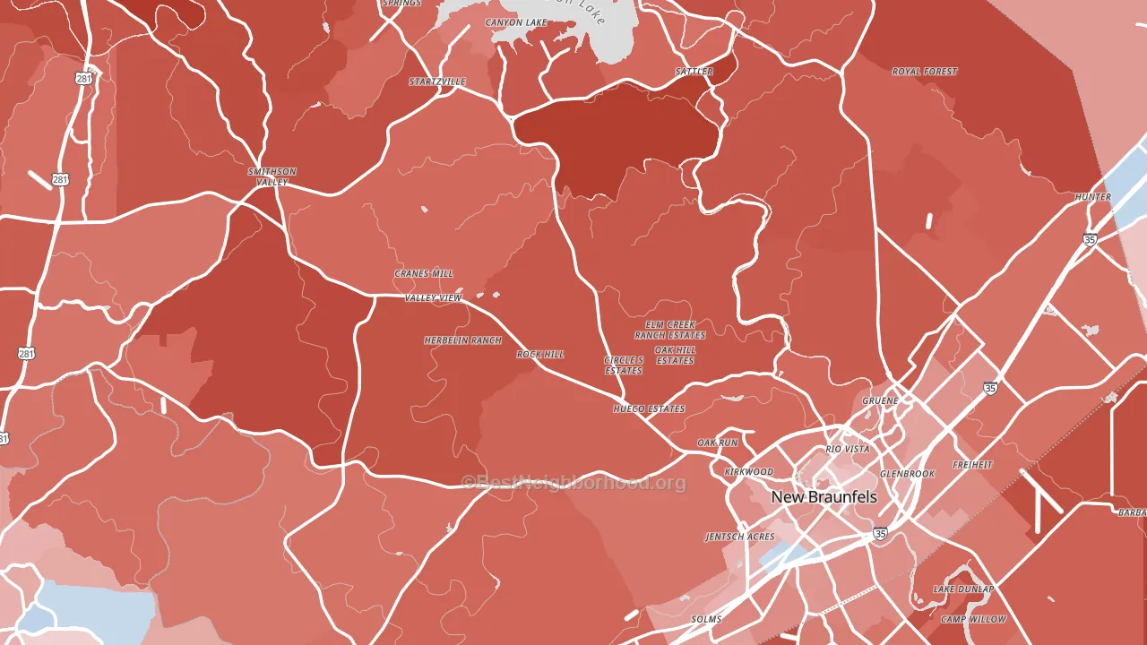
Comal County leans heavily Republican by roughly 36 points: about 32% of voters vote Democratic and 68% Republican.
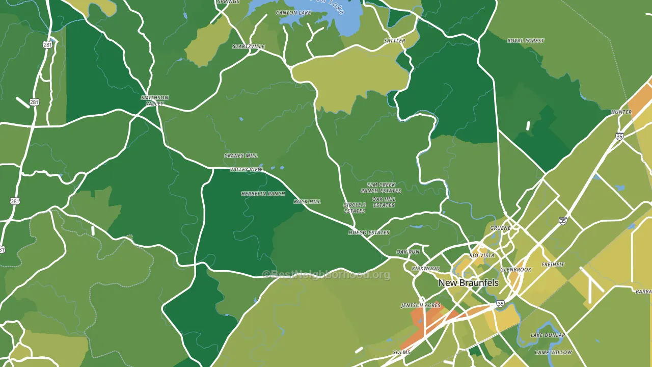
About 78% of adults in Comal County typically vote, above the U.S. average of about 62%. Among adults in Comal County, ~25% vote Democratic, ~53% Republican, and ~22% don't vote. The map below shows estimated turnout by block group.
How Comal County compares
Among counties within 50 miles, Comal County leans more Republican than 5 of 10 neighbors.
Comal County runs about 22 points more Republican than Texas as a whole.
Politics vary noticeably by city within Comal County. The north side is the most Republican-leaning (R+51) and the southeast side is the least Republican-leaning (R+19), a spread of about 32 points.
Why Comal County leans the way it does
This analysis examined 14,881 data points per county to find what predicts political lean and turnout. The items below are a few correlations that stood out for Comal County, not a ranked or complete list of what matters most.
Areas with many family households vote Republican. About 73% of households in Comal County are family households, about 6 points above the U.S. average of 67%.
Cholesterol-screening access and voter turnout
Places with high cholesterol-screening access tend to turn out at a higher rate; Comal County, TX sits in the top tenth nationally on this measure. Cholesterol screening does not drive turnout; it reflects income, insurance, and healthcare access.
Why turnout in Comal County looks the way it does
Areas with high high-school completion turn out at higher rates. About 94% of adults in Comal County have completed high school, about 9 points above the Texas average of 86%. Learn more about the findings and methodology on the political spectrum map.
Nearby Counties
- Guadalupe County, TX R+23
- Hays County, TX D+4
- Bexar County, TX D+14
- Kendall County, TX R+49
- Blanco County, TX R+53
- Caldwell County, TX R+17
- Wilson County, TX R+50
- Travis County, TX D+37
- Gonzales County, TX R+41
- Bandera County, TX R+59
Counties with Similar Populations
- Dorchester County, SC R+12
- Johnson County, IN R+35
- Portage County, OH R+12
- Rensselaer County, NY D+6
- Hampshire County, MA D+45
- Catawba County, NC R+33
- St. Clair County, MI R+31
- Ouachita Parish, LA R+13
- Jackson County, MI R+14
- Olmsted County, MN D+12
Sources and methodology
Precinct-level voting records used to fit the model come from Texas Secretary of State, Elections Division, distributed by the Voting and Election Science Team. Demographic inputs come from the U.S. Census Bureau (ACS 5-year estimates and the 2020 Decennial Census). Health and environmental inputs come from the CDC (PLACES and the Environmental Justice Index). Land cover comes from the USGS and EPA. Election-day and lead-up weather come from PRISM 4km daily grids and the NOAA Global Historical Climatology Network. Mail-voting and election-administration patterns come from the MIT Election Lab's Survey of the Performance of American Elections. Block-group crime detail comes from CrimeGrade. Internet data and modeling support provided by ISPreports.org.
Modeling and analysis by the BestNeighborhood data science team. Full methodology and findings: political spectrum map.
Methodology reviewed by the BestNeighborhood data team. Last updated May 2026.