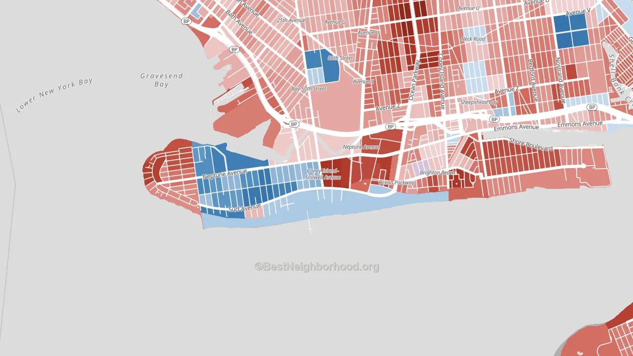
Coney Island leans Republican by roughly 18 points: about 41% of voters vote Democratic and 59% Republican.
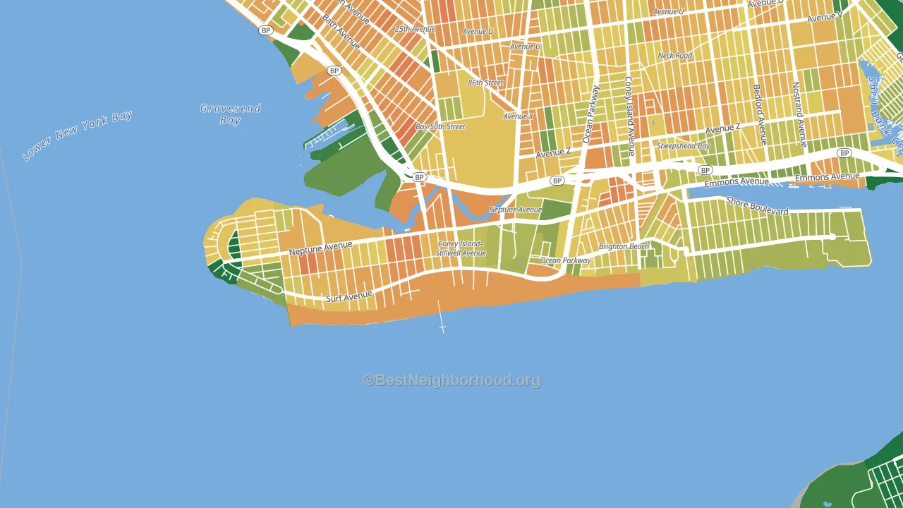
About 53% of adults in Coney Island typically vote, below the U.S. average of about 62%. Among adults in Coney Island, ~22% vote Democratic, ~31% Republican, and ~47% don't vote. The map below shows estimated turnout by block group.
How Coney Island compares
Among neighborhoods within 5 miles, Coney Island leans more Republican than 4 of 13 neighbors.
Coney Island runs about 31 points more Republican than New York as a whole. New York leans Democratic overall, while Coney Island is one of the few Republican-leaning pockets.
Politics vary noticeably by block within Coney Island. The west side runs the most Democratic (D+46) and the northeast side runs the most Republican (R+56), a spread of about 101 points.
Why Coney Island leans the way it does
This analysis examined 14,881 data points per neighborhood to find what predicts political lean and turnout. The items below are a few correlations that stood out for Coney Island, not a ranked or complete list of what matters most.
Coney Island votes against the grain of New York. New York leans Democratic overall, while Coney Island runs about 31 points more Republican.
Homeownership and voter turnout
Places with renter-heavy households tend to turn out at a lower rate; Coney Island, Brooklyn, NY sits in the bottom tenth nationally on this measure.
Why turnout in Coney Island looks the way it does
Renters vote less often than owners. About 77% of households in Coney Island rent, about 52 points above the U.S. average of 25%. Crowded housing lines up with lower turnout, and about 14% of homes in Coney Island have more than one occupant per room, above 95% of neighborhoods. Learn more about the findings and methodology on the political spectrum map.
Nearby Neighborhoods
- Brighton Beach, Brooklyn, NY R+40
- Gravesend-Sheepshead Bay, Brooklyn, NY R+29
- Manhattan Beach, Brooklyn, NY R+51
- Sheepshead Bay, Brooklyn, NY R+33
- Bensonhurst, Brooklyn, NY R+22
- Dyker Heights, Brooklyn, NY R+20
- Mapleton-Flatlands, Brooklyn, NY D+4
- Breezy Point, Queens, NY R+36
- Borough Park, Brooklyn, NY R+33
- Bay Ridge-Fort Hamilton, Brooklyn, NY D+9
Neighborhoods with Similar Populations
- Model City, Miami, FL D+60
- Arlington Heights, Fort Worth, TX D+9
- Garfield Ridge, Chicago, IL Even
- Clearview, Queens, NY Even
- Meadowview, Sacramento, CA D+39
- Rittenhouse Square, Philadelphia, PA D+67
- Ala Moana-Kakaako, Honolulu, HI D+31
- Constable Hook, Bayonne, NJ D+6
- Mountain's Edge, Las Vegas, NV Even
- South Beach, Staten Island, NY R+33
Sources and methodology
Precinct-level voting records used to fit the model come from New York State Board of Elections, distributed by the Voting and Election Science Team. Demographic inputs come from the U.S. Census Bureau (ACS 5-year estimates and the 2020 Decennial Census). Health and environmental inputs come from the CDC (PLACES and the Environmental Justice Index). Land cover comes from the USGS and EPA. Election-day and lead-up weather come from PRISM 4km daily grids and the NOAA Global Historical Climatology Network. Mail-voting and election-administration patterns come from the MIT Election Lab's Survey of the Performance of American Elections. Block-group crime detail comes from CrimeGrade. Internet data and modeling support provided by ISPreports.org.
Modeling and analysis by the BestNeighborhood data science team. Full methodology and findings: political spectrum map.
Methodology reviewed by the BestNeighborhood data team. Last updated May 2026.