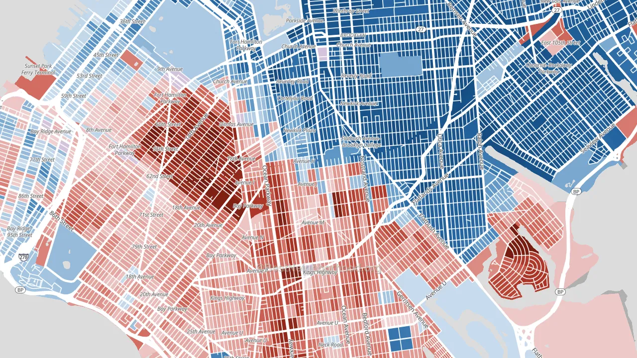
Mapleton-Flatlands is a true toss-up. About 52% of voters here vote Democratic and 48% Republican.
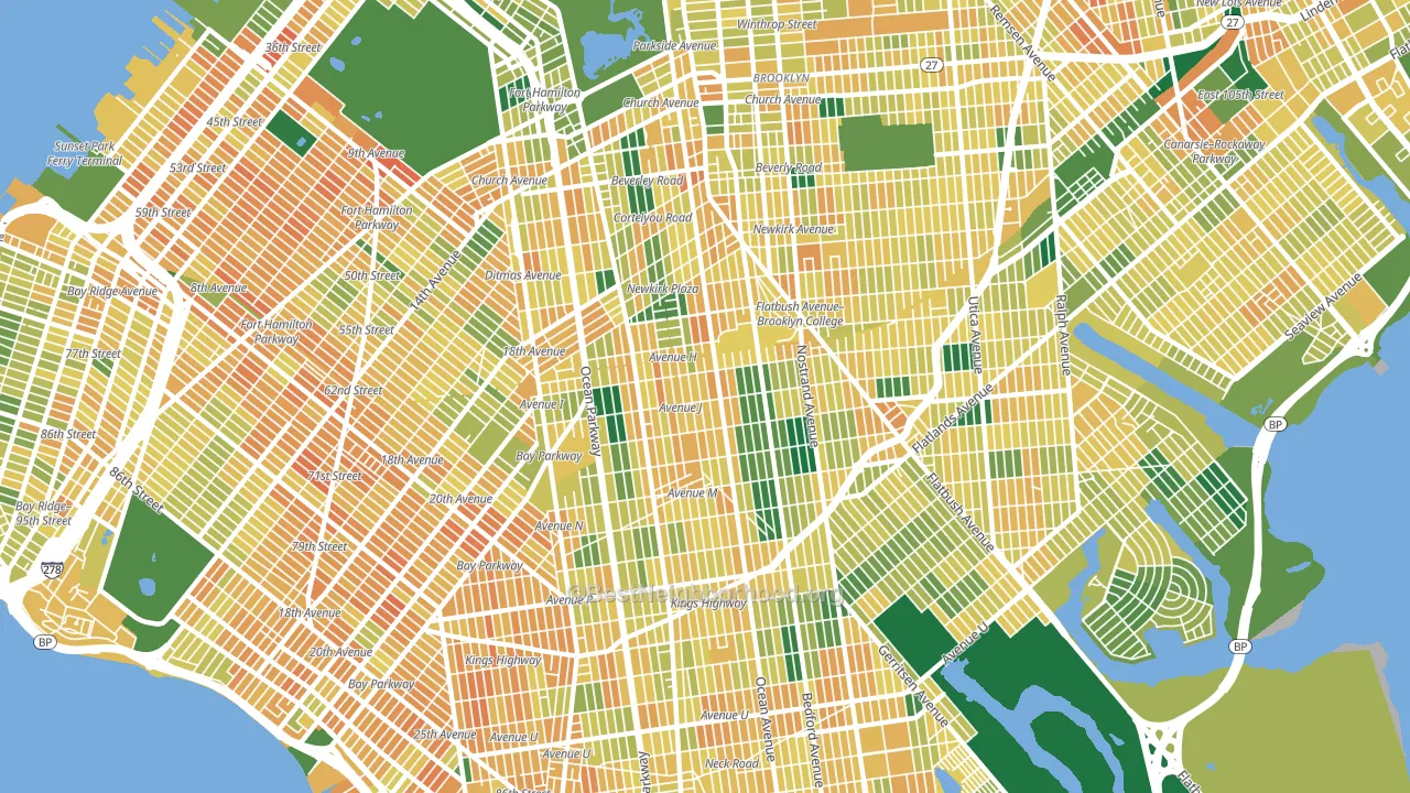
About 49% of adults in Mapleton-Flatlands typically vote, below the U.S. average of about 62%. Among adults in Mapleton-Flatlands, ~25% vote Democratic, ~24% Republican, and ~51% don't vote. The map below shows estimated turnout by block group.
How Mapleton-Flatlands compares
Among neighborhoods within 5 miles, Mapleton-Flatlands leans more Democratic than 9 of 32 neighbors.
Mapleton-Flatlands runs about 8 points more Republican than New York as a whole.
Politics vary noticeably by block within Mapleton-Flatlands. The northeast side runs the most Democratic (D+81) and the west side runs the most Republican (R+59), a spread of about 140 points.
Why Mapleton-Flatlands leans the way it does
Density, race composition, education, and family structure all sit close to their national averages in Mapleton-Flatlands. The lean here lands roughly where demographic data alone would predict.
Walkability and Democratic lean
Places with a highly walkable street grid tend to lean Democratic; Mapleton-Flatlands, Brooklyn, NY sits above the national average on this measure. A walkable street grid does not change how people vote; it mostly reflects how urban a place is.
Why turnout in Mapleton-Flatlands looks the way it does
Crowded housing lines up with lower turnout. About 14% of homes in Mapleton-Flatlands have more than one occupant per room, above 96% of neighborhoods. Renters vote less often than owners, and about 62% of households in Mapleton-Flatlands rent, about 37 points above the U.S. average of 25%. Learn more about the findings and methodology on the political spectrum map.
Nearby Neighborhoods
- Ditmas Park, Brooklyn, NY D+69
- Flatbush-Ditmas Park, Brooklyn, NY D+84
- Borough Park, Brooklyn, NY R+33
- Prospect Lefferts Gardens, Brooklyn, NY D+84
- Gravesend-Sheepshead Bay, Brooklyn, NY R+29
- Paerdegat, Brooklyn, NY D+78
- Sheepshead Bay, Brooklyn, NY R+33
- East Flatbush, Brooklyn, NY D+81
- Bensonhurst, Brooklyn, NY R+22
- Bergen Beach, Brooklyn, NY R+24
Neighborhoods with Similar Populations
- Southeast Los Angeles, Los Angeles, CA D+49
- Bedford-Stuyvesant, Brooklyn, NY D+77
- Flushing, Queens, NY Even
- Gravesend-Sheepshead Bay, Brooklyn, NY R+29
- Upper West Side, Manhattan, NY D+71
- Deer Valley, Phoenix, AZ R+8
- South Bronx, Bronx, NY D+50
- Jamaica, Queens, NY D+36
- Paradise, Las Vegas, NV D+17
- Upper East Side, Manhattan, NY D+56
Sources and methodology
Precinct-level voting records used to fit the model come from New York State Board of Elections, distributed by the Voting and Election Science Team. Demographic inputs come from the U.S. Census Bureau (ACS 5-year estimates and the 2020 Decennial Census). Health and environmental inputs come from the CDC (PLACES and the Environmental Justice Index). Land cover comes from the USGS and EPA. Election-day and lead-up weather come from PRISM 4km daily grids and the NOAA Global Historical Climatology Network. Mail-voting and election-administration patterns come from the MIT Election Lab's Survey of the Performance of American Elections. Block-group crime detail comes from CrimeGrade. Internet data and modeling support provided by ISPreports.org.
Modeling and analysis by the BestNeighborhood data science team. Full methodology and findings: political spectrum map.
Methodology reviewed by the BestNeighborhood data team. Last updated May 2026.