Culebra Park leans Democratic by roughly 26 points: about 63% of voters vote Democratic and 37% Republican.
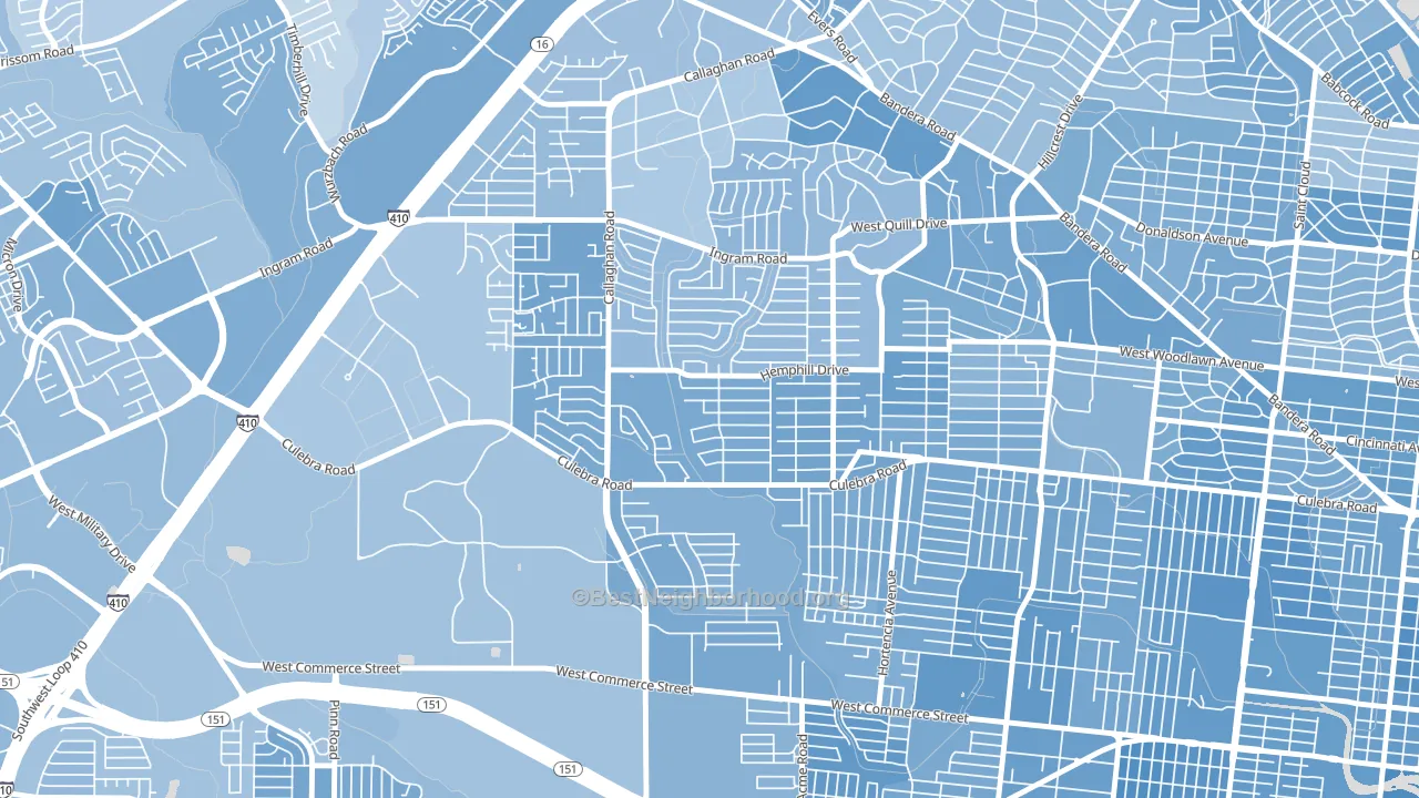
About 36% of adults in Culebra Park typically vote, below the U.S. average of about 62%. Among adults in Culebra Park, ~23% vote Democratic, ~13% Republican, and ~64% don't vote. The map below shows estimated turnout by block group.
How Culebra Park compares
Among neighborhoods within 5 miles, Culebra Park leans more Democratic than 10 of 28 neighbors.
Culebra Park runs about 41 points more Democratic than Texas as a whole. Texas leans Republican overall, while Culebra Park is one of the few Democratic-leaning pockets.
Why Culebra Park leans the way it does
This analysis examined 14,881 data points per neighborhood to find what predicts political lean and turnout. The items below are a few correlations that stood out for Culebra Park, not a ranked or complete list of what matters most.
Culebra Park votes against the grain of Texas. Texas leans Republican overall, while Culebra Park runs about 41 points more Democratic. Density combined with diversity predicts Democratic voting, and non-Hispanic white share in Culebra Park is about 3%, about 69 points below the U.S. average of 72%.
Cancer-screening access and voter turnout
Places with low colon-cancer-screening access tend to turn out at a lower rate; Culebra Park, San Antonio, TX sits in the bottom tenth nationally on this measure. Cancer screening does not drive turnout; it reflects income, insurance, and healthcare access.
Why turnout in Culebra Park looks the way it does
Areas with limited routine healthcare access turn out at lower rates. Culebra Park is in the bottom quarter nationally for routine-care measures such as insurance coverage, preventive screenings, and dental visits. The dental-visit rate here is about 43%, about 11 points below the Texas average of 54%. Low high-school completion lines up with lower turnout, and about 71% of adults in Culebra Park have completed high school, below 94% of neighborhoods. Learn more about the findings and methodology on the political spectrum map.
Nearby Neighborhoods
- Thunderbird Hills, San Antonio, TX D+23
- Third World, San Antonio, TX D+29
- Loma Park, San Antonio, TX D+27
- Ingram Hills, San Antonio, TX D+24
- Community Workers Council, San Antonio, TX D+27
- Memorial Heights, San Antonio, TX D+35
- University Park-San Antonio, San Antonio, TX D+30
- Donaldson Terrace, San Antonio, TX D+31
- Los Jardines, San Antonio, TX D+32
- United Westwood, San Antonio, TX D+28
Neighborhoods with Similar Populations
- Eastlake, Seattle, WA D+76
- Marlyville, New Orleans, LA D+50
- Howard Park, Gwynn Oak, MD D+85
- Bandini, Commerce, CA D+37
- Indian Hills, Grand Prairie, TX D+10
- Midtown-Nashville, Nashville, TN D+32
- Eastown, Grand Rapids, MI D+56
- Briarcliffe, Glenolden, PA D+15
- Northgate, College Station, TX D+35
- Waltherson, Baltimore, MD D+75
Sources and methodology
Precinct-level voting records used to fit the model come from Texas Secretary of State, Elections Division, distributed by the Voting and Election Science Team. Demographic inputs come from the U.S. Census Bureau (ACS 5-year estimates and the 2020 Decennial Census). Health and environmental inputs come from the CDC (PLACES and the Environmental Justice Index). Land cover comes from the USGS and EPA. Election-day and lead-up weather come from PRISM 4km daily grids and the NOAA Global Historical Climatology Network. Mail-voting and election-administration patterns come from the MIT Election Lab's Survey of the Performance of American Elections. Block-group crime detail comes from CrimeGrade. Internet data and modeling support provided by ISPreports.org.
Modeling and analysis by the BestNeighborhood data science team. Full methodology and findings: political spectrum map.
Methodology reviewed by the BestNeighborhood data team. Last updated May 2026.