Thunderbird Hills leans Democratic by roughly 22 points: about 61% of voters vote Democratic and 39% Republican.
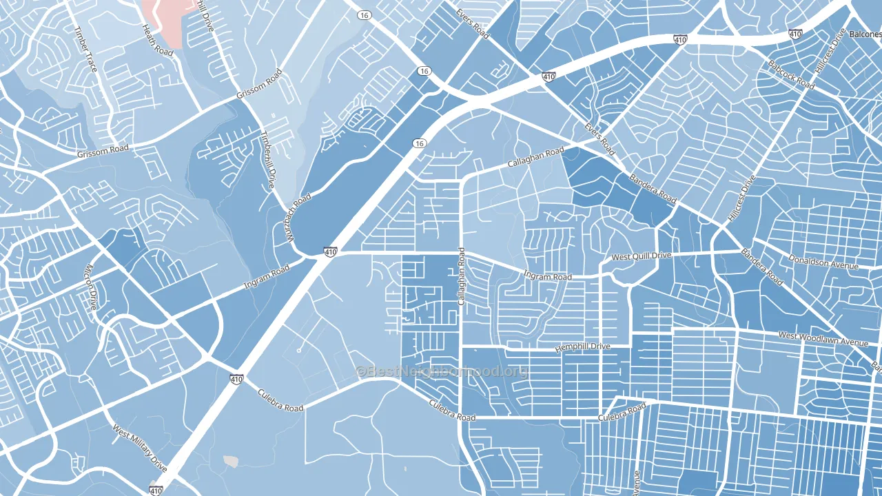
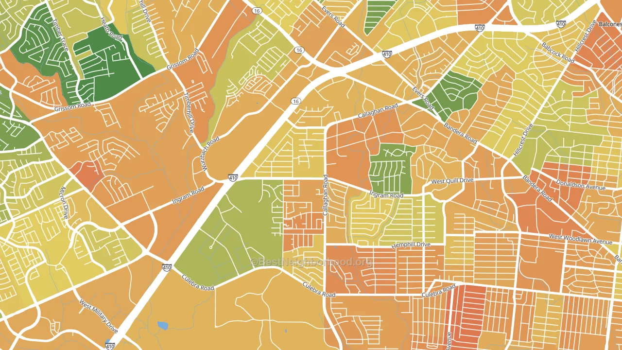
About 42% of adults in Thunderbird Hills typically vote, below the U.S. average of about 62%. Among adults in Thunderbird Hills, ~26% vote Democratic, ~17% Republican, and ~57% don't vote. The map below shows estimated turnout by block group.
How Thunderbird Hills compares
Among neighborhoods within 5 miles, Thunderbird Hills leans more Democratic than 6 of 28 neighbors.
Thunderbird Hills runs about 37 points more Democratic than Texas as a whole. Texas leans Republican overall, while Thunderbird Hills is one of the few Democratic-leaning pockets.
Why Thunderbird Hills leans the way it does
This analysis examined 14,881 data points per neighborhood to find what predicts political lean and turnout. The items below are a few correlations that stood out for Thunderbird Hills, not a ranked or complete list of what matters most.
Thunderbird Hills votes against the grain of Texas. Texas leans Republican overall, while Thunderbird Hills runs about 37 points more Democratic.
Paved land cover and Democratic lean
Places with extensive paved surfaces tend to lean Democratic; Thunderbird Hills, San Antonio, TX sits above the national average on this measure. Paved ground does not change how people vote; it mostly reflects how urban and built-up a place is.
Why turnout in Thunderbird Hills looks the way it does
Areas with limited routine healthcare access turn out at lower rates. Thunderbird Hills is in the bottom quarter nationally for routine-care measures such as insurance coverage, preventive screenings, and dental visits. The uninsured rate here is about 29%, about 10 points above the Texas average of 19%. Learn more about the findings and methodology on the political spectrum map.
Nearby Neighborhoods
- Culebra Park, San Antonio, TX D+27
- Ingram Hills, San Antonio, TX D+24
- Third World, San Antonio, TX D+29
- Pipers Meadow, San Antonio, TX D+21
- Loma Park, San Antonio, TX D+27
- Crown Meadows, San Antonio, TX D+22
- University Park-San Antonio, San Antonio, TX D+30
- Donaldson Terrace, San Antonio, TX D+31
- Community Workers Council, San Antonio, TX D+27
- Apple Creek, San Antonio, TX D+26
Neighborhoods with Similar Populations
- Liberty Street Historic District, San Francisco, CA D+81
- South Knoxville, Knoxville, TN D+19
- Brentwood-Darlington, Portland, OR D+37
- Allied Gardens, San Diego, CA D+25
- Mount Tabor, Portland, OR D+85
- Mandarin, Jacksonville, FL R+38
- Memorial Park, Santa Ana, CA D+31
- Balboa Park, San Diego, CA D+58
- Providence Plantation, Charlotte, NC Even
- Saint Anthony, St. Paul, MN D+73
Sources and methodology
Precinct-level voting records used to fit the model come from Texas Secretary of State, Elections Division, distributed by the Voting and Election Science Team. Demographic inputs come from the U.S. Census Bureau (ACS 5-year estimates and the 2020 Decennial Census). Health and environmental inputs come from the CDC (PLACES and the Environmental Justice Index). Land cover comes from the USGS and EPA. Election-day and lead-up weather come from PRISM 4km daily grids and the NOAA Global Historical Climatology Network. Mail-voting and election-administration patterns come from the MIT Election Lab's Survey of the Performance of American Elections. Block-group crime detail comes from CrimeGrade. Internet data and modeling support provided by ISPreports.org.
Modeling and analysis by the BestNeighborhood data science team. Full methodology and findings: political spectrum map.
Methodology reviewed by the BestNeighborhood data team. Last updated May 2026.