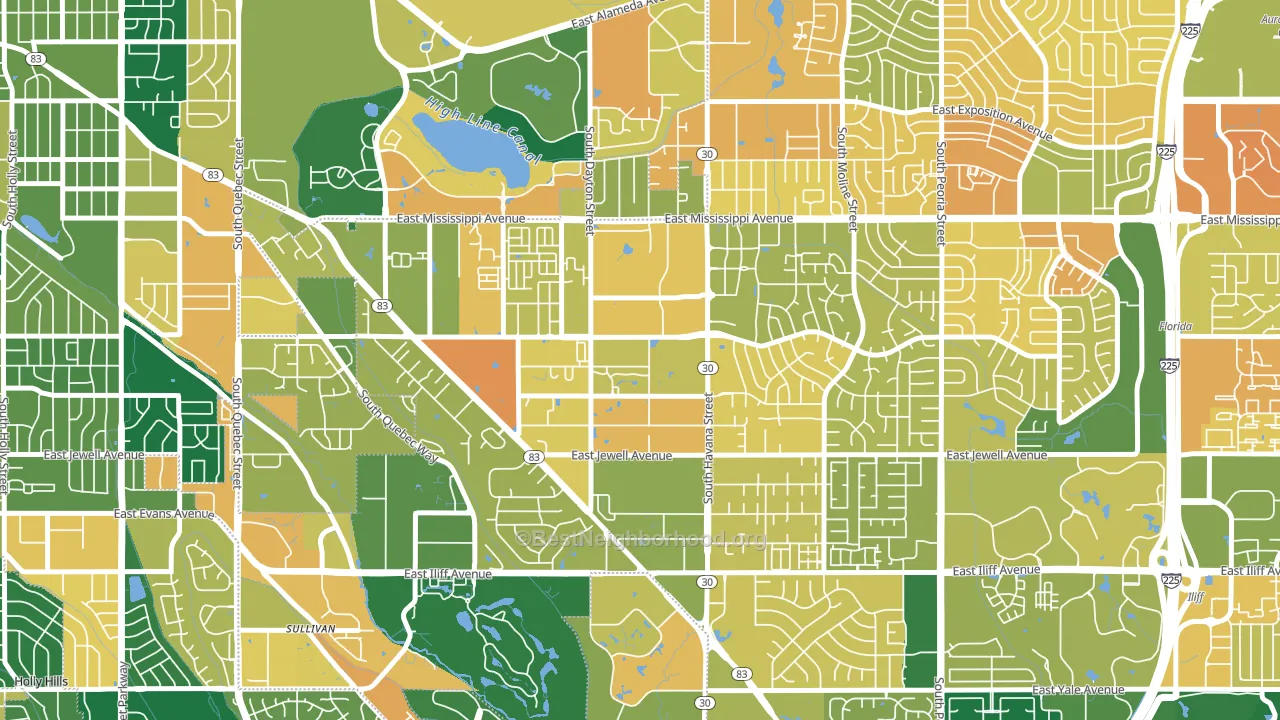
Dayton Triangle leans heavily Democratic by roughly 40 points: about 70% of voters vote Democratic and 30% Republican.
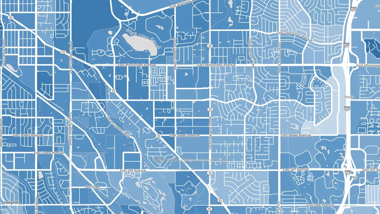
About 52% of adults in Dayton Triangle typically vote, below the U.S. average of about 62%. Among adults in Dayton Triangle, ~36% vote Democratic, ~16% Republican, and ~48% don't vote. The map below shows estimated turnout by block group.
How Dayton Triangle compares
Among neighborhoods within 5 miles, Dayton Triangle leans more Democratic than 28 of 38 neighbors.
Dayton Triangle runs about 29 points more Democratic than Colorado as a whole.
Why Dayton Triangle leans the way it does
This analysis examined 14,881 data points per neighborhood to find what predicts political lean and turnout. The items below are a few correlations that stood out for Dayton Triangle, not a ranked or complete list of what matters most.
Dense areas vote Democratic. More than 99% of residents in Dayton Triangle live in densely developed areas, about 64 points above the U.S. average of 36%. A high never-married share predicts Democratic voting, and about 46% of adults in Dayton Triangle have never been married, above 76% of neighborhoods.
Paved land cover and Democratic lean
Places with extensive paved surfaces tend to lean Democratic; Dayton Triangle, Aurora, CO sits in the top tenth nationally on this measure. Paved ground does not change how people vote; it mostly reflects how urban and built-up a place is.
Why turnout in Dayton Triangle looks the way it does
Renters vote less often than owners. About 70% of households in Dayton Triangle rent, about 45 points above the U.S. average of 25%. Learn more about the findings and methodology on the political spectrum map.
Nearby Neighborhoods
- Village East, Aurora, CO D+31
- Expo Park, Aurora, CO D+33
- Hampden, Denver, CO D+47
- Utah Park, Aurora, CO D+34
- Heather Ridge, Aurora, CO D+35
- East Ridge-Ptarmigan Park, Aurora, CO D+34
- Southeastern Denver, Denver, CO D+47
- Aurora Hills, Aurora, CO D+27
- Highline Villages, Aurora, CO D+45
- Dam East-West, Aurora, CO D+36
Neighborhoods with Similar Populations
- Elwood, East Northport, NY R+8
- Colonial Heights, Yonkers, NY D+19
- Downtown Little Rock, Little Rock, AR D+70
- Aurora Hills, Aurora, CO D+27
- Downtown Marion, Marion, OH R+21
- College Heights Baker Street, Bakersfield, CA D+15
- Fishers Landing East, Vancouver, WA D+26
- Belmont, Lincoln, NE D+8
- Villa Park, Denver, CO D+52
- Stella Mann, Tucson, AZ D+12
Sources and methodology
Precinct-level voting records used to fit the model come from Colorado Secretary of State, Elections, distributed by the Voting and Election Science Team. Demographic inputs come from the U.S. Census Bureau (ACS 5-year estimates and the 2020 Decennial Census). Health and environmental inputs come from the CDC (PLACES and the Environmental Justice Index). Land cover comes from the USGS and EPA. Election-day and lead-up weather come from PRISM 4km daily grids and the NOAA Global Historical Climatology Network. Mail-voting and election-administration patterns come from the MIT Election Lab's Survey of the Performance of American Elections. Block-group crime detail comes from CrimeGrade. Internet data and modeling support provided by ISPreports.org.
Modeling and analysis by the BestNeighborhood data science team. Full methodology and findings: political spectrum map.
Methodology reviewed by the BestNeighborhood data team. Last updated May 2026.