DeKalb County is a Democratic stronghold. About 81% of voters here vote Democratic and 19% Republican.
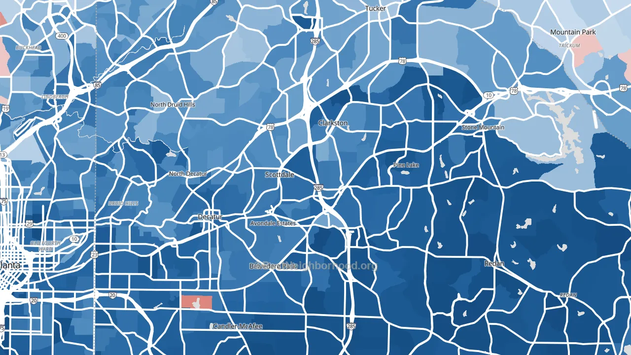
About 71% of adults in DeKalb County typically vote, above the U.S. average of about 62%. Among adults in DeKalb County, ~57% vote Democratic, ~14% Republican, and ~29% don't vote. The map below shows estimated turnout by block group.
How DeKalb County compares
Among counties within 50 miles, DeKalb County leans more Democratic than 27 of 28 neighbors.
DeKalb County runs about 65 points more Democratic than Georgia as a whole. Georgia is roughly evenly split, and DeKalb County sits clearly on the Democratic side.
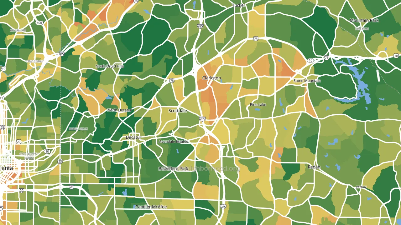
Politics vary noticeably by city within DeKalb County. The south side is the most Democratic-leaning (D+84) and the northwest side is the least Democratic-leaning (D+36), a spread of about 48 points.
Why DeKalb County leans the way it does
This analysis examined 14,881 data points per county to find what predicts political lean and turnout. The items below are a few correlations that stood out for DeKalb County, not a ranked or complete list of what matters most.
Dense areas vote Democratic. About 90% of residents in DeKalb County live in densely developed areas, about 53 points above the U.S. average of 36%. High college attainment predicts Democratic voting, and DeKalb County sits in the top quarter (about 47%, above 96% of counties). DeKalb County runs against the grain of Georgia, a Democratic-leaning outlier in a roughly evenly split state.
Population density and Democratic lean
Places with high population density tend to lean Democratic; DeKalb County, GA sits in the top tenth nationally on this measure.
Why turnout in DeKalb County looks the way it does
Areas with limited routine healthcare access turn out at lower rates. DeKalb County is in the bottom quarter nationally for routine-care measures such as insurance coverage, preventive screenings, and dental visits. Learn more about the findings and methodology on the political spectrum map.
Nearby Counties
- Fulton County, GA D+46
- Gwinnett County, GA D+21
- Rockdale County, GA D+42
- Clayton County, GA D+68
- Cobb County, GA D+20
- Henry County, GA D+26
- Newton County, GA D+16
- Walton County, GA R+37
- Forsyth County, GA R+22
- Douglas County, GA D+28
Counties with Similar Populations
- San Mateo County, CA D+48
- Cobb County, GA D+20
- Lee County, FL R+19
- Monroe County, NY D+25
- San Joaquin County, CA D+4
- Jefferson County, KY D+20
- Oklahoma County, OK D+6
- Suffolk County, MA D+53
- El Paso County, CO R+7
- Norfolk County, MA D+30
Sources and methodology
Precinct-level voting records used to fit the model come from Georgia Elections Division, distributed by the Voting and Election Science Team. Demographic inputs come from the U.S. Census Bureau (ACS 5-year estimates and the 2020 Decennial Census). Health and environmental inputs come from the CDC (PLACES and the Environmental Justice Index). Land cover comes from the USGS and EPA. Election-day and lead-up weather come from PRISM 4km daily grids and the NOAA Global Historical Climatology Network. Mail-voting and election-administration patterns come from the MIT Election Lab's Survey of the Performance of American Elections. Block-group crime detail comes from CrimeGrade. Internet data and modeling support provided by ISPreports.org.
Modeling and analysis by the BestNeighborhood data science team. Full methodology and findings: political spectrum map.
Methodology reviewed by the BestNeighborhood data team. Last updated May 2026.