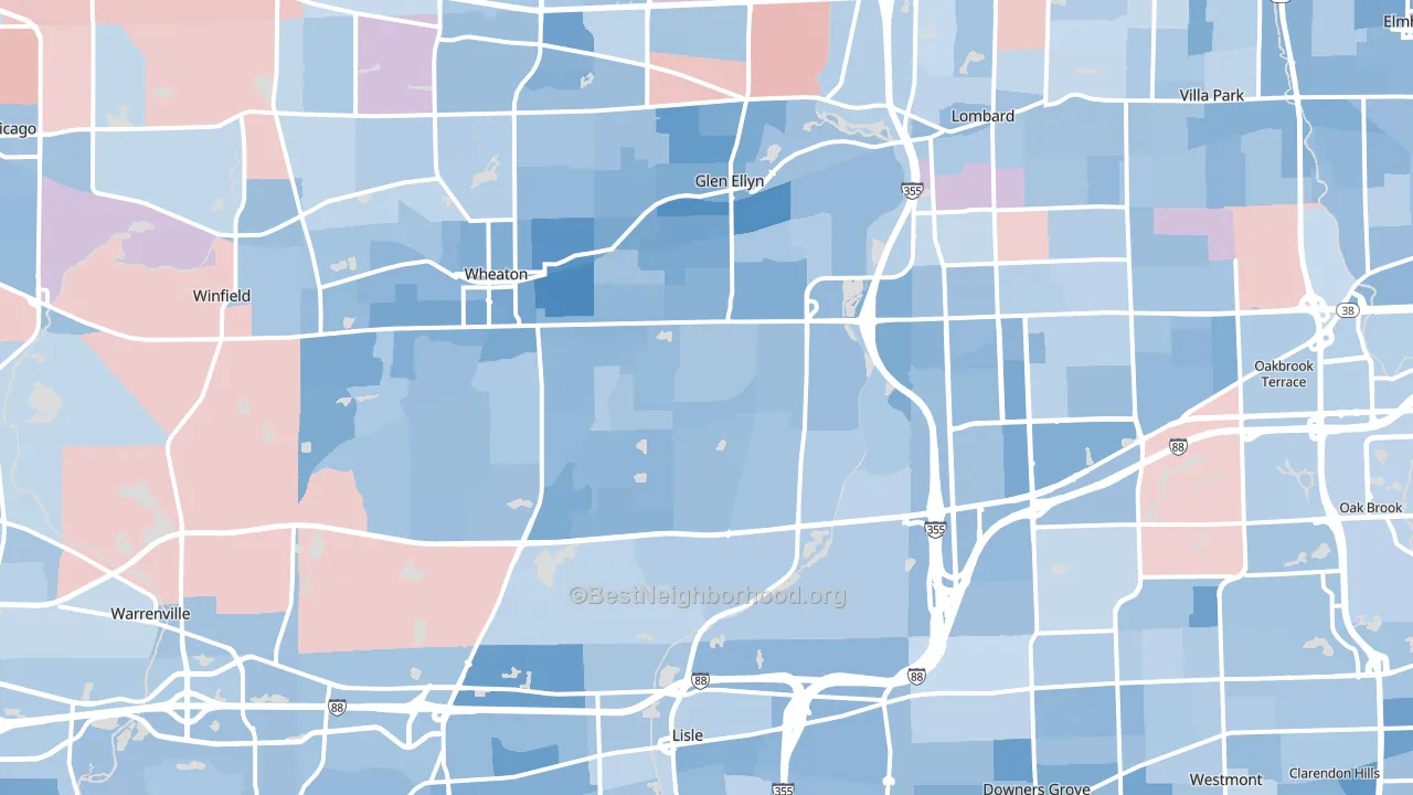
DuPage County leans slightly Democratic by roughly 14 points: about 57% of voters vote Democratic and 43% Republican.
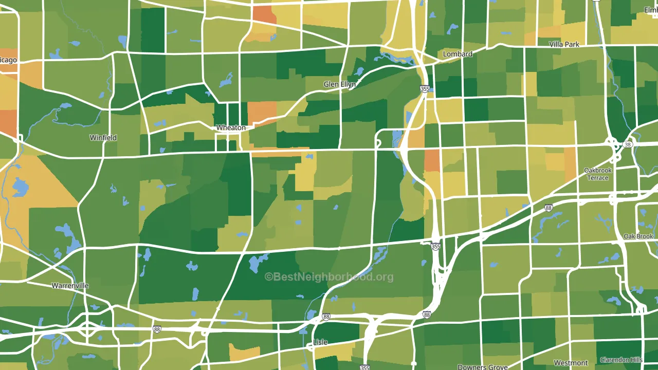
About 73% of adults in DuPage County typically vote, above the U.S. average of about 62%. Among adults in DuPage County, ~42% vote Democratic, ~31% Republican, and ~27% don't vote. The map below shows estimated turnout by block group.
How DuPage County compares
Among counties within 50 miles, DuPage County leans more Democratic than 7 of 10 neighbors.
Politically, DuPage County sits close to the rest of Illinois.
Politics vary noticeably by city within DuPage County. The southwest side is the most Democratic-leaning (D+25) and the northwest side is the least Democratic-leaning (D+4), a spread of about 21 points.
Why DuPage County leans the way it does
This analysis examined 14,881 data points per county to find what predicts political lean and turnout. The items below are a few correlations that stood out for DuPage County, not a ranked or complete list of what matters most.
Dense areas vote Democratic. About 95% of residents in DuPage County live in densely developed areas, about 58 points above the U.S. average of 36%. High college attainment predicts Democratic voting, and DuPage County sits in the top quarter (about 52%, above 98% of counties).
Population density and Democratic lean
Places with high population density tend to lean Democratic; DuPage County, IL sits in the top tenth nationally on this measure.
Why turnout in DuPage County looks the way it does
Areas with strong routine healthcare access turn out at higher rates. DuPage County is in the top quarter nationally for routine-care measures such as insurance coverage, preventive screenings, and dental visits. The dental-visit rate here is about 70%, about 10 points above the U.S. average of 60%. Learn more about the findings and methodology on the political spectrum map.
Nearby Counties
- Kane County, IL D+13
- Cook County, IL D+42
- Will County, IL D+6
- Kendall County, IL Even
- Lake County, IL D+22
- McHenry County, IL R+5
- DeKalb County, IL D+3
- Grundy County, IL R+26
- Lake County, IN D+14
- Kankakee County, IL R+9
Counties with Similar Populations
- Shelby County, TN D+40
- Milwaukee County, WI D+41
- Pierce County, WA D+12
- Erie County, NY D+15
- Bergen County, NJ D+5
- Kern County, CA R+12
- Gwinnett County, GA D+21
- Pinellas County, FL R+3
- Denton County, TX R+7
- Prince George's County, MD D+71
Sources and methodology
Precinct-level voting records used to fit the model come from Illinois State Board of Elections, distributed by the Voting and Election Science Team. Demographic inputs come from the U.S. Census Bureau (ACS 5-year estimates and the 2020 Decennial Census). Health and environmental inputs come from the CDC (PLACES and the Environmental Justice Index). Land cover comes from the USGS and EPA. Election-day and lead-up weather come from PRISM 4km daily grids and the NOAA Global Historical Climatology Network. Mail-voting and election-administration patterns come from the MIT Election Lab's Survey of the Performance of American Elections. Block-group crime detail comes from CrimeGrade. Internet data and modeling support provided by ISPreports.org.
Modeling and analysis by the BestNeighborhood data science team. Full methodology and findings: political spectrum map.
Methodology reviewed by the BestNeighborhood data team. Last updated May 2026.