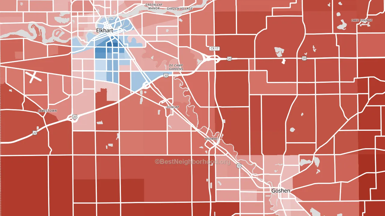
Elkhart County leans Republican by roughly 28 points: about 36% of voters vote Democratic and 64% Republican.
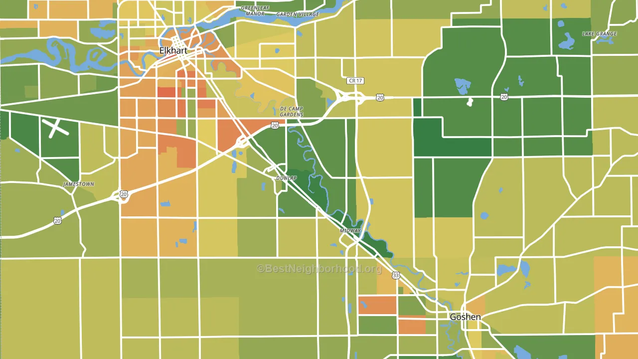
About 61% of adults in Elkhart County typically vote, near the U.S. average of about 62%. Among adults in Elkhart County, ~22% vote Democratic, ~39% Republican, and ~39% don't vote. The map below shows estimated turnout by block group.
How Elkhart County compares
Among counties within 50 miles, Elkhart County leans more Republican than 5 of 17 neighbors.
Elkhart County runs about 9 points more Republican than Indiana as a whole.
Politics vary noticeably by city within Elkhart County. The east side is the most Republican-leaning (R+53) and the west side is the least Republican-leaning (R+11), a spread of about 43 points.
Why Elkhart County leans the way it does
This analysis examined 14,881 data points per county to find what predicts political lean and turnout. The items below are a few correlations that stood out for Elkhart County, not a ranked or complete list of what matters most.
Elkhart County votes Republican even though it is densely developed (about 64%, far above the Indiana average of 25%). State and regional patterns outweigh the Democratic lean that density usually predicts here. A high family-household share predicts Republican voting, and about 70% of households in Elkhart County are family households, above 81% of counties.
High-school completion and voter turnout
Places with low high-school-completion share tend to turn out at a lower rate; Elkhart County, IN sits in the bottom tenth nationally on this measure.
Why turnout in Elkhart County looks the way it does
Turnout in Elkhart County sits close to the national pattern. Routine healthcare access, homeownership, education, and food security all land near their national averages here. Learn more about the findings and methodology on the political spectrum map.
Nearby Counties
- St. Joseph County, IN D+9
- Cass County, MI R+29
- LaGrange County, IN R+63
- Kosciusko County, IN R+47
- St. Joseph County, MI R+35
- Marshall County, IN R+44
- Noble County, IN R+49
- Berrien County, MI Even
- Whitley County, IN R+51
- Fulton County, IN R+51
Counties with Similar Populations
- Muscogee County, GA D+25
- Benton County, WA R+21
- Richmond County, GA D+41
- Champaign County, IL D+29
- Clermont County, OH R+37
- Harrison County, MS R+18
- Washington County, PA R+24
- Onslow County, NC R+23
- Yuma County, AZ R+8
- Anderson County, SC R+43
Sources and methodology
Precinct-level voting records used to fit the model come from Indiana Secretary of State, Elections, distributed by the Voting and Election Science Team. Demographic inputs come from the U.S. Census Bureau (ACS 5-year estimates and the 2020 Decennial Census). Health and environmental inputs come from the CDC (PLACES and the Environmental Justice Index). Land cover comes from the USGS and EPA. Election-day and lead-up weather come from PRISM 4km daily grids and the NOAA Global Historical Climatology Network. Mail-voting and election-administration patterns come from the MIT Election Lab's Survey of the Performance of American Elections. Block-group crime detail comes from CrimeGrade. Internet data and modeling support provided by ISPreports.org.
Modeling and analysis by the BestNeighborhood data science team. Full methodology and findings: political spectrum map.
Methodology reviewed by the BestNeighborhood data team. Last updated May 2026.